Scoring genre clarity...

Teryndor: Caelorn’s Quest capsule

Teryndor: Caelorn’s Quest

An Action game with Tower Defense elements where you defend the Protective Crystals of Teryndor! As Prince Caelorn, fight against hordes of creatures to save your kingdom from destruction.

$4.005 user reviews
ActionStrategyTower Defense
JD RoodsMar 27, 2026

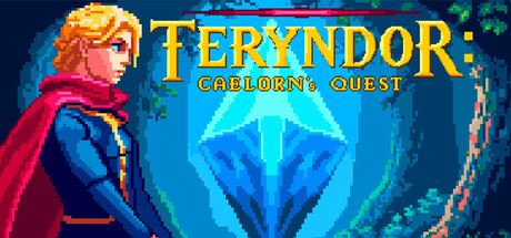
Teryndor: Caelorn’s Quest scores 72/100 — better than 46% of Action capsules (n=8,534).

5 user reviews · $4.00 · Released Mar 27, 2026 · By JD Roods

Quick text summary

Teryndor: Caelorn’s Quest scored 72/100 on Steam Analyzer — Good for a Action capsule. Top priority fix: [title_readability] Remove or integrate the subtitle into the main logo mark to ensure the full game identity survives at tiny 120×45 size without text collapse.

Capsule scores by dimension

  • Genre Clarity: 7/10 — Action fantasy with tower defense hint. The pixel art prince in combat stance with a glowing crystal centerpiece clearly signals fantasy action gameplay. The protective crystal motif and defensive positioning hint at tower defense mechanics, though the genre mix reads as action-first at tiny size. At TINY size, the character and crystal are recognizable but tower defense strategy cues become secondary to the immediate action impression.
  • Title Readability: 8/10 — Bold yellow title with strong contrast. TERYNDOR in large golden-yellow letters sits cleanly against the dark blue background with excellent contrast and clear letterforms. The subtitle CAELORN'S QUEST is readable at full size but becomes thin and risky at tiny size due to smaller point size. At SMALL size the title reads well; at TINY the main logo survives well but the subtitle fades into illegibility, though the game name alone carries sufficient recognition.
  • Contrast & Color: 8/10 — Strong warm-cool palette separation. The warm orange-gold hair and red cape of the prince pop decisively against cool blue-teal background, creating excellent value and hue separation. The bright cyan crystal in the center acts as a secondary focal point with high contrast. Grayscale test confirms strong value separation between character, crystal, and background that survives squinting.
  • Uniqueness & Polish: 7/10 — Polished pixel art with fantasy appeal. The retro pixel art style is well-executed with clean sprite work, smooth gradient backgrounds, and intentional color grading that avoids the generic fantasy trap. The prince character design with flowing cape and heroic pose conveys personality and premium indie craft. However, the overall composition follows familiar action-adventure capsule conventions without a distinctive mechanical hook that jumps out as unique.
  • Brand Consistency: 6/10 — Coherent art style, limited identity markers. The pixel art rendering is internally consistent with warm character colors and cool magical environment tones that suggest a unified art direction. The protective crystal motif could become a recognizable brand icon, but currently lacks the signature visual hook or mascot presence that would enable instant recall across multiple capsules. The style is competent and cohesive but not yet iconic.
  • Composition: 7/10 — Clear focal hierarchy with stable center. The prince occupies the left-center with strong visual weight, while the glowing crystal mandala anchors the right-center, creating a balanced two-point hierarchy. The title floats safely in the upper zone with adequate margin from edges. At SMALL and TINY sizes the composition holds together well with the character and crystal remaining distinct; however, at TINY the subtitle positioning near the crystal creates minor visual competition.

What works

  • Strong color contrast against dark background. Warm orange-gold tones and bright cyan crystal create decisive value separation that survives the #1b2838 Steam background and quick-scroll conditions.
  • Clean pixel art execution and character design. The sprite work is polished with smooth gradients and intentional lighting that conveys premium indie craft and personality in the prince's heroic pose.
  • Readable main title with strategic placement. Golden TERYNDOR text sits cleanly on controlled background space with excellent contrast and legibility at full and small sizes.

What hurts the capsule

  • Subtitle illegibility at tiny thumbnail size. CAELORN'S QUEST becomes unreadable at the 120×45 tiny size, relying entirely on the main logo for game identification.
  • Generic action-adventure composition. The two-point balance of character and crystal follows conventional fantasy game capsule patterns without a distinctive mechanical or narrative visual hook.
  • Weak tower defense brand signaling. While the protective crystal hints at tower defense mechanics, the action-heavy character focus and pose obscure the strategic gameplay element at glance, potentially misleading casual browsers about core genre.

Priority fixes

  1. [title_readability] Remove or integrate the subtitle into the main logo mark to ensure the full game identity survives at tiny 120×45 size without text collapse.
  2. [genre_clarity] Add a subtle secondary visual cue (defensive line, crystal lattice pattern, or tower silhouette) that reinforces tower defense strategy identity alongside the action stance.
  3. [uniqueness_polish] Introduce a signature visual motif or unique crystal design element that could become a recognizable brand mark across future marketing materials and store presence.

Store copy priority fixes

  1. [hook_strength] Replace the opening with a verb-forward, specific hook: 'Command towers and cut through endless hordes as Prince Caelorn—tower defense meets fast-paced combat in Teryndor' to immediately convey the action-hybrid nature and protagonist agency.
  2. [uniqueness] Add a differentiator sentence after the short description explaining what fuses action and tower defense uniquely here—e.g., 'Blend real-time weapon combat with strategic tower placement, or whether player skill in combat determines success as much as positioning does.
  3. [feature_communication] Expand weapon and creature descriptions with one mechanic example—e.g., 'Unlock 9 distinct weapons with evolving abilities, from frost arrows that slow hordes to area-burst hammers, each reshaping your tactics'—to show how progression changes gameplay.
  4. [audience_targeting] Add a sentence clarifying primary audience after the boss mention—e.g., 'Master roguelite runs for hardcore players or enjoy casual stage clears with family—full difficulty scaling supports both' to signal accessibility and competitiveness range.

Related guides

Steam app ID: 4055700 · Tags: Action, Strategy, Tower Defense, Roguelite, Pixel Graphics