Rhythm Ball scores 75/100 — better than 65% of Casual capsules (n=10,153).

Quick text summary

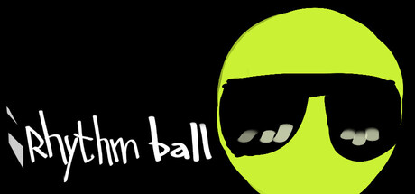
Rhythm Ball scored 75/100 on Steam Analyzer — Good for a Casual capsule. Top priority fix: [genre_clarity] Integrate a rhythm-specific visual element (musical note, pulse effect, or beat indicator) into the character or background to communicate gameplay type at glance.

Capsule scores by dimension

  • Genre Clarity: 7/10 — Casual indie rhythm game clear. The neon yellow smiley face character and upbeat color palette signal a casual, playful indie game. At SMALL and TINY sizes, the bright lime green silhouette remains distinctly visible and communicates a fun, lighthearted tone appropriate to rhythm/casual genres. However, the capsule does not explicitly communicate 'rhythm game' through traditional genre cues like notes, beats, or musical iconography—it relies on general indie charm rather than specific gameplay clarity.
  • Title Readability: 8/10 — Title legible, handwritten style holds. The 'Rhythm Ball' text in white handwritten font sits on the left against solid black background, ensuring strong contrast and readability at all sizes. The letterforms remain distinct even at TINY size due to chunky stroke weight and simple geometry. At FULL size, the casual handwriting style adds personality without sacrificing clarity, though at extreme reduction the text remains recognizable due to strong value separation.
  • Contrast & Color: 9/10 — Neon yellow pops powerfully. The bright lime-yellow character (#CDDC39 range) creates exceptional contrast against the solid black background (#1b2838), standing out immediately even at TINY thumbnail size. The high saturation and extreme value separation ensure the silhouette reads crisply in grayscale, and the character's simple sunglasses add focal point definition. This is one of the strongest color choices for discoverability at reduced sizes.
  • Uniqueness & Polish: 7/10 — Charming character, generic execution. The smiley face character with cool sunglasses has personality and fits the casual vibe, making the capsule feel friendlier than a generic template. However, the design itself—a single yellow circle with minimal detail—is relatively simple and could be mistaken for any number of indie titles without additional context. The craft is clean but the concept leans toward generic cute indie branding rather than something distinctly memorable about Rhythm Ball specifically.
  • Brand Consistency: 6/10 — Simple character, limited signature. The neon yellow smiley-face character appears to be the main brand mascot with recognizable elements (sunglasses, simple geometry). However, without reference to other store assets, it's unclear whether this character has a strong, consistent identity throughout the game's marketing ecosystem. The design is cohesive internally, but the character lacks distinctive personality markers that would make it iconic across multiple touchpoints.
  • Composition: 8/10 — Strong balance, clear focal point. The composition divides the space with the character on the right and title on the left, creating clear visual balance without clutter. The character serves as the dominant focal point with immediate visual pull, while the title anchors the left margin safely away from Steam's typical crop hazards. At SMALL and TINY sizes, the layout remains unambiguous with no competing elements—the yellow sphere draws attention instantly while text remains legible.

What works

  • Exceptional color contrast. The neon yellow character against pure black background delivers maximum value separation and pops immediately at any size, even at thumbnail scale.
  • Clean, readable typography. White handwritten 'Rhythm Ball' text maintains legibility at TINY size with strong contrast, chunky letterforms, and safe placement on solid background.
  • Uncluttered composition. Simple left-right balance with one dominant focal point prevents visual confusion and allows quick recognition during fast scrolling.

What hurts the capsule

  • Genre ambiguity. No musical or rhythm-specific iconography (notes, beats, waveforms) visible; the capsule communicates 'cute indie' rather than 'rhythm game' specifically.
  • Generic character concept. A smiley face with sunglasses is a common trope in casual indie games and lacks a distinctive visual hook that screams 'Rhythm Ball' over any competitor.
  • Minimal visual storytelling. The design shows the mascot but not the core gameplay mechanic or what makes this rhythm game unique compared to other casual titles in the genre.

Priority fixes

  1. [genre_clarity] Integrate a rhythm-specific visual element (musical note, pulse effect, or beat indicator) into the character or background to communicate gameplay type at glance.
  2. [uniqueness_polish] Add a subtle gameplay mechanic visual (like a ball bouncing to a beat pattern or grid/target indicator) to differentiate from generic cute indie mascots.
  3. [brand_consistency] Ensure the yellow character and sunglasses motif are consistently applied across all store assets to build iconic recognition.

Store copy priority fixes

  1. [hook_strength] Rewrite the short description to lead with a specific emotion or outcome: 'Tap the beat to break obstacles and chase perfect runs in this rhythmic platformer.'
  2. [feature_communication] Expand the detailed description to 150+ words explaining level progression, music variety, difficulty modes, visual feedback, and how platforming challenges tie to rhythm mechanics.
  3. [uniqueness] Add 1–2 sentences highlighting what sets Rhythm Ball apart: e.g., the specific obstacle types, art style, music selection, or a unique mechanic (e.g., 'combines rhythm precision with platformer puzzle-solving').
  4. [audience_targeting] Include a sentence that signals the intended player: e.g., 'Perfect for rhythm game fans seeking quick, satisfying challenges' or 'Family-friendly precision gaming.'

Related guides

Steam app ID: 4056470 · Tags: Casual, Rhythm, 2D, Singleplayer, 2D Platformer