Scoring genre clarity...
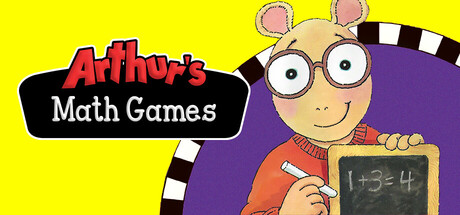
Arthur's Math Games is the perfect combination of learning, fun, and helpful features. With 6 different fun-filled activities and 5 levels of difficulty, Arthur's Math Games will entertain your child with hours of learning and fun!
$9.991 user reviews
CasualEducationFamily Friendly
Jordan Freeman Group, Marc Brown Studios, Wanderful EdutainmentDec 26, 2025