Scoring genre clarity...

PORTERS capsule

PORTERS

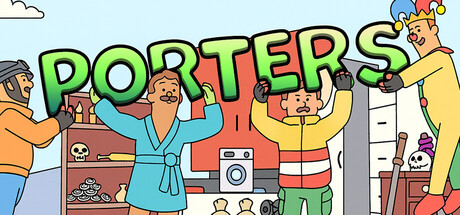
Porters is a hilarious 2-4 player co-op platformer! As porters, carry crates, furniture, and quirky items through obstacle-filled levels. Work in sync, don’t lose your arms, and try to deliver everything intact. Can you handle the chaos?

$1.99No user reviews
Precision Platformer3D PlatformerPuzzle Platformer
Rational StudiosDec 21, 2025

PORTERS scores 77/100 — better than 77% of Precision Platformer capsules (n=784).

No user reviews · $1.99 · Released Dec 21, 2025 · By Rational Studios

Quick text summary

PORTERS scored 77/100 on Steam Analyzer — Good for a Precision Platformer capsule. Top priority fix: [composition] Add a subtle depth fade or vignette to push background characters back and ensure the featured porter(s) command clear primary focus at SMALL and TINY sizes.

Capsule scores by dimension

  • Genre Clarity: 8/10 — Clear co-op platformer with comedy. The cartoon art style, multiple characters in exaggerated poses, and visual chaos of people struggling with objects immediately signals a physics-based co-op game. At TINY size, the character silhouettes and object-carrying activity remain readable and the comedic tone is evident. The genre expectation of cooperative platformer gameplay is well-established through visual language alone.
  • Title Readability: 9/10 — Bold, colorful, highly legible. The title 'PORTERS' uses large, bright multi-colored letters (green, red, yellow, blue) with thick black outlines on a light blue background, ensuring excellent contrast at all sizes. At TINY size the letterforms remain distinct and readable. The strategic placement at the top in a controlled sky region avoids competition with busy character elements.
  • Contrast & Color: 8/10 — Strong value separation, vibrant palette. The light blue sky background contrasts strongly with warm orange and yellow character clothing, cool blue robes, and the red/green title text. Silhouettes of characters and objects read clearly even when squinting. Against Steam's dark #1b2838 background, the overall light value and saturation of the capsule pop noticeably without muddy mid-tones.
  • Uniqueness & Polish: 7/10 — Charming cartoon style, coherent execution. The illustrated art style with expressive character animations and cluttered, humorous scenarios gives it personality beyond generic co-op game visuals. The capsule feels intentional and branded, though the overall comedic chaos approach is shared with other indie co-op titles. Craft is clean and polished without standout innovation in composition or visual storytelling.
  • Brand Consistency: 7/10 — Consistent cartoon aesthetic, recognizable. The flat cartoon illustration style with warm orange/yellow and cool blue color palette is internally consistent throughout the visible character lineup and objects. The exaggerated, stumbling character poses and prop-carrying activity are likely iconic to the game's identity based on the gameplay premise. No jarring style shifts or conflicting design languages within the frame.
  • Composition: 7/10 — Balanced layout, clear primary action. The composition uses a horizontal spread of characters engaged in different porter tasks, creating visual interest across the frame without a single focal point dominating too heavily. The title sits clearly at top, characters occupy the middle and lower third in a logical depth arrangement. At SMALL size, the clustered characters remain readable, though at TINY the individual character details blur into a cheerful silhouette mass, which still communicates the co-op chaos intent.

What works

  • Excellent title contrast and legibility. Bold multi-color letters with thick black outlines on light sky background remain readable at all viewing sizes, from full header to TINY thumbnail.
  • Strong genre communication. Character poses, prop-carrying activity, and physical comedy immediately signal a co-op platformer game without requiring text explanation.
  • Vibrant, cohesive color palette. Warm and cool tones work harmoniously and pop against Steam's dark background while maintaining internal consistency.

What hurts the capsule

  • Visual density loses detail at TINY. Multiple overlapping characters and objects create clutter that reduces individual character recognition at thumbnail size, blending into an abstract mass.
  • Generic co-op comedy approach. While charming, the chaotic character grouping and physical humor concept shares similar visual language with many competing indie co-op titles, limiting distinctive memorability.
  • No clear focal point hierarchy. Characters are given roughly equal visual weight across the composition, which works for portraying group chaos but doesn't create a compelling primary subject.

Priority fixes

  1. [composition] Add a subtle depth fade or vignette to push background characters back and ensure the featured porter(s) command clear primary focus at SMALL and TINY sizes.
  2. [uniqueness_polish] Introduce a signature visual element or iconic object (mascot, recurring prop, or branded UI element) that makes the capsule immediately recognizable in game browser scrolling.
  3. [composition] Tighten character spacing in the midground to reduce visual clutter and ensure silhouettes remain distinct even at TINY thumbnail resolution.

Store copy priority fixes

  1. [feature_communication] Expand the empty feature headers with 1-2 sentences each: explain what customization options are available, describe 2-3 example items and their unique carry challenges, and name 1-2 environment themes.
  2. [hook_strength] Add one sentence to the opening that explains the stretch arms mechanic in gameplay terms (e.g., 'Your arms stretch and compress as you haul items—work together to keep your grip or watch them tumble').
  3. [genre_clarity] Insert a sentence describing the core gameplay loop: 'Pick up oversized objects, navigate obstacle-filled paths, and deliver them without dropping them or tangling your limbs.'

Related guides

Steam app ID: 4062800 · Tags: Precision Platformer, 3D Platformer, Puzzle Platformer, Parkour, Casual