Scoring genre clarity...

The Hunger of Z'eeth! capsule

The Hunger of Z'eeth!

A bite-sized, mouse-controlled arcade game made in Pico-8. Feed an ancient cosmic terror cheeseburgers, wear him down, and strike before he realizes he’s being tricked.

$1.991 user reviews
ArcadePixel GraphicsOld School
Second Way StudiosFeb 28, 2026

The Hunger of Z'eeth! scores 68/100 — better than 14% of Arcade capsules (n=3,765).

1 user reviews · $1.99 · Released Feb 28, 2026 · By Second Way Studios

Quick text summary

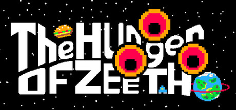
The Hunger of Z'eeth! scored 68/100 on Steam Analyzer — Solid for a Arcade capsule. Top priority fix: [title_readability] Increase title letter spacing and weight, or scale/position the title to remain legible at 120px width by reducing character count or using a more condensed treatment.

Capsule scores by dimension

  • Genre Clarity: 7/10 — Arcade action with cosmic theme. The pixel art style, starfield background, and retro arcade aesthetic clearly signal an indie arcade game. The colorful antagonist orbs and central celestial theme suggest a space-based shooter or action game, though the specific mechanic (feeding a cosmic entity) is not immediately obvious from visuals alone. At tiny size, the pixel art and bright enemy elements read as arcade action, which is correct for genre.
  • Title Readability: 5/10 — Title legible at full, struggles tiny. The title 'The Hunger of Z'eeth' uses a bold white sans-serif font with decent contrast against the black starfield, reading clearly at full and small sizes. However, at tiny thumbnail size (~120x45), the letter spacing and weight cause the text to compress and blur together, making individual words hard to parse without prior knowledge. The apostrophe in Z'eeth becomes a noise artifact at micro scale.
  • Contrast & Color: 8/10 — Strong pop, vibrant palette stands out. Bright magenta and yellow circular enemies pop sharply against the pure black starfield, creating excellent value separation and silhouette clarity. The white title text and turquoise planet element add color variety that maintains visual interest without muddiness. At tiny size, the hot pink enemy orbs remain the dominant focal point and clearly separate from the background, aiding quick visual recognition.
  • Uniqueness & Polish: 7/10 — Distinctive retro pixel craft. The Pico-8 aesthetic is intentional and cohesive, with pixel-perfect sprite work on the enemy orbs and a recognizable low-resolution art style that signals indie credibility. The concept of feeding a cosmic horror comedic food items is visually hinted at through the playful presentation, though the execution remains within familiar retro arcade bounds. The craft is clean and purposeful, but the visual storytelling doesn't break new ground in the crowded indie space.
  • Brand Consistency: 6/10 — Retro palette, limited identity markers. The pixel art style and magenta-yellow color palette are internally consistent and align with Pico-8 conventions, but lack a truly distinctive visual signature or iconic character that would make this capsule immediately recognizable in future marketing. The enemy orbs are the main visual trademark, but they read as generic hostile space objects rather than a unique brand anchor. No memorable symbol or recurring visual motif stands out across the composition.
  • Composition: 8/10 — Clear hierarchy, balanced layout. The title anchors the left-center region with strong spatial separation, while the three main enemy orbs form a dynamic right-side cluster that guides the eye without overwhelming. The starfield provides breathing room and context without competing for attention, and the turquoise planet adds depth to the mid-ground. Layout remains readable at small and tiny sizes with no critical elements at unsafe margins, though the title-to-orbs relationship could benefit from tighter visual connection.

What works

  • Vibrant enemy contrast. Magenta and yellow orbs create immediate visual pop against the black starfield and remain the clear focal point even at tiny thumbnail size.
  • Confident retro aesthetic. Pico-8 pixel art style is clean, intentional, and instantly communicates indie arcade credibility with no low-effort asset look.
  • Balanced composition. Title on left, enemies on right, and planet mid-ground create a well-distributed layout that avoids clutter and guides attention without dead space.

What hurts the capsule

  • Title compression at tiny size. Letter spacing and font weight cause the title to lose legibility at ~120px width, becoming a blur of white shapes rather than readable words.
  • Generic cosmic identity. While clean and competent, the visual elements (starfield, colored orbs, planet) feel like standard arcade game tropes without a distinctive brand marker or memorable character silhouette.
  • Concept not visually evident. The unique selling point—feeding an ancient horror cheeseburgers—is not communicated through the capsule's visuals, leaving the gameplay hook unclear.

Priority fixes

  1. [title_readability] Increase title letter spacing and weight, or scale/position the title to remain legible at 120px width by reducing character count or using a more condensed treatment.
  2. [genre_clarity] Add a subtle visual cue that hints at the feeding/strategy mechanic—such as a small burger sprite or silhouette of food near the entity—to clarify the unique gameplay loop.
  3. [brand_consistency] Introduce an iconic visual marker or signature color accent that reinforces Z'eeth's identity and makes this capsule immediately recognizable across future marketing materials.

Store copy priority fixes

  1. [feature_communication] Add a line specifying average run length and total content scope (e.g., 'Single runs last 10-15 minutes; multiple difficulty tiers and challenge modes await').
  2. [audience_targeting] Clarify whether this is a quick arcade distraction or a game with progression depth (e.g., 'Perfect for arcade fans seeking a quick fix or a longer strategy campaign').
  3. [feature_communication] Expand the gameplay features list with one or two additional mechanics (enemy patterns, special burger types, or power-ups) to hint at depth beyond the basic loop.

Related guides

Steam app ID: 4063210 · Tags: Arcade, Pixel Graphics, Old School, Singleplayer, Real Time Tactics