Scoring genre clarity...
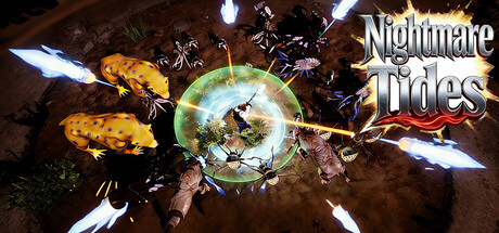
This is an indie Survivors-like game (no card-drawing) with 4 maps via real in-game screenshots. Defeat monsters for XP to level up & allocate skill points; upgrade 5 elements (Metal/Wood/Water/Fire/Earth) to Lv2 for powerful skills—survive 20 waves to beat the stage.
$0.99
3D PlatformerTop-Down ShooterShooter
CHEN XIANGWEINov 21, 2025