Scoring genre clarity...
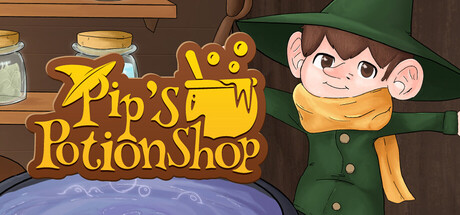
With your shop on the line, meet unique characters and craft potions of every flavor in this short, light-hearted game. From giant constructs to quirky little creatures, listen to their troubles and mix the right ingredients to create a potion that soothes their hearts and satisfies their cravings!
$4.994 user reviews
CasualRPGPuzzle
Temple 7 StudiosFeb 17, 2026