Scoring genre clarity...
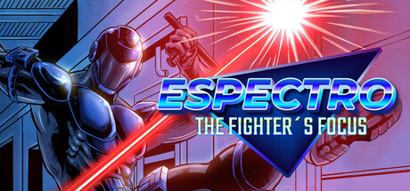
Espectro - The Fighter's Focus is a beat 'em up action game with retro visuals and exuberant pixel art. Espectro and his allies, Sayuri and Iron Crusher, face hordes of enemies and powerful bosses in their quest for justice.
$4.49Positive(14)
ActionAdventureBeat 'em up
Bytteam Game StudioApr 2, 2026