Scoring genre clarity...

The Space Between (Subatomic Forge) capsule

The Space Between (Subatomic Forge)

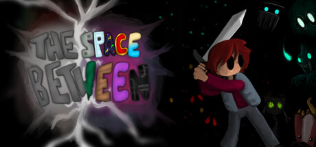
A 2D, open-world indie combat RPG set in an unstable world parallel to ours. Fight chaotic entities and bosses, explore broken worlds, and collect unique items to customize your loadout. Warp the fabric of time and space, and discover new unstable elements to grow your power and reach victory.

$7.992 user reviews
CombatRPGAdventure
Caleb JesseDec 22, 2025

The Space Between (Subatomic Forge) scores 63/100 — better than 5% of Combat capsules (n=3,433).

2 user reviews · $7.99 · Released Dec 22, 2025 · By Caleb Jesse

Quick text summary

The Space Between (Subatomic Forge) scored 63/100 on Steam Analyzer — Solid for a Combat capsule. Top priority fix: [title_readability] Redesign title with solid white or single-color letters with a dark outline, use horizontal linear layout instead of scattered angles, and center on a safe region away from edges to ensure legibility at all sizes including TINY.

Capsule scores by dimension

  • Genre Clarity: 7/10 — Indie RPG action game clear. The character sprite with weapon, vibrant combat-focused aesthetic, and glowing cyan/neon UI elements clearly signal an action-adventure indie game. At TINY size, the silhouette and color scheme still read as a stylized indie RPG protagonist, though specific subgenre mechanics aren't immediately obvious. The breakdown of specific mechanics like time-warping or dimensional instability requires reading the title rather than visual inference alone.
  • Title Readability: 5/10 — Colorful but fragmented legibility. The title uses bright multi-colored letters with an electric lightning effect, creating visual interest at full size but suffering significant readability loss at TINY size where individual letter colors blur together. The scattered, angled letter placement and gradient fills make it difficult to parse quickly during a scroll, and the subtitle 'BETWEEN' is particularly hard to isolate from 'THE SPACE' at reduced sizes. At SMALL size (231x87), the title becomes a color smear rather than readable text.
  • Contrast & Color: 7/10 — Bright neon pop with depth. The vibrant cyan, pink, and purple accent colors on the character and UI elements create strong separation from the dark background, and the white lightning effect adds high-value contrast. The character sprite in dark red/brown stands out adequately against the black void with supporting cyan lights providing additional visual pop. However, the title's mixed saturation and some mid-tone blending in the lightning effect slightly reduce overall silhouette clarity at tiny scale.
  • Uniqueness & Polish: 6/10 — Competent indie aesthetic, generic execution. The capsule uses familiar indie RPG visual language—pixel-art character, neon color grading, and glowing sci-fi elements—executed cleanly but without a distinctive hook that separates it from other dimensional/abstract indie games. The lightning effect and character pose are well-rendered, but the overall composition feels like a standard 'protagonist in surreal space' template rather than communicating a unique selling point. The visual storytelling doesn't clearly convey what makes The Space Between mechanically or thematically distinct.
  • Brand Consistency: 6/10 — Cohesive neon aesthetic, limited identity. The capsule maintains consistent internal style with matching neon cyan/pink palette, unified lighting approach, and a coherent pixel-art plus glow visual language that appears to align with game screenshots. However, there are no immediately memorable iconic motifs, signature characters, or distinctive symbols that would create strong brand recall on repeat exposure. The color scheme and effects are competent but share similarities with many sci-fi indie titles.
  • Composition: 7/10 — Clear focal point, title placement risk. The character stands as a clear primary focal point in the right-center area, with supporting cyan lights and UI elements creating depth hierarchy and drawing the eye downward. The title dominates the upper left with strong visual weight but sits in a region vulnerable to Steam's edge cropping, and the scattered letter arrangement creates a diffuse area rather than a compact readable block. At SMALL size, the focal point hierarchy remains readable, though title legibility degrades significantly.

What works

  • Strong neon color contrast. Cyan, pink, and purple accent colors create excellent visual separation from the dark Steam background and maintain read clarity at small sizes.
  • Clear character focal point. The protagonist sprite is well-positioned and silhouetted clearly, making it the obvious visual anchor even when squinting or viewing at reduced size.
  • Coherent sci-fi visual language. The neon glow effects, pixel art, and abstract background elements create a unified aesthetic that signals an indie sci-fi adventure title.

What hurts the capsule

  • Title readability collapses at tiny size. The multi-colored, angled letter design becomes a blurred color smear at TINY scale (120x45), making brand recognition and text parsing fail during quick scrolls.
  • Generic visual hook. The capsule communicates 'abstract indie game' without clearly showing what makes The Space Between mechanically unique or thematically memorable compared to peers.
  • Title edge vulnerability. The title placement in the upper left region risks cropping during Steam's responsive layout adjustments, and the sprawling letter arrangement doesn't form a compact safe zone.

Priority fixes

  1. [title_readability] Redesign title with solid white or single-color letters with a dark outline, use horizontal linear layout instead of scattered angles, and center on a safe region away from edges to ensure legibility at all sizes including TINY.
  2. [uniqueness_polish] Add a visual element that communicates a core game mechanic—such as a dimensional rift, time-distortion effect, or distinctive enemy silhouette—to differentiate from generic sci-fi indie templates.
  3. [composition] Reposition title as a compact horizontal bar in a safe margin zone (upper center or lower area) to maximize legibility and avoid Steam cropping while keeping character as primary focal point.
  4. [genre_clarity] Consider adding subtle UI or environment cues (e.g., itemization icons, parallel world duality visual) that hint at the RPG progression and dimensional mechanics at SMALL size.

Store copy priority fixes

  1. [hook_strength] Rewrite the detailed description's opening to lead with a specific, visceral action rather than capitalized entity names—e.g., 'Warp through fractured realities and fight reality-bending bosses to stop an ancient war consuming the space between atoms.'
  2. [uniqueness] Add a sentence explicitly contrasting this game's atom-synthesis and playstyle customization system against standard RPG progression—e.g., 'Unlike traditional RPGs, every Unstable Atom rewires your abilities, letting you build completely unique loadouts.'
  3. [audience_targeting] Highlight the accessibility and 'no timed input' feature in the detailed description to signal to players who want deep RPG mechanics without reflexive pressure.
  4. [tone_match] Replace or minimize excessive capitalization of proper nouns; let the liminal-space atmosphere speak through descriptive language rather than typography.

Related guides

Steam app ID: 4072160 · Tags: Combat, RPG, Adventure, Story Rich, Hand-drawn