Scoring genre clarity...

엉덩이 밀기! (Assslash!) capsule

엉덩이 밀기! (Assslash!)

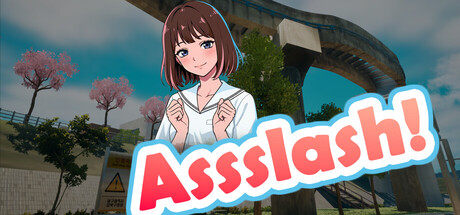
Everyone, "This isn't just a fight." Get ready for the spectacular sight of adorable cute girls pushing each other off vibrant, flashy 3D stages using their 'Ultimate Butt Push' techniques. Download now and show off your 'Ultimate ASSS Power!' (Don't forget to time your moves just right.)

Free to PlayPositive(37)
ActionCasual3D Fighter
Chilgok GamesOct 22, 2025

엉덩이 밀기! (Assslash!) scores 70/100 — better than 29% of Action capsules (n=8,534).

Positive (37 reviews) · Free to Play · Released Oct 22, 2025 · By Chilgok Games

Quick text summary

엉덩이 밀기! (Assslash!) scored 70/100 on Steam Analyzer — Good for a Action capsule. Top priority fix: [genre_clarity] Add a subtle visual cue that hints at the 'butt push' mechanic, such as an exaggerated pushing pose, collision effect, or directional arrow to differentiate from generic action games.

Capsule scores by dimension

  • Genre Clarity: 7/10 — Casual action gameplay clear. The anime-styled character in a pushing/combat pose against a vibrant 3D stage environment clearly signals a casual action game with comedic intent. The bright, exaggerated art style and cheerful character expression communicate lighthearted gameplay rather than serious combat. At tiny size, the character silhouette and colorful stage backdrop still read as casual action, though the specific 'butt push' mechanic is not visually obvious without context.
  • Title Readability: 8/10 — Bold readable title placement. The 'Assslash!' logo uses thick white lettering with bold hot-pink fill and a clear outline, positioned prominently in the right-center area on a semi-transparent background. The text maintains excellent legibility at both full and small sizes due to high contrast and chunky letterforms. At tiny size, the title remains clearly readable, though the exclamation mark becomes a fine detail.
  • Contrast & Color: 8/10 — Vibrant separation from dark bg. The turquoise sky, pink-red title, and light-skinned character create strong value separation against the dark Steam background (#1b2838). The hot-pink title pops distinctly, and the character's white shirt provides bright focal contrast. In grayscale, the character and title maintain clear silhouettes with good edge definition, though the stage architecture in the background becomes softer.
  • Uniqueness & Polish: 6/10 — Competent anime style, generic feel. The capsule features clean anime character art and a polished title treatment, but the overall composition feels like a standard anime game promotional image rather than a distinctive visual hook. The character pose and stage setting are pleasant but don't immediately communicate the unique 'butt push' mechanic or differentiate it from dozens of similar casual anime titles. There is craft in the execution, but limited novelty or memorable identity.
  • Brand Consistency: 6/10 — Limited identity, anime standard palette. The capsule uses typical anime game visual language—bright colors, cheerful character expression, vibrant stage environment—but establishes no iconic character, symbol, or signature palette that would be recognizable across marketing materials. The hot-pink title is the strongest brand element, but without additional reference materials, the internal cohesion appears competent but not distinctly branded. The cheerful, colorful approach is consistent with the game's tone but not unique to it.
  • Composition: 7/10 — Clear focal point, balanced layout. The character is positioned left-of-center as the primary focal point, with the title anchoring the right side, creating a balanced asymmetrical layout. The 3D stage environment provides visual depth and context without overwhelming the character. The composition holds up well at small size with a clear hierarchy, though at tiny size the stage details blur and the eye reads primarily the character and title together as one unit.

What works

  • Strong title contrast and legibility. The hot-pink 'Assslash!' logo with white outline pops clearly against both the image and dark Steam background, remaining readable even at tiny thumbnail size.
  • Clear casual action genre signals. The anime character in a dynamic pose combined with the colorful 3D stage environment immediately communicates lighthearted action gameplay.
  • Balanced asymmetrical composition. The character left-of-center and title right-of-center create visual balance and a clear hierarchy that guides the eye effectively.

What hurts the capsule

  • Generic anime game aesthetic. The visual style, character design, and stage environment lack distinctive personality and could belong to dozens of similar casual anime titles.
  • No visual communication of core mechanic. The 'butt push' gameplay hook is not suggested by the capsule visuals; viewers unfamiliar with the game cannot infer the unique selling point.
  • Limited memorable brand identity. Beyond the title logo, there are no iconic symbols, signature colors, or recurring visual motifs that would make the brand instantly recognizable.

Priority fixes

  1. [genre_clarity] Add a subtle visual cue that hints at the 'butt push' mechanic, such as an exaggerated pushing pose, collision effect, or directional arrow to differentiate from generic action games.
  2. [uniqueness_polish] Introduce a signature color accent or visual motif beyond the title that could become a recognizable brand element across all marketing materials.
  3. [brand_consistency] Ensure character and visual style are distinctly consistent across all 8 store screenshots to reinforce a cohesive brand identity.

Store copy priority fixes

  1. [hook_strength] Rewrite the short description opening to lead with a gameplay verb: 'Push cute bishōjo characters off 3D stages using nothing but your butt in this one-button arcade action game' replaces the defensive 'This isn't just a fight' and immediately communicates what makes this unique.
  2. [genre_clarity] Add a note in the detailed description clarifying which tags are inaccurate or reframe: if 'Souls-like' refers to pattern-reading dodge mechanics, state 'Master enemy attack patterns like a souls-like rhythm game,' and remove 'Platformer' and 'Education' if unsupported by gameplay.
  3. [audience_targeting] Add a sentence specifying the player type: 'Perfect for casual arcade fans seeking quick, absurdist fun and speedrunners chasing roguelike variety' gives different players a reason to feel included.
  4. [feature_communication] Expand the story section with one specific plot beat or character name to validate the 'deep narrative' claim rather than leaving it vague—e.g., 'Uncover the identity of Officer Yook and the mastermind behind the Butt-Rage phenomenon' gives narrative weight.

Related guides

Steam app ID: 4072170 · Tags: Action, Casual, 3D Fighter, Arcade, 3D Platformer