Scoring genre clarity...

Creating New World capsule

Creating New World

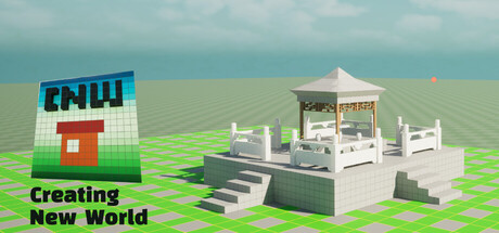
This is a building game. We have redesigned the building structure and logic. Breaking down a building into basic forms and units, these basic units can be directly used, or create more forms. Players can freely build objects by selecting building forms, choosing the quantity, specifying the color.

$7.99
EducationBuildingCasual
Jian StudioNov 5, 2025

Creating New World scores 68/100 — better than 20% of Education capsules (n=649).

$7.99 · Released Nov 5, 2025 · By Jian Studio

Quick text summary

Creating New World scored 68/100 on Steam Analyzer — Solid for a Education capsule. Top priority fix: [contrast_color] Add a warmer or more saturated accent color to the sky or environment to increase pop against Steam's dark background—consider a sunset gradient or deeper sky tone.

Capsule scores by dimension

  • Genre Clarity: 8/10 — Building game clearly communicated. The capsule immediately conveys a casual building/creation game through the isometric white pavilion structure, green grid base plane, and gridded aesthetic. At tiny size, the geometric building silhouette and grid foundation remain recognizable as construction-focused gameplay. The acronym 'CNWU' with the red chimney element reinforces the building theme effectively.
  • Title Readability: 7/10 — Title readable but tagline unclear. The main title 'Creating New World' in black text reads clearly at full and small sizes against the light background. However, at tiny size the tagline becomes difficult to parse, and the 'CNWU' logo acronym lacks context without the full game title visible. The title placement on the left side with contrast works well, but competes with the logo for attention.
  • Contrast & Color: 7/10 — Good value separation overall. The white building and light green grid read well against the pale sky background, but contrast is moderate rather than strong when evaluated against Steam's dark #1b2838 background. The red chimney provides a warm accent that pops, and the black title text is strong, but the overall palette skews pastel and soft, reducing silhouette punch at tiny sizes. Grayscale test shows adequate but not excellent separation between subject and background.
  • Uniqueness & Polish: 6/10 — Competent casual aesthetic. The voxel-style white pavilion with grid base feels clean and intentional for a building game, matching expected genre conventions seen in titles like Tiny Glade. The presentation is polished with consistent low-poly rendering, but the design lacks a distinctive hook or memorable visual identity that would elevate it above other casual builders. The CNWU logo with red accent is a brand attempt but reads as functional rather than iconic.
  • Brand Consistency: 6/10 — Consistent style, lacks memorability. The voxel aesthetic and isometric view are applied consistently, with unified color treatment across the building structure and grid plane. However, there are no strong iconic characters, signature symbols, or distinctive palette choices that would create lasting brand recognition. The CNWU acronym could serve as identity, but it needs stronger visual reinforcement across other store assets to establish coherent branding.
  • Composition: 7/10 — Clear focal point, balanced layout. The white pavilion sits as a strong central focal point with the grid plane extending naturally below, creating good depth layering. The logo and title are positioned left with breathing room, avoiding edge conflicts. At small and tiny sizes, the composition maintains clarity with the building as primary subject and text elements supporting without competing. The layout shows intentional hierarchy and benefits from the rule-of-thirds awareness.

What works

  • Genre immediately recognizable. The isometric building structure and grid plane communicate building/creation gameplay at all sizes, matching player expectations for casual builder games.
  • Title contrast and placement. Black text on light background with left-side positioning ensures the main title remains readable even at tiny thumbnail size without competing with the building focal point.
  • Clean voxel aesthetic. Consistent low-poly rendering style across the pavilion and environment creates a cohesive, polished visual presentation appropriate to the casual building genre.

What hurts the capsule

  • Tagline unreadable at small size. The descriptive text below the title becomes illegible at tiny size, losing the opportunity to communicate the unique building system to scrolling players.
  • Subdued contrast against dark background. The pale sky and white building create soft contrast that weakens when the capsule appears on Steam's dark theme, reducing stand-out potential during discovery browse.
  • CNWU acronym lacks recognition. The logo abbreviation feels arbitrary and doesn't establish a memorable brand identity compared to benchmarks like Balatro or Tiny Glade that have iconic visual symbols.
  • Limited visual hook or differentiation. While competently executed, the capsule shows no unique mechanic or distinctive visual storytelling that distinguishes it from other casual builders in the genre.

Priority fixes

  1. [contrast_color] Add a warmer or more saturated accent color to the sky or environment to increase pop against Steam's dark background—consider a sunset gradient or deeper sky tone.
  2. [title_readability] Remove or redesign the tagline; if keeping descriptive text, enlarge it or place it in a dedicated dark background bar to ensure readability at small sizes.
  3. [uniqueness_polish] Introduce a character, iconic object, or visual signature (e.g., a builder figure, signature building piece) into the composition to create memorable brand identity.
  4. [composition] Increase the visual weight or saturation of the red chimney or add complementary color accent details to strengthen focal point hierarchy at tiny size.

Store copy priority fixes

  1. [hook_strength] Rewrite the short description to open with a player-centric verb and emotional benefit: 'Build anything you imagine, from whimsical houses to impossible cities, by mixing and matching simple colorful blocks—no limits, no rules, just creative fun.'
  2. [tone_match] Infuse the copy with warmth and playfulness that matches the Cute and Funny tags, replacing technical jargon like 'basic forms and units' with accessible, inviting language that speaks to relaxation and joy.
  3. [feature_communication] Add 2–3 concrete examples of what players can build (e.g., 'a cozy cottage with a tower roof and purple walls, a floating castle, a bustling marketplace') to make the creative freedom tangible.
  4. [uniqueness] Articulate the specific advantage of the modular building system with a clear differentiator: 'Start with simple building blocks and combine them endlessly—no hidden complexity, pure creative expression' or similar.

Related guides

Steam app ID: 4078250 · Tags: Education, Building, Casual, Relaxing, Funny