Scoring genre clarity...

DigDig ZakuZaku capsule

DigDig ZakuZaku

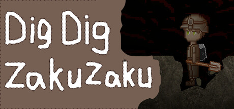
A game where you dig through the ground, collect ores, and earn money. Keep digging steadily, earn little by little, upgrade your gear, and aim to escape from the mine. Dig deep, mine tons of ores, and perhaps freedom awaits you at the very bottom.

$4.99
CasualPlatformer2D Platformer
gentomeNov 17, 2025

DigDig ZakuZaku scores 60/100 — better than 0% of Casual capsules (n=10,153).

$4.99 · Released Nov 17, 2025 · By gentome

Quick text summary

DigDig ZakuZaku scored 60/100 on Steam Analyzer — Solid for a Casual capsule. Top priority fix: [contrast_color] Introduce a vibrant accent color (gold ore, bright tool detail) or increase title contrast with a colored outline to pop against the dark Steam background.

Capsule scores by dimension

  • Genre Clarity: 7/10 — Mining casual game clear. The pixelated character holding a pickaxe and the earthy brown background immediately signal a mining or digging game. At tiny size, the pickaxe silhouette and humble character sprite remain readable enough to suggest resource gathering gameplay, though the exact subgenre could be clearer with more environmental storytelling.
  • Title Readability: 6/10 — White text readable but awkward. The title 'Dig Dig ZakuZaku' uses white hand-drawn lettering with uneven baseline and spacing, positioned over a muddy brown background on the left. At small and tiny sizes, the playful irregular letterforms hold up reasonably well, but the split title and inconsistent font weight create minor parsing friction that slightly reduces immediate impact.
  • Contrast & Color: 6/10 — Adequate separation with muddy tones. White title text contrasts adequately against the tan-brown background, and the character sprite reads clearly on the dark right side. However, the overall palette is relatively muted and warm-dominated, lacking the sharp value separation or saturated accent colors that would make it pop at quick glance on Steam's dark interface.
  • Uniqueness & Polish: 5/10 — Charming but generic resource game. The hand-drawn pixel art character and playful title lettering show craft and personality, positioning this as a cozy mining experience rather than a gritty sim. However, the composition feels straightforward—simple character pose, static background—without a distinctive visual hook or mechanic communication that sets it apart from other casual mining games in the current market.
  • Brand Consistency: 6/10 — Consistent pixel style, minimal identity. The retro pixel art style is applied consistently to the character and palette, and the whimsical title font establishes a casual tone. However, there are no iconic motifs, symbols, or signature visual elements that create a memorable brand identity or would be recognizable in future marketing materials beyond 'pixel mining game.'
  • Composition: 6/10 — Balanced but predictable layout. The layout splits clearly: title on left, character on right, with adequate spacing and no dangerous edge crops. The focal point (character + pickaxe) is clear, but the composition lacks dynamic depth layering or visual rhythm; the character feels placed rather than integrated into a cohesive scene, reducing visual interest at all sizes.

What works

  • Clear genre identity. The pickaxe-wielding character and earthy setting immediately communicate a mining or digging game.
  • Readable title at small sizes. White hand-drawn lettering maintains legibility even when scaled down, supporting quick recognition during scrolling.
  • Safe composition layout. No critical elements hug edges or risk cropping, and the left-right split provides stability across viewport sizes.

What hurts the capsule

  • Muted color palette. The brown and tan tones lack saturation and bold value contrast, making the capsule feel dull against Steam's dark background.
  • Generic scene composition. The static character pose and plain background lack visual storytelling, mechanic hints, or environmental storytelling that communicates what makes this game unique.
  • No memorable brand cues. The pixel art is competent but generic; there are no iconic symbols, character traits, or signature elements that would stand out in a series or marketing campaign.

Priority fixes

  1. [contrast_color] Introduce a vibrant accent color (gold ore, bright tool detail) or increase title contrast with a colored outline to pop against the dark Steam background.
  2. [uniqueness_polish] Add environmental storytelling—mine entrance, ore piles, or depth layers—that conveys the digging loop and rewards progression visually.
  3. [genre_clarity] Include a subtle UI element (progress bar, ore icon, depth number) or expanded background that reinforces the incremental mining loop as the core mechanic.
  4. [brand_consistency] Develop a signature visual motif (ZakuZaku character expression, ore type, or palette accent) that becomes instantly recognizable across store pages and marketing.

Store copy priority fixes

  1. [uniqueness] Add 1-2 sentences explicitly describing what makes DigDig ZakuZaku different (e.g., does the art style, mechanics, or narrative twist differentiate it, or is there a specific hook like the jetpack being core to the platforming identity).
  2. [hook_strength] Strengthen the short description's opening with a more evocative verb or emotional hook, such as 'Trapped in a mine, dig deeper than ever before' or 'Dig through layers of rock, discover rare ores, and earn your freedom' to make it more memorable.
  3. [feature_communication] Expand the Gameplay section to briefly explain what each upgrade (battery, shovel) actually changes in play (e.g., 'Upgrades increase dig speed or extend battery life, letting you reach deeper and richer ore deposits').
  4. [audience_targeting] Add a sentence or two clarifying whether the game is relaxed progression, has difficulty spikes, or encourages replayability, so players know if this is a chill experience or a skill challenge.

Related guides

Steam app ID: 4080600 · Tags: Casual, Platformer, 2D Platformer, 2D, Retro