Scoring genre clarity...

Spudtrap capsule

Spudtrap

A retro grid-based puzzle about falls, pits, and crates. Think one step ahead, switch between two heroes, and neutralize enemies.

$2.99No user reviews
CasualPuzzlePlatformer
Potato corporationApr 20, 2026

Spudtrap scores 78/100 — better than 82% of Casual capsules (n=10,153).

No user reviews · $2.99 · Released Apr 20, 2026 · By Potato corporation

Quick text summary

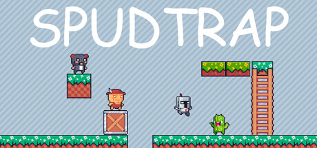
Spudtrap scored 78/100 on Steam Analyzer — Good for a Casual capsule. Top priority fix: [uniqueness_polish] Introduce a signature visual element or character trait unique to Spudtrap—such as a distinctive protagonist silhouette, iconic hazard design, or unique mechanic visual cue that elevates the capsule from generic retro to memorable indie standout.

Capsule scores by dimension

  • Genre Clarity: 8/10 — Clear retro puzzle platformer. The pixel art style, grid-based level design with platforms, crates, and pit hazards immediately signal a classic puzzle-platformer. The two distinct character sprites (orange and green figures) and enemy presence reinforce tactical gameplay mechanics. At tiny size, the retro aesthetic and environmental layout remain legible enough to infer puzzle-based movement.
  • Title Readability: 9/10 — Excellent bold uppercase clarity. SPUDTRAP is rendered in large, clean white sans-serif uppercase text positioned across the top third with ample negative space behind it. The letterforms maintain full legibility at full size, small capsule size, and tiny thumbnail due to heavy weight and high contrast against the light blue background. No decorative flourishes or taglines compromise readability.
  • Contrast & Color: 8/10 — Strong light background separation. The soft blue-gray background with diagonal stripe pattern creates clear separation from the white title and pixel art elements. Character sprites use saturated primary colors (orange, green, red) that pop against the neutral backdrop, and the green grass platform creates a clean horizon line. In grayscale, value separation remains strong, though the mid-tone blue background could be slightly darker for more punch.
  • Uniqueness & Polish: 7/10 — Solid retro craft, modest distinction. The capsule demonstrates clean pixel art execution with intentional sprite design and level layout clarity, but the aesthetic is firmly within retro puzzle-platformer conventions without a distinctive visual hook or unique mechanic showcase. The composition tells a scene story (two heroes, enemies, hazards) rather than a unique selling point, placing it in the solid competent range rather than memorable premium tier.
  • Brand Consistency: 7/10 — Cohesive retro pixel identity. The capsule maintains consistent 8-bit style rendering across all elements—sprites, platforms, crates, and title—creating a unified nostalgic brand voice. The color palette (primary colors, greens, oranges) is internally coherent and recognizable as a specific retro aesthetic. Without access to the 5 store screenshots, internal cohesion appears strong, though the distinctive character/motif strength remains moderate.
  • Composition: 8/10 — Balanced focal hierarchy and depth. The layout creates clear visual hierarchy with the title anchoring the top, gameplay scene occupying the center-bottom with foreground grass platform, mid-ground characters and hazards, and background crates creating layered depth. The focal point remains on the two hero sprites in the center-left, guiding eye through the scene naturally. Safe margins protect the title, and the composition reads clearly at small and tiny sizes without element clustering or edge-hugging risks.

What works

  • Legible retro title treatment. The white uppercase SPUDTRAP maintains perfect readability at all scales due to heavy letterforms and clean positioning away from visual clutter.
  • Clear gameplay scene communication. The pixel art immediately conveys puzzle-platformer mechanics through visible platforms, pits, crates, and two distinct character sprites that suggest tactical switching.
  • Strong color-contrast separation. The light blue background allows pixel art sprites and white text to pop with high value separation, maintaining clarity at thumbnail size.
  • Cohesive visual style unity. All elements share consistent 8-bit rendering and a unified retro palette, creating a recognizable branded aesthetic.

What hurts the capsule

  • Generic retro puzzle look. The capsule relies on familiar retro-platformer visual tropes without a distinctive hook, visual storytelling element, or unique mechanic showcase that differentiates it from other indie puzzle games.
  • Modest visual distinctiveness. While competently executed, the pixel art style and composition follow expected genre conventions rather than offering a premium, standout visual identity that would earn memorable recognition.
  • Limited character iconography. The two hero sprites lack distinctive silhouettes or memorable character design elements that could serve as a recognizable brand motif across marketing materials.

Priority fixes

  1. [uniqueness_polish] Introduce a signature visual element or character trait unique to Spudtrap—such as a distinctive protagonist silhouette, iconic hazard design, or unique mechanic visual cue that elevates the capsule from generic retro to memorable indie standout.
  2. [contrast_color] Deepen the background blue value slightly or add subtle contrast emphasis around key sprites to maximize pop at tiny thumbnail size and ensure pixel art remains crisp in quick-scroll conditions.
  3. [brand_consistency] Develop a cohesive color accent or motif (such as a recurring crate style, enemy design, or UI element) that appears consistently across all marketing materials to build recognizable brand identity.

Store copy priority fixes

  1. [uniqueness] Add one or two sentences explaining what makes Spudtrap's approach to puzzle-platformer design distinct—e.g., why the dual-character + gravity combo creates a puzzle space others don't, or what problem it solves that competitors don't.
  2. [feature_communication] Rewrite the bulleted interactions section to show a brief *example* of a puzzle scenario in narrative form (e.g., "Drop a crate to break the floor below, switch to your partner to push debris into an enemy trap") so players imagine a turn, not just read mechanics.
  3. [audience_targeting] Add a sentence clarifying the difficulty curve and intended player base—e.g., "Perfect for puzzle fans seeking thoughtful, timed-free brain-teasers" or "Family-friendly challenges for all ages, no reflexes required."

Related guides

Steam app ID: 4080720 · Tags: Casual, Puzzle, Platformer, 2D Platformer, Puzzle Platformer