Scoring genre clarity...

The Seven Bad Apples capsule

The Seven Bad Apples

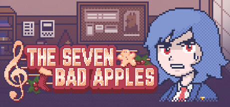
Ranko and her friend Astrid must investigate the case of some missing scores just before the big Christmas concert of the academy. Help them question the seven daunting suspects before it's too late!

$3.993 user reviews
Visual NovelDetectiveFemale Protagonist
1564 StudioDec 27, 2025

The Seven Bad Apples scores 70/100 — better than 43% of Visual Novel capsules (n=1,147).

3 user reviews · $3.99 · Released Dec 27, 2025 · By 1564 Studio

Quick text summary

The Seven Bad Apples scored 70/100 on Steam Analyzer — Good for a Visual Novel capsule. Top priority fix: [contrast_color] Increase value contrast by darkening the background or brightening key elements (character or title) to improve silhouette separation and legibility at tiny sizes.

Capsule scores by dimension

  • Genre Clarity: 7/10 — Pixel art adventure with clear character focus. The pixel art style immediately signals indie adventure game, and the character sprite with determined expression plus musical motif (treble clef) hints at the story's concert investigation theme. At tiny size, the blue-haired character and bold title remain recognizable, though the specific mystery-adventure subgenre reads more as general adventure without strong detective or narrative-focused visual cues that would elevate clarity to 8+.
  • Title Readability: 8/10 — Bold, readable title with strong positioning. The title 'THE SEVEN BAD APPLES' uses a warm golden-yellow color with a clean outline on a darker background region, maintaining excellent legibility at full size and remaining readable at small size. At tiny size the text remains mostly legible due to the outline and value contrast, though individual letter clarity diminishes slightly—a minor weakness that prevents a 9, but the strategic placement and outline treatment still perform well under scroll stress.
  • Contrast & Color: 7/10 — Warm palette with decent value separation. The warm brown-mauve background with golden title text and blue character sprite creates reasonable separation against Steam's dark background. The character's bright blue hair reads clearly at small size, and the golden title pops adequately, but the overall palette leans warm-muted and lacks the sharp light-dark contrast of top-tier capsules; in grayscale, the mid-tones compress slightly, reducing silhouette punch at tiny sizes.
  • Uniqueness & Polish: 6/10 — Competent pixel art without standout hook. The pixel art execution is clean and well-rendered with a recognizable character and thematic musical element, but the overall presentation feels like competent genre work without a distinctive visual hook or memorable art direction that differentiates it from other indie adventures. The cozy pixel aesthetic is well-executed but common in the space, and the capsule communicates the mystery-adventure concept without revealing a unique selling point or core mechanic that would push it to 7+
  • Brand Consistency: 7/10 — Coherent pixel art style with character identity. The blue-haired character Ranko appears to be a consistent visual anchor with a defined expression and outfit, and the warm interior setting with pixel art details suggests a cohesive art direction across the game. The palette and rendering style feel internally consistent, establishing a recognizable indie-adventure brand identity, though without signature motifs or a more iconic symbol that would push this to 8+ for memorability.
  • Composition: 7/10 — Clear focal point with balanced element placement. The character sprite occupies the right side of the frame as the primary focal point, while the title and musical motif sit left-center, creating a clear visual hierarchy without scattered attention. The composition maintains good depth with background room details, mid-ground character, and foreground title, but the character's positioning slightly right of center and the background's mild busyness prevent the layout from achieving tighter focus; at tiny size, the arrangement still reads clearly with no critical cropping risk.

What works

  • Clear title contrast and legibility. Golden-yellow outlined text maintains strong readability at both full and small sizes against the darker background region.
  • Recognizable character focal point. The blue-haired character sprite is distinct and immediately readable, serving as a strong visual anchor across all size reductions.
  • Cohesive pixel art execution. Clean rendering and consistent art style convey a professional indie-game presentation with no obvious cheap asset feel.
  • Thematic musical element. The treble clef motif elegantly connects to the concert mystery premise and adds visual narrative information.

What hurts the capsule

  • Limited visual distinction in genre. The cozy pixel-art aesthetic is well-executed but generic within the indie adventure space, lacking a memorable unique hook.
  • Muted value contrast at tiny size. The warm brown-mauve palette compresses in grayscale and lacks sharp light-dark separation that would help the capsule pop on dark Steam backgrounds.
  • No iconic brand symbol or motif. While the character is recognizable, there are no signature visual elements (logo, symbol, or palette) that would enable later brand recall beyond the character alone.

Priority fixes

  1. [contrast_color] Increase value contrast by darkening the background or brightening key elements (character or title) to improve silhouette separation and legibility at tiny sizes.
  2. [uniqueness_polish] Add a distinctive visual hook such as a signature color accent, animated detail, or iconic UI element that differentiates the capsule from generic pixel-art adventures.
  3. [genre_clarity] Strengthen visual cues for the mystery-investigation theme—consider adding detective or clue-specific iconography alongside the character to clarify the adventure subgenre.

Store copy priority fixes

  1. [uniqueness] Add a sentence that positions the 'interactive decision-making' as a shift from the original kinetic novel format, or highlight a signature mechanic (e.g., 'for the first time, your choices determine which suspect is guilty') that differentiates this entry.
  2. [hook_strength] Rewrite the opening of the detailed description to lead with a character voice, dialogue sample, or specific moment that shows personality and humor rather than plot summary alone.
  3. [audience_targeting] Add a sentence early in the short description clarifying 'standalone mystery' or 'no prior experience needed' to remove friction for new players unfamiliar with Murder on the Marine Express.
  4. [feature_communication] Expand the explanation of the decision-making mechanic—clarify whether choices alter the investigation path, suspect guilt, or outcome, so players know what interactivity means here.

Related guides

Steam app ID: 4081900 · Tags: Visual Novel, Detective, Female Protagonist, Nonlinear, Adventure