Scoring genre clarity...

Push and Plunder capsule

Push and Plunder

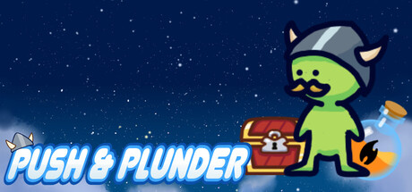
Push and Plunder is a Sokoban-like puzzle platformer where your goal is to navigate a maze of boxes, barrels, and more to reclaim your lost treasure. These brain busting puzzles are sure to be a challenge but with the help of your magic potions you are sure to conquer in the end!

$6.99
Sokoban2D PlatformerPuzzle Platformer
JK's GamedevDec 27, 2025

Push and Plunder scores 75/100 — better than 69% of Sokoban capsules (n=194).

$6.99 · Released Dec 27, 2025 · By JK's Gamedev

Quick text summary

Push and Plunder scored 75/100 on Steam Analyzer — Good for a Sokoban capsule. Top priority fix: [genre_clarity] Add a subtle box or maze element in the midground or as part of the character's environment to visually communicate the Sokoban puzzle mechanic.

Capsule scores by dimension

  • Genre Clarity: 7/10 — Puzzle platformer intent clear. The green character with horns pushing a treasure chest against a starry night background clearly signals a puzzle-adventure theme with collection mechanics. At tiny size, the character silhouette and chest remain recognizable, though the specific Sokoban-like puzzle nature is not immediately obvious from visuals alone without prior knowledge. The whimsical art style and magical potion hint support the casual puzzle genre positioning.
  • Title Readability: 8/10 — Title reads well at all sizes. PUSH & PLUNDER uses a bold, blue italic sans-serif font with white outline that contrasts sharply against the dark starry background in the left-center region. The text remains legible at small and tiny sizes due to strong outline and spacing, though the ampersand style becomes slightly less distinct at thumbnail resolution. Strategic placement away from the character keeps the title clear and unobstructed across all viewing conditions.
  • Contrast & Color: 8/10 — Strong value separation throughout. The bright lime-green character pops distinctly against the deep navy-blue starry background, creating excellent silhouette separation. The warm orange-red treasure chest adds a complementary accent that draws the eye without competing for dominance. In grayscale, the character and chest maintain clear tonal separation from the background, ensuring readability even at tiny thumbnail size.
  • Uniqueness & Polish: 7/10 — Charming art with solid execution. The character design is appealing and memorable with the horned green sprite and friendly expression, paired with well-rendered environmental details like floating particles and the treasure chest. The overall craft feels intentional and polished rather than generic, though the visual approach is familiar within the casual indie game space. The magical potion particle effects on the right add visual interest but don't establish a unique gameplay hook beyond the character charm.
  • Brand Consistency: 7/10 — Cohesive art direction established. The capsule presents a consistent visual identity with the green character, whimsical sprite-based art style, and night-sky color palette that should carry across promotional materials. The character design and color choices create a recognizable brand signature, though without reference to the 12 store screenshots, the exact consistency cannot be fully verified. The rendering style is clean and uniform throughout the composition.
  • Composition: 8/10 — Clear hierarchy with balanced elements. The green character occupies the strong right-center focal point, drawing immediate attention while the title anchors the left side, creating effective visual balance and clear hierarchy. The starry background provides visual depth without cluttering the primary subject, and safe margins protect key elements from edge cropping. At small and tiny sizes, the character silhouette remains the dominant focal point with minimal distraction, though the rightmost particles approach the edge boundary slightly.

What works

  • Excellent contrast and silhouette. Bright lime-green character against deep navy background ensures clarity even at thumbnail size, with strong grayscale separation maintaining legibility.
  • Bold readable title placement. Blue italic text with white outline positioned on left-center avoids visual clutter and remains legible across all viewing sizes.
  • Charming character design. The horned green protagonist is appealing and memorable, establishing a recognizable brand identity for the game.
  • Clean composition hierarchy. Clear focal point on the character with well-balanced title placement creates strong visual reading at both full and tiny sizes.

What hurts the capsule

  • Puzzle game nature not visually implied. The capsule does not communicate the Sokoban-like or box-pushing mechanic visually; the treasure chest alone doesn't clearly signal puzzle gameplay.
  • Right-edge particles approach boundary. The floating orange particle effects on the right side sit close to the edge and risk being cropped or cut off on certain Steam display layouts.
  • Generic starfield background. The night-sky aesthetic, while clean, is a common backdrop for casual indie games and doesn't establish distinctive visual branding.

Priority fixes

  1. [genre_clarity] Add a subtle box or maze element in the midground or as part of the character's environment to visually communicate the Sokoban puzzle mechanic.
  2. [composition] Shift right-side particle effects inward by 10-15% to ensure safe distance from edge cropping across all Steam display sizes.
  3. [uniqueness_polish] Consider a more distinctive background that hints at treasure hunting or maze-like environments rather than generic starfield.

Store copy priority fixes

  1. [feature_communication] Replace 'magic potions that can change the world around you' with a concrete example, e.g., 'magic potions that freeze enemies, melt ice blocks, or teleport you across gaps'.
  2. [uniqueness] Add one sentence explaining how the magic potion mechanic sets Push and Plunder apart from classic Sokoban, e.g., 'Unlike traditional Sokoban, potions let you dynamically alter puzzle elements mid-solution.'
  3. [hook_strength] Rewrite the final clause of the short description to emphasize player agency: replace 'with the help of your magic potions you are sure to conquer' with a more active, specific benefit that hints at creative puzzle-solving.
  4. [feature_communication] Add details about level count, difficulty curve, or an estimate of playtime to help players gauge scope and commitment.

Related guides

Steam app ID: 4081960 · Tags: Sokoban, 2D Platformer, Puzzle Platformer, Casual, Puzzle