Scoring genre clarity...
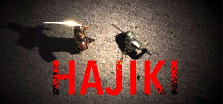
Pure parry action. Just tilt your right stick or mouse to deflect attacks. A simple yet intense samurai duel where timing and focus decide everything. Sharpen your reflexes, enter the flow, and master the art of Hajiki.
$2.992 user reviews
SwordplayNinjaImmersive Sim
電脳鈴木組Oct 28, 2025