Scoring genre clarity...
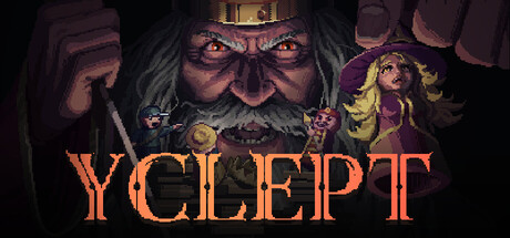
A grim adventure where the King is destroying his own city, and you must stop him. To survive, you must navigate the game board, hunt down and eliminate his accomplices, and frame others to draw the King's wrath away from yourself.
$3.49Positive(35)
DarkDungeon CrawlerResource Management
Artur Shevale, Valerii MukshinMay 31, 2026