Scoring genre clarity...

The Foundation Survive: Artificial Home capsule

The Foundation Survive: Artificial Home

In this SCP story, you will become Liam, a broken test subject trapped within the Foundation. Every corridor hides a piece of your past, and every memory you recover brings you closer to madness.

$5.99
Action-AdventureActionHorror
Nullity StudioNov 19, 2025

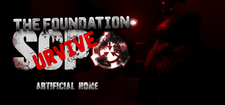
The Foundation Survive: Artificial Home scores 60/100 — better than 0% of Action-Adventure capsules (n=3,294).

$5.99 · Released Nov 19, 2025 · By Nullity Studio

Quick text summary

The Foundation Survive: Artificial Home scored 60/100 on Steam Analyzer — Solid for a Action-Adventure capsule. Top priority fix: [uniqueness_polish] Introduce a distinctive visual motif or character silhouette (e.g., a recognizable test subject pose or Foundation-specific symbol) that differentiates this game from generic SCP titles and creates a memorable brand image.

Capsule scores by dimension

  • Genre Clarity: 7/10 — Horror action with SCP DNA clear. The red and black color palette with distressed imagery immediately signals horror-action tone. At TINY size, the glowing red accents and grimy texture still communicate survival-horror atmosphere, though the SCP Foundation connection requires prior knowledge. The visual language of decay and institutional horror reads well at small sizes.
  • Title Readability: 6/10 — Main title legible, tagline struggles small. THE FOUNDATION SURVIVE reads clearly at full size with strong metallic gray letterforms. At SMALL size the title remains functional but the red SURVIVE overlay slightly competes for focus. At TINY size the text becomes compressed and the ARTIFICIAL HOME tagline drops below legible threshold, requiring viewer to already know the game name.
  • Contrast & Color: 7/10 — Strong red-black separation, good pop. The crimson red SURVIVE text creates excellent value separation against the dark background and pulls focus immediately. The metallic silver-gray title maintains solid contrast with the black regions. At TINY size the color distinction remains readable, though some mid-tone details in the distressed imagery blur together in quick scrolls.
  • Uniqueness & Polish: 5/10 — Generic horror aesthetic, lacks distinctive hook. The design relies on familiar horror tropes—red text, decay, dark institutional setting—without a memorable unique selling point or visual signature. While competently executed, it reads as a standard SCP-inspired capsule rather than something with distinctive visual identity or mechanical clarity. The distressed texture feels applied rather than integral to conveying what makes this game stand out.
  • Brand Consistency: 5/10 — No clear iconic identity or motif. The capsule shows internal consistency in tone and palette but lacks recognizable brand signals that could identify the game later—no distinctive character, symbol, or signature visual hook. The SCP Foundation aesthetic is generic to the entire SCP game category, making this feel interchangeable with similar titles rather than distinctly branded.
  • Composition: 6/10 — Centered title, crowded layering mid-composition. The title anchors cleanly at top-center with the tagline below, providing clear hierarchy at full size. The background imagery is dense with red glows and decay textures creating depth, but these competing light sources don't establish a clear focal point—the eye scatters across multiple glowing hot spots rather than landing on one primary subject. At TINY size the composition compresses into visual noise without a strong primary anchor beyond the title.

What works

  • Strong title contrast and placement. Metallic gray title with red overlay sits cleanly centered at top, remaining readable even at compressed sizes and providing immediate visual hierarchy.
  • Horror tone communicates instantly. The red-black palette, glowing decay effects, and distressed texture immediately signal survival-horror atmosphere without ambiguity about genre intent.
  • Color pops against Steam dark background. Crimson red and metallic silver create excellent value separation and draw eye quickly during scroll-through browsing.

What hurts the capsule

  • Generic SCP horror visual language. Relies on familiar institutional decay and red-text aesthetic that blends with dozens of other SCP-inspired games, offering no distinctive visual identity or memorable hook.
  • Tagline illegible at small and tiny sizes. ARTIFICIAL HOME text becomes unreadable below full size, and casual viewers scrolling at speed won't recognize the subtitle at thumbnail scale.
  • Background loses coherence at compression. Multiple competing red glows and decay textures create visual noise at SMALL and TINY sizes rather than a clear focal point; the composition scatters attention across equal hot spots.
  • No visible unique selling point or mechanic. The capsule communicates SCP-horror tone but doesn't visually hint at what makes this specific game distinct—no signature character, core mechanic visual, or distinctive art style emerges.

Priority fixes

  1. [uniqueness_polish] Introduce a distinctive visual motif or character silhouette (e.g., a recognizable test subject pose or Foundation-specific symbol) that differentiates this game from generic SCP titles and creates a memorable brand image.
  2. [composition] Reduce background texture complexity and consolidate red glow hot spots into a single focal point or clear depth layer (foreground subject, mid-ground environment, background decay) so the eye lands on one primary element at TINY size.
  3. [title_readability] Increase ARTIFICIAL HOME tagline size or position it with enhanced contrast/outline so it remains legible at SMALL size without sacrificing title dominance.
  4. [brand_consistency] Develop a visual signature or recurring motif (icon, color accent, texture treatment) that could appear across store screenshots and social assets to build recognizable identity beyond generic horror palette.

Store copy priority fixes

  1. [hook_strength] Replace 'In this SCP story' with a more visceral verb-forward opening like 'Trapped in the Foundation's depths, you must uncover your fractured memories before the Containment Breach destroys your mind' to lead with emotional stakes rather than IP framing.
  2. [uniqueness] Add 1-2 sentences explaining what makes this game's narrative or approach distinct—e.g., 'Unlike standard SCP adaptations, your memories actively reshape the environment around you' or a specific narrative hook that justifies playing this over other horror games.
  3. [feature_communication] Rewrite 'experimental gameplay mechanics' to cite 1-2 concrete mechanics by name—e.g., 'puzzle-solving through recovered memories' or 'dynamic threat escalation based on your sanity level'—so players understand actual gameplay loops.
  4. [audience_targeting] Add a brief context sentence for players unfamiliar with SCP lore, such as 'The Foundation is a secret organization that contains supernatural anomalies—and you're trapped inside during a catastrophic breach' to widen appeal beyond SCP fandom.

Related guides

Steam app ID: 4087840 · Tags: Action-Adventure, Action, Horror, First-Person, Survival