Scoring genre clarity...
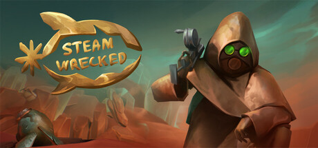
Ascend the skies and escape the hot desert caused by humanity's over usage of fossil fuels. Find blueprints, scavenge and craft items to build your airship to soar the skies up to society once more. Can you survive this tragedy or fall prey to the harsh nature of this decaying world?
Free to PlayMixed(41)
AdventureSandboxSurvival
sTeamFeb 7, 2026