Scoring genre clarity...
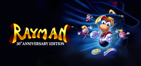
Celebrate 30 years of Rayman with the definitive edition of the platforming classic, featuring 5 versions, 120+ extra levels, and an exclusive documentary on the creation of the limbless hero.
$19.99Mixed(22)
AdventureActionPlatformer
Digital Eclipse, UbisoftFeb 13, 2026