Quick text summary
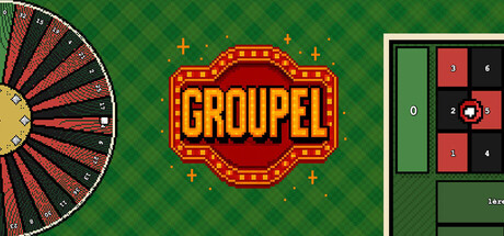
Groupel scored 72/100 on Steam Analyzer — Good for a Casual capsule. Top priority fix: [uniqueness_polish] Add a distinctive visual hook or character element that signals Groupel specifically—such as a unique mascot, icon, or visual motif that differentiates it from generic casino games
Capsule scores by dimension
- Genre Clarity: 7/10 — Casino roguelike theme clear. The roulette wheel on the left and vintage casino marquee sign immediately signal gambling mechanics and carnival aesthetics. The pixel-art UI elements on the right hint at roguelike structure and strategic gameplay. At tiny size, the wheel and marquee read well, though the specific roguelike aspect becomes less obvious without context.
- Title Readability: 8/10 — Bold marquee title stands firm. The GROUPEL title uses a classic casino marquee design with red and gold colors and clear, thick letterforms that maintain legibility even at small sizes. The decorative border and light bulb effects feel thematic without compromising readability. The title holds up well in the small capsule view at 231x87 and remains recognizable at tiny thumbnail sizes.
- Contrast & Color: 8/10 — Strong value separation throughout. The emerald green diamond-pattern background provides excellent contrast against the warm red, gold, and yellow accent elements of the marquee and wheel. The grayscale test confirms distinct silhouettes: the wheel's red-gold fan contrasts sharply against the green, and the marquee pops with clear light-dark separation. The UI elements on the right maintain sufficient brightness to read at all sizes.
- Uniqueness & Polish: 7/10 — Polished casino aesthetic, some generic feel. The design demonstrates intentional craft with the vintage marquee styling, gold accents, and decorative light bulb border elements that feel premium and thematic. However, the overall aesthetic draws heavily from familiar casino design tropes—while executed cleanly, it lacks a distinctive visual hook that separates it from other gambling-themed games beyond the roulette wheel focus. The pixel UI on the right adds personality but doesn't fully elevate to standout originality.
- Brand Consistency: 6/10 — Coherent casino theme, limited signature. The design maintains internal consistency with a unified gold-red-green palette and vintage carnival styling throughout all visible elements. However, there are no strong iconic character, symbol, or distinctive visual motifs that would make this recognizable as specifically Groupel in isolation—it reads as 'casino game' rather than as a unique brand identity. The mix of marquee signage and pixel UI, while coherent, doesn't establish a memorable signature.
- Composition: 7/10 — Well-balanced layout with clear focal points. The composition uses a clear three-section hierarchy: the decorative roulette wheel anchors the left, the marquee title dominates the center, and UI elements occupy the right, creating balanced visual weight. At small and tiny sizes, the eye naturally gravitates to the bright marquee in the center, supporting strong focal point clarity. The layout respects safe margins and resists edge-hugging, though the wheel element could be better integrated to avoid feeling slightly disconnected.
What works
- Clear casino-roulette genre signaling. The combination of the spinning roulette wheel and vintage marquee immediately communicates gambling mechanics and roguelike potential.
- Excellent contrast against Steam background. Warm golds and reds pop distinctly against the emerald green, maintaining silhouette clarity and readability at all viewing sizes.
- Strong title legibility at scale. The marquee design uses thick, clear letterforms and strategic spacing that survive compression to small and tiny thumbnail sizes without collapse.
- Balanced three-part composition. The wheel, marquee, and UI elements are arranged to create visual balance and guide the eye to the central focal point without clutter.
What hurts the capsule
- Generic casino aesthetic lacks signature. While polished, the design relies on familiar vintage gambling tropes without establishing a distinctive Groupel visual identity that would be memorable long-term.
- Limited integration between design sections. The roulette wheel feels somewhat disconnected from the marquee and UI elements rather than forming a cohesive unified composition.
- Roguelike nature unclear at tiny size. At thumbnail scale, the strategic card-game aspects visible in the UI elements on the right become too small to parse, reducing genre specificity.
Priority fixes
- [uniqueness_polish] Add a distinctive visual hook or character element that signals Groupel specifically—such as a unique mascot, icon, or visual motif that differentiates it from generic casino games
- [composition] Integrate the roulette wheel more seamlessly into the overall design, perhaps overlapping or interacting with the marquee to create stronger visual unity
- [genre_clarity] Include a subtle card or chip element in the center composition to better signal the roguelike deck-building aspect alongside roulette mechanics
Store copy priority fixes
- [uniqueness] Expand the final paragraph to explicitly contrast what makes roulette-based roguelike mechanics different from card-deck builders—e.g., 'Unlike deck-builders where synergies persist, every spin resets probability; your jokers don't change your cards, they change the odds themselves.'
- [audience_targeting] Add a sentence after the features list clarifying the pace and intensity: 'Perfect for strategy lovers who enjoy tense risk-reward decisions, whether you're playing in short bursts or long sessions.'
- [tone_match] Soften the 'house doesn't forgive' language slightly or add a counterbalance explaining that skill and strategy mitigate RNG—something like 'One bad bet can hurt, but mastering joker synergies lets you turn bad luck into opportunity.'
Related guides
Steam app ID: 4095030 · Tags: Casual, Simulation, Singleplayer, Capitalism, Choices Matter