Scoring genre clarity...
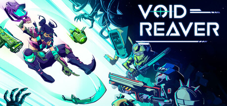
Void Reaver capsule

Void Reaver

Inventory management meets bullet heaven. In this sci-fi roguelite, your backpack determines your fate. Master the art of item layout to create game-breaking synergies and turn a humble arsenal into a screen-clearing storm of destruction. Collect 300+ items and annihilate the Void.

Bullet HeavenInventory ManagementAction Roguelike
Banana BlitzQ3 2026

Void Reaver scores 72/100 — better than 34% of Bullet Heaven capsules (n=137).

Released Q3 2026 · By Banana Blitz

Quick text summary

Void Reaver scored 72/100 on Steam Analyzer — Good for a Bullet Heaven capsule. Top priority fix: [uniqueness_polish] Introduce a unique visual motif or character silhouette that hints at the inventory management mechanic—such as a backpack shape, item grid overlay, or distinctive protagonist pose that signals the game's core hook.

Capsule scores by dimension

  • Genre Clarity: 7/10 — Sci-fi action with clear tone. The neon-lit void environment, silhouetted characters in combat poses, and glowing geometric architecture immediately signal action gameplay in a sci-fi setting. At TINY size, the bright neon chevrons and dark figures maintain readability and convey high-energy combat, though the specific roguelite/inventory management mechanic is not visually apparent from the capsule alone.
  • Title Readability: 8/10 — Bold neon text, excellent contrast. VOID REAVER uses bright cyan and white neon-style lettering that stands out sharply against the dark starfield background. The title remains legible at SMALL and TINY sizes due to thick letterforms and high luminosity; the two-line layout is clean and avoids clutter. Letter spacing is generous and the glow effect enhances rather than obscures the forms.
  • Contrast & Color: 8/10 — Strong luminous separation throughout. The bright cyan and white neon elements create excellent value separation from the deep blue-black background, with additional visual pop from the glowing chevrons and geometric shapes. Silhouettes of characters are darkly defined against the lighter midground, and the overall palette uses warm cyan and cool navy to reinforce depth. At TINY size, the contrast remains punchy and readable without muddy mid-tones.
  • Uniqueness & Polish: 7/10 — Polished neon aesthetic, familiar execution. The capsule demonstrates clean craft with coherent neon-cyberpunk art direction, glowing effects that feel intentional, and strong visual polish that suggests a premium product. However, the neon sci-fi aesthetic is common in modern indie games, and the composition—silhouettes against a starfield with floating geometric elements—reads as a familiar visual template rather than a standout unique hook. The core inventory management mechanic that differentiates the game is not communicated visually.
  • Brand Consistency: 6/10 — Cohesive neon style, limited identity. The capsule maintains consistent neon rendering, color palette (cyan/white on dark blue), and sci-fi thematic elements that would likely carry through the game's UI and store screenshots. However, there are no distinctive character silhouettes, iconic symbols, or signature motifs that would make this identity memorable or instantly recognizable as Void Reaver specifically rather than a generic sci-fi action title. The visual language is internally coherent but not uniquely branded.
  • Composition: 7/10 — Clear layering, centered focus point. The composition uses effective depth: starfield background, mid-ground geometric architecture, and foreground character silhouettes create readable layering at all sizes. The title sits securely in the upper portion with safe margins, and the character cluster anchors the lower half as a secondary focal point. At SMALL and TINY sizes, the bright title and silhouettes read clearly without excessive clutter, though the composition lacks a single dominant primary subject and feels somewhat evenly distributed.

What works

  • Legible neon title at all sizes. The thick cyan and white letterforms with glow effects maintain sharp readability from FULL down to TINY without collapsing or losing contrast against the dark background.
  • Strong value contrast and silhouettes. Dark character figures read distinctly against lighter midground elements and the starfield, creating clear visual separation that survives the grayscale test and maintains impact at thumbnail scale.
  • Cohesive sci-fi neon aesthetic. The palette, glow effects, and geometric architecture feel intentional and professionally executed, reinforcing a premium cyberpunk-action tone that matches genre expectations.

What hurts the capsule

  • Generic sci-fi template composition. The silhouettes-against-starfield-with-floating-shapes layout is visually common in indie sci-fi marketing and does not communicate the game's unique inventory-driven mechanic or identity.
  • No iconic character or symbol. The character silhouettes are generic soldier/fighter poses with no distinctive design cues or memorable branding element that would make the capsule recognizable as Void Reaver specifically.
  • Inventory management hook not visual. The capsule communicates action and sci-fi tone but completely omits visual hints about the core roguelite item-synergy mechanic that differentiates this game from competitors.

Priority fixes

  1. [uniqueness_polish] Introduce a unique visual motif or character silhouette that hints at the inventory management mechanic—such as a backpack shape, item grid overlay, or distinctive protagonist pose that signals the game's core hook.
  2. [genre_clarity] Add subtle visual cues that communicate the roguelite/item-collection aspect, such as faint glowing item icons, a grid pattern, or synergy arc effects to differentiate from generic action sci-fi.
  3. [brand_consistency] Develop a signature character, enemy design, or UI element that appears consistently across capsule and store screenshots to build memorable brand identity.

Store copy priority fixes

  1. [feature_communication] Replace or clarify 'pure Survivor-like experience' with a direct gameplay description: 'Your weapons fire automatically—you focus entirely on dodging and positioning while your inventory build unleashes damage.' This removes jargon and reinforces the unique inventory-as-weapon hook.
  2. [uniqueness] Add a sentence explicitly contrasting this game against standard bullet heavens or roguelikes: 'Unlike traditional roguelikes with fixed equipment slots, every item placement matters and reshapes your power curve.' This strengthens the differentiation claim.
  3. [tone_match] Move or shorten the soundtrack credit paragraph to a separate 'Credits & Development' section or footer; it reads like corporate filler in the core game description and breaks the action-forward momentum of the main copy.

Related guides

Steam app ID: 4096910 · Tags: Bullet Heaven, Inventory Management, Action Roguelike, Loot, Bullet Hell