Scoring genre clarity...

Ninjamboree capsule

Ninjamboree

A chaotic online party‑PvP arena where four players cycle through a format of one player controlling the Ninja racing for treasure while the other three team up as monsters to stop them.

$4.99
ActionCasualParty Game
EuchApr 26, 2026

Ninjamboree scores 62/100 — better than 3% of Action capsules (n=8,534).

$4.99 · Released Apr 26, 2026 · By Euch

Quick text summary

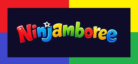
Ninjamboree scored 62/100 on Steam Analyzer — Solid for a Action capsule. Top priority fix: [genre_clarity] Integrate a ninja silhouette or action-pose element into the composition to signal combat gameplay and differentiate from generic children's entertainment.

Capsule scores by dimension

  • Genre Clarity: 5/10 — Colorful party game, genre ambiguous. The rainbow typography and playful aesthetic suggest a casual party game, but provide no clear visual cues about the PvP arena mechanic or the ninja-versus-monsters gameplay loop. At tiny size, the design reads as generic children's entertainment rather than action-oriented chaos, missing opportunity to convey the competitive multiplayer or asymmetrical gameplay that defines the experience.
  • Title Readability: 7/10 — Readable but decorative, loses clarity tiny. The "Ninjamboree" title uses bold, multi-colored letter forms with clear spacing that remain legible at full and small sizes. However, at tiny size (120×45), the varied letter heights and individual color assignments create visual noise that slightly degrades recognition; the playful style works against rapid recognition during quick scroll.
  • Contrast & Color: 8/10 — Strong vibrant contrast against dark background. The deep navy background (#1b2838-adjacent) provides excellent separation for the bright red, yellow, blue, green, and cyan letters. Each letter pops distinctly in grayscale due to varied luminance values, and the rainbow palette ensures high saturation separation even at tiny size, though the colorful noise slightly reduces silhouette unity.
  • Uniqueness & Polish: 5/10 — Playful but generic children's game aesthetic. The rainbow gradient typography and bright primary colors feel like standard children's entertainment branding rather than a distinctive action-PvP identity. The design lacks visual storytelling about the core mechanic (ninja racing + monster ambush), asymmetrical gameplay, or chaotic multiplayer energy that would differentiate it from countless casual party titles.
  • Brand Consistency: 5/10 — No clear identity cues or memorable motifs. The capsule establishes no iconic character, symbol, or signature palette that would be recognizable across marketing materials; the rainbow-text-on-dark-background approach is generic enough that it could apply to dozens of party games. Without reference to gameplay UI, ninja imagery, or monster elements, there is no internal brand signal that ties this visual identity to the asymmetrical PvP loop described.
  • Composition: 7/10 — Centered, balanced, clean margins preserved. The title sits centered in the dark navy zone with ample breathing room on all sides, and the color-blocked frame (red, yellow, blue, green bars at edges) creates deliberate hierarchy and safe margins. At small and tiny sizes, the composition holds together well, though the frame design feels ornamental rather than functionally enhancing readability or gameplay communication.

What works

  • High contrast pops on Steam dark background. Vibrant rainbow letters and bold color saturation create immediate visual separation from #1b2838, ensuring the title remains discoverable during scroll.
  • Solid spacing and safe margins. Centered layout with generous padding and colored frame preserve legibility across all viewing sizes without awkward edge-hugging or Steam crop risk.
  • Maintains readability at small size. Despite decorative letter treatment, the core typography remains clear enough at 231×87 that players can identify the title during quick browse.

What hurts the capsule

  • Fails to communicate genre or core mechanic. The playful children's aesthetic gives no visual hint of PvP arena chaos, asymmetrical gameplay, ninja racing, or monster teamplay that defines the experience.
  • Generic party-game branding lacks distinction. Rainbow gradient text and primary color blocks are interchangeable with dozens of casual titles, offering no iconic character, symbol, or gameplay UI cue that builds brand recognition.
  • Decorative typography degrades at tiny size. Varied letter heights and individual color assignments create visual noise that slightly reduces rapid recognition when the capsule appears at 120×45 during scroll.

Priority fixes

  1. [genre_clarity] Integrate a ninja silhouette or action-pose element into the composition to signal combat gameplay and differentiate from generic children's entertainment.
  2. [uniqueness_polish] Replace pure rainbow-text branding with a distinctive visual hook—such as a split ninja/monster icon, asymmetrical color split, or gameplay UI element—that communicates the asymmetrical multiplayer core.
  3. [brand_consistency] Establish a recognizable color motif or character symbol that anchors all future marketing materials and creates lasting brand identity beyond the title alone.
  4. [title_readability] Test legibility at 120×45 and consider adding subtle outline or shadow to letters to strengthen tiny-size silhouette and reduce color-transition blur.

Store copy priority fixes

  1. [feature_communication] Add a brief sentence explaining what Supers are and how they differ from monsters (e.g., 'Supers grant the Ninja special abilities like speed boosts or combat powers'). This closes the gap between mentioning 8 unique Supers and the reader understanding why that matters.
  2. [hook_strength] Reinforce in the opening of the detailed description why this 1v3 format is fun and fair, not frustrating. Add a line like 'The Ninja has the advantage of choice and powers, while the monsters have numbers and map knowledge—every role feels viable.'
  3. [audience_targeting] Expand the 'Designed with streaming, parties, and play-with-friends energy' line into a dedicated sentence early in the detailed description. Explicitly state this is best played with friends or communities, not solo, to set expectations.
  4. [feature_communication] Replace or reframe the 'Anti-Dead Game' section header and tone. Instead of messaging about potential decline, position the Discord and monthly Ninjams as 'Community Events' and 'Matchmaking Support,' making them feel like features, not insurance.

Related guides

Steam app ID: 4100420 · Tags: Action, Casual, Party Game, Multiplayer, Ninja