Bullet Barrage Basketball scores 78/100 — better than 85% of Action capsules (n=8,534).

Quick text summary

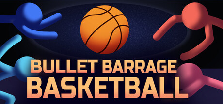
Bullet Barrage Basketball scored 78/100 on Steam Analyzer — Good for a Action capsule. Top priority fix: [uniqueness_polish] Introduce a distinctive mascot or character personality (e.g., a specific athlete or logo mark) that becomes the visual signature and differentiates the game from generic arena titles.

Capsule scores by dimension

  • Genre Clarity: 8/10 — Clear sports action hybrid. The central basketball and stylized stick figures immediately signal sports + action gameplay. The orange gradient ball and neon blue/red character silhouettes effectively convey a fast-paced, arcade aesthetic that reads as action-sports at TINY size. At full size, the composition clearly communicates a multiplayer arena concept without ambiguity.
  • Title Readability: 9/10 — Bold, legible hierarchy. BULLET BARRAGE BASKETBALL uses a clean, sans-serif typeface in golden-orange that maintains excellent contrast against the dark blue background across all sizes. The two-line layout with BULLET BARRAGE stacked above BASKETBALL creates clear visual hierarchy that remains readable even at TINY size. The title sits on a relatively clean background region and does not collapse under squint testing.
  • Contrast & Color: 9/10 — Strong value separation. The warm golden-orange title pops distinctly against the cool dark blue background, creating excellent value contrast that works at all viewing scales. Character silhouettes in neon blue and red-coral maintain sharp separation from the background in grayscale, with the basketball providing a bright focal point. Even at TINY size, the color palette reads clearly without muddy midtones or blend-in issues.
  • Uniqueness & Polish: 7/10 — Polished but familiar concept. The execution is clean and professional with good 3D rendering of the basketball and character models, showing intentional lighting and saturation control. However, the core concept—stick figure athletes + sports equipment—feels somewhat generic as a visual hook; it communicates the gameplay premise competently but lacks a distinctive signature style or memorable mascot/motif. The neon arena aesthetic is well-rendered but not particularly unique within indie action-sports space.
  • Brand Consistency: 6/10 — Functional but generic identity. The neon color palette (blue, red-coral, golden-orange) is internally cohesive and repeated across the layout consistently. However, there are no iconic symbols, character personalities, or signature visual motifs that would allow instant brand recognition in a crowded store. The style is polished but does not establish a memorable identity distinct from other arena action games.
  • Composition: 8/10 — Strong focal hierarchy. The basketball occupies clear center-focal prominence with character figures balanced on left and right, creating natural symmetry and avoiding dead space. The title placement below the visual anchor is strategic and does not interfere with the primary image. Safe margins are respected, and the composition remains effective at SMALL and TINY sizes without critical cropping issues; the eye is drawn to the ball first, then the action figures.

What works

  • Golden title contrast. Warm orange-gold typography provides excellent separation from cool dark background and remains fully readable at TINY size without outline assistance.
  • Clear visual hierarchy. Basketball at center with flanking figures creates intuitive focal point that communicates a competitive arena setup without confusion.
  • Balanced composition. Symmetric character placement and centered ball avoid cluttered or awkward empty gaps, maintaining visual appeal across all viewing scales.
  • Professional 3D rendering. Character models and ball are well-lit with intentional saturation and shadow work that elevates perceived production value.

What hurts the capsule

  • Generic stick-figure aesthetic. The neon-colored character silhouettes, while legible, lack personality or distinctive design that would stand out as a recognizable brand icon.
  • No unique visual hook. The capsule communicates gameplay (sports + action) but offers no memorable motif, signature style, or standout artistic direction beyond competent execution.
  • Limited brand recognition cues. No mascot, logo variation, or internal visual language present that would allow players to identify this game by capsule alone in a crowded storefront.

Priority fixes

  1. [uniqueness_polish] Introduce a distinctive mascot or character personality (e.g., a specific athlete or logo mark) that becomes the visual signature and differentiates the game from generic arena titles.
  2. [brand_consistency] Develop a signature color combination or visual motif that extends beyond the current palette and can anchor brand recognition across thumbnails and store assets.
  3. [genre_clarity] Add subtle UI elements like a score display, bullet trail, or explosive effect to reinforce the bullet-hell fusion mechanic more visually at TINY size.

Store copy priority fixes

  1. [audience_targeting] Add explicit signal for party/couch co-op players by inserting 'Perfect for local co-op nights' or similar phrase before the Key Features section to match the strong multiplayer category tags.
  2. [uniqueness] Expand the genre-fusion hook by adding one sentence explaining a specific emergent moment (e.g., 'Score while dodging incoming fire and your teammate blocks a rival's shot') to show why this hybrid is compelling.
  3. [feature_communication] Replace 'Visuals and effects that turn every victory (or explosion) into a highlight reel' with a concrete visual descriptor (e.g., 'Vibrant 2D cartoon aesthetic with dynamic explosion effects on every basket and collision').

Related guides

Steam app ID: 4101530 · Tags: Action, Bullet Hell, Multiplayer, Local Multiplayer, Arcade