Black Fog scores 70/100 — better than 29% of Casual capsules (n=10,153).

Quick text summary

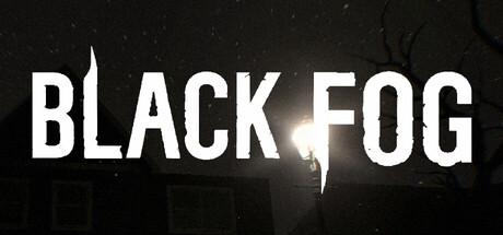
Black Fog scored 70/100 on Steam Analyzer — Good for a Casual capsule. Top priority fix: [uniqueness_polish] Introduce a signature visual element—a distinctive silhouette shape, color accent, or anomaly effect—that signals the hallucination/anomaly mechanic and differentiates Black Fog from generic survival horror.

Capsule scores by dimension

  • Genre Clarity: 7/10 — Horror atmosphere clearly communicated. The dark, foggy environment with a solitary illuminated figure against black establishes survival horror and psychological tension effectively. At tiny size, the stark silhouette and ominous fog particles read as horror/survival, though the specific 'anomaly hallucination' mechanic is not visually apparent from the imagery alone.
  • Title Readability: 8/10 — Bold sans-serif title stands firm. WHITE sans-serif lettering 'BLACK FOG' is set against the dark background with strong value contrast and clean letterforms that maintain legibility at small and tiny sizes. The title placement is centered and uncluttered, avoiding noisy texture interference, and the horizontal lock-up survives squinting and scaling well.
  • Contrast & Color: 8/10 — Strong value separation and silhouettes. White title text and the glowing center figure create crisp contrast against the #1b2838-adjacent dark background, with additional warm glow around the central light source providing depth. The grayscale silhouette test confirms clear edge definition; however, the fog particles in the lower third blend somewhat into the darkness and could be more defined.
  • Uniqueness & Polish: 6/10 — Competent but familiar horror setup. The foggy, lone-figure-in-darkness composition is a well-executed but fairly common horror game visual archetype that does not immediately signal the unique 'anomaly hallucination' survival mechanic described. The craft is clean and intentional, but lacks a distinctive visual hook or thematic signature that separates it from other psychological horror titles.
  • Brand Consistency: 6/10 — Minimal visual identity signals present. The capsule uses generic horror iconography—fog, darkness, isolated light source—without establishing a recognizable internal brand motif or signature palette that would help players remember Black Fog specifically. Without reference to the 10 available store screenshots, no distinctive character, symbol, or color scheme emerges from this capsule alone.
  • Composition: 7/10 — Clear focal point with effective layering. The central glowing figure serves as a strong primary focal point with background fog and foreground darkness creating depth layers that guide attention effectively. Title placement at top does not intrude on the composition; however, at tiny size the bottom half becomes murky and undifferentiated, reducing the visual hierarchy slightly.

What works

  • Title legibility across all sizes. White sans-serif 'BLACK FOG' maintains crisp readability at full, small, and tiny scales due to strong value contrast and clean geometric letterforms.
  • Dark atmosphere and focal contrast. The centered warm glow and solitary figure create an immediate psychological horror tone and serve as a clear eye-draw against the black void.
  • Uncluttered, professional layout. Safe margins, centered hierarchy, and restrained visual noise allow the design to breathe and function well on the Steam dark background.

What hurts the capsule

  • Generic horror archetype. The lone figure in fog is a familiar and overused horror game visual that does not communicate the unique anomaly/hallucination mechanic or differentiate Black Fog from similar titles.
  • Weak brand identity signals. No iconic character, symbol, or signature color palette emerges that would make this capsule recognizable as Black Fog specifically rather than a generic survival horror.
  • Lower composition clarity at tiny size. Below the title, fog and darkness merge into an undifferentiated murk at thumbnail scale, reducing visual hierarchy and impact on quick scroll.

Priority fixes

  1. [uniqueness_polish] Introduce a signature visual element—a distinctive silhouette shape, color accent, or anomaly effect—that signals the hallucination/anomaly mechanic and differentiates Black Fog from generic survival horror.
  2. [genre_clarity] Add a subtle but recognizable anomaly or distortion visual cue (e.g., glitching edges, warped figure, impossible geometry) that communicates the 'what is real' theme at small/tiny sizes.
  3. [composition] Increase contrast and definition in the lower fog region so the gradient from light to dark remains visually distinct at thumbnail scale and sustains hierarchy.

Store copy priority fixes

  1. [hook_strength] Replace 'anomaly-style' with a plain-language hook: 'Survive the night by photographing deadly hallucinations before your anxiety spirals to lethal levels.' This immediately communicates genre and core tension.
  2. [audience_targeting] Add one sentence explicitly stating who the game is for: 'Perfect for horror fans seeking psychological dread without jump scares, and players who want meaningful difficulty scaling for their skill level.'
  3. [feature_communication] Clarify the photography mechanic in one sentence: e.g., 'Snap photos of hallucinations before they overwhelm you—each photograph drains anxiety and confirms what's real.' This closes the gap between mechanic and outcome.

Related guides

Steam app ID: 4101770 · Tags: Casual, Exploration, Hidden Object, 3D, First-Person