Scoring genre clarity...
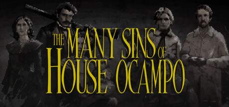
The Many Sins of House Ocampo capsule

The Many Sins of House Ocampo

The bloody roots of the Ocampo family tree run deep and dark in this mystery point-and-click adventure. Investigate the last moments of your ancestors and put together the pieces of the family's macabre fate to find out who you really are.

AdventurePoint & Click2D
Dead Idle GamesTo be announced

The Many Sins of House Ocampo scores 73/100 — better than 61% of Adventure capsules (n=8,231).

Released To be announced · By Dead Idle Games

Quick text summary

The Many Sins of House Ocampo scored 73/100 on Steam Analyzer — Good for a Adventure capsule. Top priority fix: [contrast_color] Increase figure luminosity or add subtle accent lighting (deep amber or cool rim light) to separate the character silhouettes from the dark sepia ground while maintaining gothic mood.

Capsule scores by dimension

  • Genre Clarity: 7/10 — Period mystery with gothic undertones. The sepia-toned character lineup and formal attire suggest a historical narrative adventure, while the muted color palette and somber composition hint at dark mystery elements. At tiny size, the grouped figures read as a cast of characters in period costume, effectively communicating a story-driven adventure rather than action or puzzle gameplay, though the genre specificity could be sharper.
  • Title Readability: 8/10 — Strong golden title with solid hierarchy. The bright yellow-gold serif typography stands out clearly against the dark background at all sizes, with "THE MANY SINS OF" in smaller caps and "HOUSE OCAMPO" as the dominant focal point. At tiny size the title remains legible and eye-catching, though some serif detail is lost; placement centered above the character group avoids competition from background noise.
  • Contrast & Color: 8/10 — Golden text pops against dark palette. The bright yellow-gold title creates strong value separation from the dark sepia-toned background, and the high saturation ensures it reads well even during quick scrolls. The character figures blend somewhat into the background due to muted grays and browns, but the title dominance compensates; grayscale separation favors the text while figures remain atmospheric rather than distracting.
  • Uniqueness & Polish: 7/10 — Polished period aesthetic with restraint. The sepia-photography styling with arranged cast figures conveys a premium, intentional visual identity consistent with literary mystery properties rather than generic adventure fare. The restraint from heavy effects or clutter feels deliberate, though the composition relies on a familiar 'period drama cast lineup' trope that is not wholly distinctive within the adventure genre benchmark set.
  • Brand Consistency: 7/10 — Coherent gothic-mystery identity. The monochromatic sepia treatment, serif title typography, and formal character arrangement create a cohesive internal identity that signals literary mystery and dark family drama. The golden type and muted palette form recognizable identity cues, though without a unique character silhouette or symbolic motif, it relies on genre convention rather than a singular memorable hook.
  • Composition: 7/10 — Clear hierarchy with atmospheric balance. The centered golden title commands the upper two-thirds while the character group anchors the lower portion, creating a natural top-to-bottom flow that works at small and tiny sizes. At tiny size the title remains dominant and figures read as a supporting ensemble silhouette; composition is well-balanced without dead space, though the figures could be more dynamically posed to add visual tension.

What works

  • Legible golden title at all sizes. The bright yellow-gold serif text maintains clarity and visual pop even at tiny thumbnail size, ensuring the game name cuts through Steam browsing clutter.
  • Polished period-drama aesthetic. The sepia-toned photography styling with formal character arrangement conveys a premium, intentional visual identity appropriate for a literary mystery adventure.
  • Strong value contrast with background. The golden title stands out decisively against the dark sepia palette, creating immediate visual hierarchy and quick discoverability.

What hurts the capsule

  • Character figures blend into background. The muted gray and brown tones of the cast figures lack sufficient separation from the dark background, reducing their visual impact and atmospheric presence at small sizes.
  • Generic period-cast trope. The arranged-lineup composition, while well-executed, echoes common period drama marketing and does not establish a unique visual hook that distinguishes this game within the adventure genre benchmark set.
  • Limited symbolic differentiation. The capsule lacks an iconic character silhouette, motif, or signature visual element that would make it immediately recognizable on repeat browsing.

Priority fixes

  1. [contrast_color] Increase figure luminosity or add subtle accent lighting (deep amber or cool rim light) to separate the character silhouettes from the dark sepia ground while maintaining gothic mood.
  2. [uniqueness_polish] Introduce one distinctive visual element—such as a symbolic object, unique pose, or subtle macabre detail—that signals the family mystery theme and differentiates from generic period-drama marketing.
  3. [composition] Consider a slightly asymmetrical or dynamic character arrangement to add visual tension and intrigue that reflects the dark family narrative rather than formal lineup stasis.

Store copy priority fixes

  1. [feature_communication] After the deduction mechanic description, add a brief note on scope: 'Investigate the fates of X family members across multiple time periods' to ground player expectations for content volume.
  2. [uniqueness] Strengthen the uniqueness sentence by replacing the comp title reference with: 'A deduction-based mystery where you piece together your family's dark history through documents, letters, and relics—uncovering a pattern that may predict your own fate.'
  3. [audience_targeting] Add early in the detailed description: 'For players who value story, atmosphere, and investigation over action—a contemplative mystery for single-player experience.' to clearly signal intended audience.
  4. [feature_communication] Clarify the tone of deduction by adding: 'Solution-based puzzles guide your investigation' or 'Story-driven clue discovery' to set expectations for puzzle difficulty vs. narrative flow.

Related guides

Steam app ID: 4102890 · Tags: Adventure, Point & Click, 2D, Isometric, Pixel Graphics