Scoring genre clarity...

Drifting Dots capsule

Drifting Dots

A minimalist physics roguelite where you create a mesmerizing cascade of droplets. Choose from three distinct modes and discover powerful upgrade synergies to master the flow. Calm, complex, and endlessly replayable.

$7.992 user reviews
CasualPhysicsStrategy
JLau GamesMay 11, 2026

Drifting Dots scores 73/100 — better than 54% of Casual capsules (n=10,153).

2 user reviews · $7.99 · Released May 11, 2026 · By JLau Games

Quick text summary

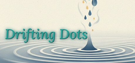
Drifting Dots scored 73/100 on Steam Analyzer — Good for a Casual capsule. Top priority fix: [uniqueness_polish] Introduce a subtle visual signature—such as a distinctive dot pattern, color accent, or UI element—that hints at the upgrade synergy or three-mode mechanic and differentiates from generic water-drop aesthetics.

Capsule scores by dimension

  • Genre Clarity: 7/10 — Calm physics mechanics clear. The water droplet impact and ripple rings immediately signal a physics-based, meditative game. The minimalist aesthetic and droplet cascade visual match casual indie expectations, though the specific roguelite upgrade layer is not visually apparent at small sizes. At tiny size, the droplet and water ripple remain the dominant read, successfully conveying a contemplative, water-focused mechanic.
  • Title Readability: 8/10 — Legible serif title, good placement. The 'Drifting Dots' title in teal serif font is well-positioned in the upper-left to center region with ample light background support, ensuring strong readability at full and small sizes. The font choice is distinctive and supports the calm, elegant brand. At tiny size the text remains recognizable, though the decorative serifs soften slightly; the teal color maintains enough contrast against the pale background to avoid collapse.
  • Contrast & Color: 8/10 — Strong teal-to-cream separation effective. The teal title pops cleanly against the warm cream-beige background, with the dark blue water droplet and concentric rings providing strong value anchors in the lower half. The monochromatic ripple design avoids muddy mid-tones and maintains clear silhouettes in grayscale. At small and tiny sizes, the three-layer palette (cream, teal, dark blue) preserves excellent contrast and quick readability against Steam's dark background.
  • Uniqueness & Polish: 7/10 — Polished minimalist aesthetic, slightly generic. The hand-drawn water ripple illustration and soft color palette demonstrate intentional craft and a cohesive meditative mood. However, water droplet and ripple visuals are fairly common in casual indie marketing, and the capsule does not clearly communicate the roguelite upgrade synergy or three-mode gameplay depth that distinguish the product. The execution is clean and premium-feeling, but the unique selling point is subtle rather than immediately memorable.
  • Brand Consistency: 6/10 — Consistent palette, limited iconic identity. The teal and cream palette is applied uniformly, and the water ripple motif aligns well with a physics simulation concept. However, without reference to the five store screenshots, this capsule does not establish a distinctive brand symbol or character that would enable later recognition. The design is coherent but leans on a generic minimalist water theme rather than a proprietary visual hook.
  • Composition: 8/10 — Clear hierarchy, centered focal point. The droplet impact and ripple rings form a strong focal point in the lower-center-right area, drawing the eye naturally. The title anchors the top-left with balanced breathing room, and the falling drops in the upper portion create a logical flow from source to impact. The composition is resilient across sizes; at tiny size the water impact remains the clear hero, and no critical elements sit dangerously close to edges that would risk Steam cropping.

What works

  • Readable serif title with accent color. Teal 'Drifting Dots' text remains legible at small and tiny sizes due to strategic light-background placement and sufficient contrast.
  • Water ripple motif reinforces genre. The concentric ring animation and droplet cascade clearly communicate a physics-based, meditative gameplay loop.
  • Balanced composition with clear focal point. Droplet impact in lower-center anchors attention while title and falling elements guide the eye without clutter.
  • Strong color separation on Steam dark background. Warm cream and teal palette provides excellent contrast in grayscale and maintains visibility during quick scroll.

What hurts the capsule

  • Generic water-droplet visual hook. The ripple and droplet aesthetic is common in casual indie titles, reducing distinctiveness and memorability compared to genre benchmarks.
  • Roguelite upgrade complexity not communicated. The capsule does not hint at the three distinct modes or powerful upgrade synergies that differentiate the game, leaning on a simple meditative read instead.
  • No iconic brand symbol or character. The design lacks a recognizable proprietary motif or mascot that would enable players to identify the game in future marketing or third-party contexts.

Priority fixes

  1. [uniqueness_polish] Introduce a subtle visual signature—such as a distinctive dot pattern, color accent, or UI element—that hints at the upgrade synergy or three-mode mechanic and differentiates from generic water-drop aesthetics.
  2. [brand_consistency] Establish a recognizable icon or character motif (e.g., stylized dot cluster or abstract upgrade symbol) that reinforces brand identity and aids player recall across all marketing assets.
  3. [genre_clarity] Add a thin UI hint or secondary visual cue (e.g., subtle upgrade indicator or mode selector silhouette) in the composition to signal the roguelite progression layer without compromising the meditative mood.

Store copy priority fixes

  1. [feature_communication] In the 'Shape The Cascade' section, add one concrete synergy example: 'Combine [Attunement name] with [Mantra name] to [specific outcome]' to demonstrate the depth of upgrade interactions.
  2. [feature_communication] Define Essence and Insight in plain language immediately after first mention: 'Each run earns Essence (the primary score). Score is converted into Insight (permanent currency) to unlock Mantras.'
  3. [uniqueness] Add a differentiating sentence after 'vast tree of game-changing Mantras': 'Synergies stack exponentially—no two builds play the same way,' or similar language that articulates mechanical uniqueness beyond aesthetics.
  4. [feature_communication] Clarify the roguelite structure: 'Mantras unlock permanently, but each 15-minute run is independent. Build your mastery through runs, not through individual persistence.'

Related guides

Steam app ID: 4104160 · Tags: Casual, Physics, Strategy, Minimalist, Indie