Scoring genre clarity...

Quiet Office Floors capsule

Quiet Office Floors

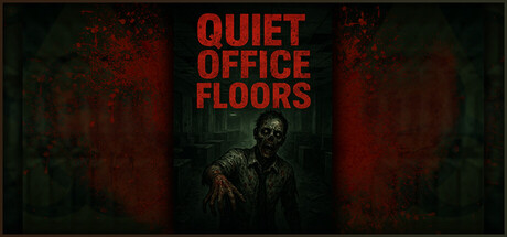
FPS game going home from work, crafting to conceal yourself so you don't get caught, walk silently so you don't get busted, Quiet Office Floors is a game that challange your patience, but is the workplace is the only game level? No. you will walk through forest, cemetery, mine and sewer to get home

$3.99
ActionAdventureAction-Adventure
Andri Stefanus GamesNov 9, 2025

Quiet Office Floors scores 68/100 — better than 17% of Action capsules (n=8,534).

$3.99 · Released Nov 9, 2025 · By Andri Stefanus Games

Quick text summary

Quiet Office Floors scored 68/100 on Steam Analyzer — Solid for a Action capsule. Top priority fix: [uniqueness_polish] Replace generic zombie with a distinctive character or iconic silhouette—consider adding a subtle office element (desk, tie, briefcase fragment) to reinforce the office-to-horror premise and create a memorable anchor.

Capsule scores by dimension

  • Genre Clarity: 7/10 — Horror-action stealth premise clear. The decayed zombie-like figure in the center and blood-red color palette immediately signal a horror or dark action game. The office setting is readable and the overall tone suggests stealth or survival gameplay. At tiny size, the skull-faced character silhouette and red environmental glow still convey danger and supernatural threat, though the specific stealth-based FPS mechanic is not obvious from visuals alone.
  • Title Readability: 8/10 — Bold red title highly legible. QUIET OFFICE FLOORS uses a strong, clean sans-serif in bright red against dark teal-green backdrop, creating excellent contrast that holds at all sizes. The stacked layout is simple and reads clearly even at tiny 120x45 resolution. The title remains a recognizable red block at thumbnail size without color collapse or letter blur.
  • Contrast & Color: 8/10 — High value separation, effective lighting. Bright red title and reddish-orange atmospheric glows create strong value separation against the dark teal and black background layers. The central zombie figure benefits from rim lighting that pushes it forward from the murky surroundings. In grayscale, the mid-tone character still reads distinctly from the background due to edge definition and relative brightness, and the red title becomes a clear light gray bar.
  • Uniqueness & Polish: 6/10 — Competent horror framing, generic execution. The decomposed figure and blood-streaked aesthetic are functional for horror-action positioning, but the rendering feels stock—a fairly standard zombie or corpse asset in a moody lighting setup rather than a distinctive visual hook. The color grading is competent but relies on familiar horror tropes (red and dark teal) without a memorable signature element that distinguishes Quiet Office Floors from other indie horror titles.
  • Brand Consistency: 5/10 — Thematic coherence lacks iconic anchor. The capsule establishes a horror-workplace mood and the grim color palette is internally consistent, but there is no clear character, symbol, or motif that would create lasting brand recognition. The zombie-like figure is a generic undead type with no distinctive pose, outfit, or personality that could serve as a recognizable franchise anchor across marketing materials.
  • Composition: 7/10 — Strong centered hierarchy, balanced staging. The zombie figure is positioned in the center-lower portion with the title stacked above in clear hierarchy, creating a stable focal point that survives compression to small and tiny sizes. The left and right atmospheric glow provide balanced framing without cluttering the core silhouette. The composition avoids dead space and title cropping risk, though at Steam's tiny thumbnail the character detail may soften slightly.

What works

  • Title legibility across all sizes. Bright red bold sans-serif on controlled dark background remains fully readable at tiny 120x45 without color loss or letter collapse.
  • Clear atmospheric contrast. Red-orange lighting and teal shadows create distinct value separation in both color and grayscale, keeping the character silhouette readable at thumbnail scale.
  • Centered focal point stability. The zombie figure positioned in visual center maintains a clear primary subject that doesn't scatter attention or risk edge cropping on Steam.

What hurts the capsule

  • Generic asset and pose. The zombie figure lacks distinctive personality, unique outfit, or memorable stance that would create brand recognition or visual hook.
  • Overreliance on familiar horror clichés. Red-and-dark-teal palette and undead monster are standard genre expectations rather than a unique selling point or signature visual identity for the game.
  • No mechanical or gameplay hint. The capsule conveys horror tone but does not visually communicate stealth, crafting, office setting, or the multi-environment journey that defines the gameplay loop.

Priority fixes

  1. [uniqueness_polish] Replace generic zombie with a distinctive character or iconic silhouette—consider adding a subtle office element (desk, tie, briefcase fragment) to reinforce the office-to-horror premise and create a memorable anchor.
  2. [genre_clarity] Integrate a subtle stealth or crafting visual cue—such as a silhouette in a hiding pose, a crafting material in hand, or layered environment hints—to clarify the stealth-action mechanic at small size.
  3. [brand_consistency] Develop a signature visual motif or color accent that appears in store screenshots—ensure the zombie or character design feels intentional and proprietary, not like a stock asset.

Store copy priority fixes

  1. [hook_strength] Rewrite the short description to lead with the core tension: 'Survive a zombie-infested commute home using camouflage and stealth—hide in boxes and bushes to stay alive through six deadly locations.'
  2. [feature_communication] Clarify the camouflage system with explicit guidance: 'Box camouflage hides you indoors; bush camouflage works outdoors. Remain still to avoid detection or use a bow to create distance when exposed.'
  3. [tone_match] Remove rhetorical questions and replace with direct feature statements; proofread for spelling and grammar ('challenge' not 'challange'; fix awkward phrasing throughout).
  4. [audience_targeting] Add a single sentence targeting the audience: 'Perfect for players who love stealth-horror over run-and-gun gameplay' or similar to signal who will enjoy this experience.

Related guides

Steam app ID: 4105610 · Tags: Action, Adventure, Action-Adventure, Shooter, FPS