Scoring genre clarity...

Floor 13 capsule

Floor 13

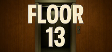
In Floor13, reality doesn’t change all at once — it shifts quietly, waiting for you to notice.You walk the same office corridor over and over, but something always feels… slightly off.Your task is simple: observe, detect, report. If you fail to see the difference, the corridor will keep you forever.

$4.999 user reviews
ExplorationPsychological HorrorAtmospheric
VerenithStudioNov 24, 2025

Floor 13 scores 78/100 — better than 89% of Exploration capsules (n=4,872).

9 user reviews · $4.99 · Released Nov 24, 2025 · By VerenithStudio

Quick text summary

Floor 13 scored 78/100 on Steam Analyzer — Good for a Exploration capsule. Top priority fix: [brand_consistency] Introduce a distinctive visual motif—such as a subtle distortion, shadow detail, or unique design element in the elevator frame—that can anchor brand recognition across marketing assets

Capsule scores by dimension

  • Genre Clarity: 7/10 — Eerie office mystery, subtle horror. The elevator door with dimly lit corridor creates immediate tension and mystery, clearly signaling a psychological or supernatural genre. The plain brown/beige office setting and numbered floor placard suggest a contained, procedural space rather than action or combat. At TINY size, the elevator framing and signage still read as ominous and corridor-focused, though the specific genre (psychological horror/simulation) is less explicit without color or character presence.
  • Title Readability: 9/10 — Bold sans-serif, excellent clarity. The title 'FLOOR 13' uses a heavy, clean sans-serif font with strong white-to-dark contrast that remains legible at all viewing sizes, including TINY. The split placement—'FLOOR' at top, '13' centered below—creates visual rhythm and ensures the critical number isn't lost. Even at 120x45 pixels, the chunky letterforms and clean layout hold perfectly.
  • Contrast & Color: 8/10 — Strong value separation, warm atmosphere. Cream/off-white title text pops distinctly against the dark elevator frame and warm brown corridor background. The warm brown-to-dark gradient creates natural depth and lighting separation that reads clearly even in grayscale. At SMALL and TINY sizes, the light-dark silhouette of the elevator frame against the warmer background maintains excellent clarity and visual separation.
  • Uniqueness & Polish: 8/10 — Distinctive minimalist horror aesthetic. The elevator door visual is a specific, memorable hook that immediately differentiates this from generic horror or simulation games. The restrained color palette, realistic architectural rendering, and deliberate 'off' framing convey psychological unease rather than jump-scare intensity. The craft is clean and intentional, communicating the core mechanic (observation, repetition, dread) through environment alone.
  • Brand Consistency: 7/10 — Coherent minimalist office horror. The warm brown office lighting, institutional elevator, and plain typography create a cohesive, recognizable identity around mundane dread. However, without secondary brand motifs (character, icon, or signature palette variation), the design relies entirely on environmental consistency. The visual would be recognizable in a library of horror capsules, but lacks a distinctive character or symbol that becomes iconic over time.
  • Composition: 8/10 — Clear focal point, balanced framing. The centered elevator door acts as an unmistakable primary focal point, with the floor number as the secondary anchor. Title placement above and within the elevator frame integrates text into composition rather than floating it separately. The symmetrical framing and generous margins ensure safe rendering across Steam crop scenarios, and at TINY size the elevator silhouette remains the clear hero element.

What works

  • Title remains legible at all sizes. Heavy sans-serif with strong contrast ensures 'FLOOR 13' reads clearly from full header down to tiny 120x45 thumbnail.
  • Atmospheric, genre-specific hook. The elevator-and-corridor visual immediately communicates psychological/supernatural mystery without needing character or action.
  • Strong value contrast and silhouette. Light text and dark elevator frame separate cleanly from warm brown background, maintaining clarity in grayscale and quick scrolls.
  • Balanced composition with safe margins. Centered focal point and symmetrical framing ensure nothing critical gets lost to Steam's crop behavior across different display sizes.

What hurts the capsule

  • Limited brand identity differentiation. The design relies entirely on the elevator environment and lacks iconic character, symbol, or signature motif for long-term brand recall.
  • Warm palette may reduce perceived intensity. The comfortable brown tones and soft lighting undercut potential psychological dread compared to cooler or more alien color schemes used by top competitors.
  • Generic institutional setting. While effective, the office corridor is a familiar trope in horror that doesn't yet communicate what makes Floor 13 unique versus similar observation-based games.

Priority fixes

  1. [brand_consistency] Introduce a distinctive visual motif—such as a subtle distortion, shadow detail, or unique design element in the elevator frame—that can anchor brand recognition across marketing assets
  2. [uniqueness_polish] Amplify the 'off' or uncanny quality through subtle color grading (slight desaturation, color shift, or unnatural lighting angle) that signals the core mechanic of noticing wrongness
  3. [genre_clarity] Add a subtle environmental cue (e.g., repeating detail, slight flicker, or impossible geometry) that hints at the repetition and shift mechanics at smaller sizes

Store copy priority fixes

  1. [feature_communication] Expand the detailed description to 150–200 words explaining what types of anomalies players detect (visual shifts, object placement, environmental changes) and how the clipboard detection mechanic works step-by-step.
  2. [feature_communication] Add a paragraph describing the game's narrative context: who is the player, why are they in Floor 13, and what is the consequence of repeated failure beyond 'the corridor keeps you forever'?
  3. [audience_targeting] Clarify the intended player archetype early in the detailed description—e.g., 'designed for players who love atmospheric mystery and careful observation over action' or similar language that signals whether this is hardcore horror or accessible puzzle exploration.
  4. [feature_communication] Expand the Features section to include difficulty modes, accessibility options (if any), or replayability hooks that would broaden appeal beyond pure horror fans.

Related guides

Steam app ID: 4105730 · Tags: Exploration, Psychological Horror, Atmospheric, Puzzle, Detective