Scoring genre clarity...

1-DC capsule

1-DC

An open-ended programming puzzle game with a minimalist, abstract, Assembly-like programming language.

$4.99No user reviews
ProgrammingSimulationPuzzle
89oOct 31, 2025

1-DC scores 68/100 — better than 25% of Programming capsules (n=111).

No user reviews · $4.99 · Released Oct 31, 2025 · By 89o

Quick text summary

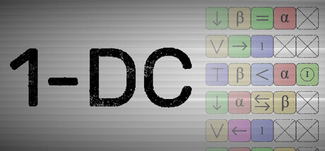
1-DC scored 68/100 on Steam Analyzer — Solid for a Programming capsule. Top priority fix: [contrast_color] Increase saturation of grid button colors or add a gradient background to create stronger value separation against #1b2838 and improve pop at small sizes.

Capsule scores by dimension

  • Genre Clarity: 7/10 — Programming puzzle concept readable. The grid of colored buttons with mathematical/logical symbols (β, =, α, arrows) immediately signals a puzzle or programming game, and the '1-DC' title reinforces an abstract, technical theme. At TINY size, the grid pattern and symbol arrangement still convey 'logic puzzle' or 'programming,' though the specific symbols blur slightly. Genre reads as puzzle/simulation rather than action or narrative-driven.
  • Title Readability: 8/10 — Bold title clear across sizes. The '1-DC' text is rendered in large, bold sans-serif with strong black color against a light gray background, ensuring excellent readability at full, small, and tiny sizes. The title occupies safe left-center positioning away from the grid elements on the right. No decorative font issues or collapse at small scale; the letterforms remain distinct even at thumbnail size.
  • Contrast & Color: 7/10 — Adequate contrast with minor blend. The bold black title contrasts well against the light gray background, and the pastel-colored grid buttons provide visual interest and separation. However, the gray background itself is mid-tone and relatively flat; at TINY size, the overall composition risks appearing slightly washed against the Steam dark background #1b2838. The pastel colors are distinct from each other but lack punch compared to high-saturation genre benchmarks.
  • Uniqueness & Polish: 6/10 — Minimalist but generic aesthetic. The capsule effectively communicates the game's abstract, minimalist programming concept through its grid UI and symbol palette, which aligns with the game's actual design. However, the execution feels more like a functional UI screenshot than a carefully crafted marketing image; the presentation is competent but lacks distinctive visual storytelling or premium polish compared to top-performing simulators. No memorable visual hook or signature art style emerges that would set it apart in a crowded genre.
  • Brand Consistency: 6/10 — Functional but lacks identity cues. The grid interface and symbol set are internally coherent and directly represent the game's core mechanic, creating consistency with the game itself. However, there are no iconic characters, distinctive color motifs, or signature design elements that would allow recognition of '1-DC' specifically in future marketing materials. The minimalist approach is on-brand for the game, but the capsule lacks memorable identity markers.
  • Composition: 7/10 — Clear hierarchy with safe layout. The title occupies the left two-thirds as a strong primary focal point, while the grid interface serves as a secondary visual anchor on the right, creating balanced asymmetry. The layout respects safe margins and avoids edge-hugging, and the title will survive Steam cropping at small sizes. At TINY size, both the title and grid grid remain distinct, though the grid buttons lose individual clarity and read as a texture block rather than distinct interactive elements.

What works

  • Bold, readable title treatment. The '1-DC' title maintains excellent legibility across all size scales with strong black-on-light contrast and clear sans-serif letterforms.
  • Concept immediately communicates genre. The grid of symbols and mathematical operators instantly signal a logic puzzle or programming game, aligning gameplay expectations.
  • Safe, balanced composition. Title and grid are well-separated with no overlap or awkward cropping risks, and spatial hierarchy is clear.

What hurts the capsule

  • Generic background treatment. The flat gray background lacks visual interest and fails to differentiate from typical software UI screenshots; it feels more like a functional capture than a marketing image.
  • Pastel palette lacks saturation impact. The soft, desaturated button colors are readable but fail to pop against the Steam dark background and appear muted compared to genre benchmarks.
  • No distinctive brand identity signals. The capsule is a direct UI screenshot with no memorable character, icon, or signature visual that creates lasting recognition of '1-DC' specifically.
  • Grid loses detail clarity at tiny size. Individual buttons and symbols blur into a texture block at thumbnail resolution, reducing the communicative power of the grid at discovery size.

Priority fixes

  1. [contrast_color] Increase saturation of grid button colors or add a gradient background to create stronger value separation against #1b2838 and improve pop at small sizes.
  2. [uniqueness_polish] Redesign the background with subtle depth cues, gradient lighting, or a thematic visual element that elevates the screenshot from functional UI to marketing asset.
  3. [genre_clarity] Consider simplifying or enlarging key symbols in the grid so that at TINY size the puzzle concept remains visually distinct rather than blurring into texture.
  4. [brand_consistency] Introduce a signature color accent or icon motif that can become a recognizable brand mark across future marketing materials.

Store copy priority fixes

  1. [hook_strength] Restructure the opening: lead with the core appeal (e.g., 'Master an alien programming language to solve impossible puzzles') before disclaimers. Move the programming prerequisite warning to after the hook or integrate it less defensively (e.g., 'Built for programmers and puzzle enthusiasts who love minimalist design').
  2. [feature_communication] Add 1-2 sentence explanations for key terms: define 'commands par' as 'optimize solutions for speed or memory'), clarify 'zach-like' as 'programming puzzle games in the style of Zachtronics,' and explain what the level editor enables ('Create and share custom challenges with expanded variables and higher value ranges').
  3. [uniqueness] Develop the voicelog narrative thread with a concrete detail: explain briefly how the boss's story unfolds through the campaign (e.g., 'Uncover clues about your missing colleague as your boss leaves increasingly desperate voicemails between puzzles') to differentiate this from pure puzzle games.
  4. [audience_targeting] Expand the disclaimer into a confidence signal for the right player: replace the all-caps warning with an invitation like 'Perfect for programmers seeking cerebral puzzles and anyone comfortable thinking in abstract logic and syntax' to convert rather than repel.

Related guides

Steam app ID: 4105760 · Tags: Programming, Simulation, Puzzle, Sandbox, Dark