Scoring genre clarity...
Scoring genre clarity...
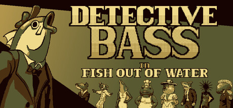
Detective Bass in Fish out of Water scores 73/100 — better than 60% of Detective capsules (n=647).
Positive (10 reviews) · $2.99 · Released Jan 21, 2026 · By Team Grouper
Detective Bass in Fish out of Water scored 73/100 on Steam Analyzer — Good for a Detective capsule. Top priority fix: [composition] Remove or significantly reduce the bottom silhouette row; refocus the composition on the character and title alone to eliminate clutter and strengthen focal hierarchy.
Steam app ID: 4106150 · Tags: Detective, Comedy, Casual, Funny, Cute