Scoring genre clarity...
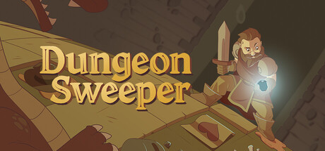
Use logic to defeat enemies in minesweeper-style combat to gain experience, level up, and eventually defeat the Dragon. But watch out! Carefully observe the numbers and enemy patterns to avoid the deadly mines!
$7.99Positive(20)
LogicTraditional RoguelikeRoguelite
Smoketree StudiosMar 11, 2026