Scoring genre clarity...
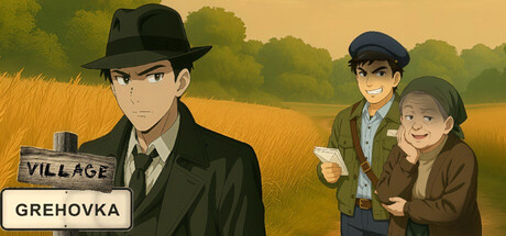
You've come to the village to "recharge." An hour later, you're looking for something you've lost, sniffing incense in a barn, and arguing with people who smile when it suits them. Here, a glance, a pause, and what's under the rug decide everything.
$0.99Positive(13)
CasualVisual NovelDesign & Illustration
TotalJan 11, 2026