Epic Game Maker scores 68/100 — better than 17% of Action capsules (n=8,534).

Quick text summary

Epic Game Maker scored 68/100 on Steam Analyzer — Solid for a Action capsule. Top priority fix: [uniqueness_polish] Introduce a distinctive visual hook—either a memorable character design, striking color accent, or core mechanic visual (e.g., glowing level editor element) that communicates the game's unique selling point and stands out from generic platformer assets.

Capsule scores by dimension

  • Genre Clarity: 8/10 — Platformer sandbox creator clearly signaled. Pixel art style, small character sprite on a platform, visible brick/stone environment, and level editor UI hints all immediately communicate a 2D platformer with creation mechanics. At TINY size, the retro aesthetic and platform silhouette remain instantly recognizable as indie platformer territory, though the exact 'maker' aspect becomes less obvious without the text.
  • Title Readability: 7/10 — Gold serif text readable at all sizes. The 'Epic Game Maker' title uses a warm gold serif font with clear letterforms positioned in the upper portion against a dark brick background, providing good separation. The text remains legible at SMALL size and maintains recognizable letterforms at TINY, though fine serifs blur slightly during extreme reduction. Placement away from noisy textures helps readability significantly.
  • Contrast & Color: 7/10 — Warm gold pops against dark stone. The golden title and yellow 'MAIN' label stand out clearly against the dark gray brick background (#1b2838 context), creating strong value separation. The character sprite and platform elements also read well with their light/medium tones against dark stone, though the mid-tone brick texture creates some visual noise that slightly reduces overall silhouette crispness at TINY size.
  • Uniqueness & Polish: 6/10 — Competent retro aesthetic, generic execution. The pixel art style and level editor theme align well with game content, but the capsule feels like a straightforward asset showcase rather than a distinctive hook or narrative moment. The brick environment is functional but fairly generic platformer territory; there's no memorable character pose, striking visual effect, or core mechanic storytelling that would make this stand out in a crowded indie scene. Craft is solid but lacks the premium polish or unique selling point that would elevate it beyond baseline competence.
  • Brand Consistency: 6/10 — Consistent pixel art, lacks iconic identity. The retro pixel art style is internally cohesive throughout the capsule, and the warm gold/brown/gray palette is consistent with the game's visual theme. However, there are no distinctive brand symbols, memorable character designs, or signature visual motifs that would allow instant recognition of this title later; it relies on genre conventions rather than a unique identity hook.
  • Composition: 7/10 — Balanced layout, clear hierarchy maintained. The title anchors the top, the character and platform occupy the center-left focal area, and the 'MAIN' label sits right-center, creating a natural reading flow without dead zones or equal emphasis competition. The composition maintains readable hierarchy at SMALL and TINY sizes, though the horizontal spread of elements (character left, label right) could risk edge cropping on very narrow viewports. Overall balance is good with the brick background providing stable base framing.

What works

  • Genre immediately clear at all sizes. Pixel art aesthetic, platform silhouette, and character sprite communicate 2D platformer genre unmistakably even at TINY resolution.
  • Strong color contrast against dark background. Warm gold title and yellow accent label pop distinctly against dark stone, ensuring visibility in Steam's dark theme and quick-scroll contexts.
  • Readable title with strategic placement. Gold serif font maintains legibility across FULL to TINY sizes, positioned on a controlled background region away from busy textures.

What hurts the capsule

  • Generic theme with no distinctive hook. The brick platformer environment and level editor concept lack a memorable visual identity or core mechanic storytelling that differentiates it from other indie platformers.
  • Mid-tone brick texture creates visual noise. The stone background, while atmospheric, reduces silhouette crispness and creates competition for attention at TINY size where simplicity is critical.
  • No iconic character or brand symbol. The small player sprite is generic and forgettable, missing an opportunity for a recognizable mascot or visual signature that builds brand recall.

Priority fixes

  1. [uniqueness_polish] Introduce a distinctive visual hook—either a memorable character design, striking color accent, or core mechanic visual (e.g., glowing level editor element) that communicates the game's unique selling point and stands out from generic platformer assets.
  2. [contrast_color] Reduce brick texture detail or add a subtle dark vignette around edges to increase silhouette separation and ensure the character and platforms read as sharp focal points at TINY size.
  3. [brand_consistency] Develop a recognizable brand mascot or iconographic element (character pose, signature color combo, or symbol) that could serve as a consistent identity marker across all marketing materials.

Store copy priority fixes

  1. [hook_strength] Replace '
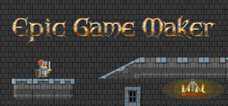
Epic Game Maker is a 2D sandbox platformer' with a verb-forward hook that emphasizes creation or competition, such as 'Build and publish your own 2D platformer levels, then compete with friends to see whose design reigns supreme.'
  2. [uniqueness] Add a 1-2 sentence statement that differentiates this game from competitors, such as a specific design philosophy, art style strength, or game mode that is distinctly featured here.
  3. [feature_communication] Clarify the mission and objective system by adding a sentence like 'Choose your objective when designing: defeat all enemies, reach the exit, collect items, or survive for a set time.'
  4. [tone_match] Remove or rephrase patronizing language like 'it's simple' and replace with confidence-building language that matches the creative and competitive tone, such as 'Creating levels is intuitive, so you can focus on design.'

Related guides

Steam app ID: 4110880 · Tags: Action, Arcade, Sandbox, Platformer, 2D Platformer