Scoring genre clarity...
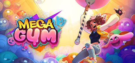
MegaGum capsule

MegaGum

Play as Uja in this colorful 3D action-platformer set inside the twisted candy empire of Mister Gum, where chewing gum powers the world. Run on walls, glide across deadly factory floors, fight bizarre living Gummies, and uncover the dark secrets hidden inside the gigantic GUM Tower.

Adventure3D PlatformerThird Person
N-Zone, FrostyFroggs, Chibi Phoenix2027

MegaGum scores 80/100 — better than 93% of Adventure capsules (n=8,231).

Released 2027 · By N-Zone

Quick text summary

MegaGum scored 80/100 on Steam Analyzer — Good for a Adventure capsule. Top priority fix: [genre_clarity] Add a subtle visual cue to the character or background that hints at a signature mechanic (e.g., gum-trail effect, wall-surface hint) to strengthen immediate genre identification.

Capsule scores by dimension

  • Genre Clarity: 8/10 — Colorful action platformer clearly read. The character pose, vibrant candy-themed environment, and dynamic energy clearly signal an action-platformer game with fantastical/whimsical setting. At TINY size, the bright character silhouette and candy aesthetic remain distinctive and readable, though specific mechanics (wall-run, gum powers) are not visually obvious from the capsule alone.
  • Title Readability: 9/10 — Bold pink title stands out excellently. The MEGA GUM title uses large, high-contrast yellow and pink lettering with strong outline definition that remains legible even at TINY size. The playful bubble-gum style font matches the theme perfectly and sits on a controlled dark background region, preventing text-to-texture collision.
  • Contrast & Color: 8/10 — Strong value separation with vibrant neon. The capsule employs a dark purple-blue background that creates excellent contrast with the bright character (coral/pink tones) and neon yellow title text. At SMALL and TINY sizes, the character silhouette and title remain clearly separated from background, though some mid-tone candy elements in the right side lose minor definition in grayscale.
  • Uniqueness & Polish: 8/10 — Distinctive candy-world aesthetic with polish. The character design (Uja with braided pink/coral hair, expressive face) and candy-factory theming feel cohesive and crafted rather than generic. The visual storytelling immediately communicates a playful, stylized adventure world distinct from typical action-platformers, with clean 3D rendering and intentional color grading that avoids looking like a template asset.
  • Brand Consistency: 7/10 — Consistent color palette with character focus. The warm coral/pink character palette, neon yellow accents, and purple-blue background establish a recognizable identity. The character Uja serves as a clear brand anchor, and the color scheme appears consistent based on the genre-matching description, though without access to the 18 screenshots, subtle consistency with broader campaign materials cannot be fully verified.
  • Composition: 8/10 — Clear focal point with balanced layering. The character (Uja) occupies the left-center as the primary focal point with strong eye-contact and pose that draws attention. The title (MEGA GUM) and decorative gum/candy elements frame the upper-right, creating depth and hierarchy without competing for focus; safe margins appear appropriate and elements are unlikely to be cropped by Steam display variations.

What works

  • High-contrast title legibility. Bold yellow and pink MEGA GUM text remains fully readable at TINY size with clean outline and proper spacing.
  • Character-driven focal point. Uja's expressive face and distinctive braided-hair silhouette immediately convey personality and anchor the capsule design.
  • Thematic cohesion and visual appeal. Candy-factory aesthetic, neon color grading, and playful tone align perfectly with the game's core concept and feel premium.
  • Value separation on dark background. Dark purple-blue background ensures character, title, and accent elements pop clearly without muddy mid-tones.

What hurts the capsule

  • Right-side decorative clutter. Candy and gum elements in the upper-right, while thematic, add visual noise that could be simplified for stronger clarity at SMALL sizes.
  • Limited mechanic communication. The capsule does not visually hint at core gameplay mechanics (wall-running, gum powers, factory combat) that differentiate this platformer from competitors.
  • Moderate generic risk. While distinctive, the whimsical candy-world theme could overlap with other indie platformers; character alone carries most uniqueness weight.

Priority fixes

  1. [genre_clarity] Add a subtle visual cue to the character or background that hints at a signature mechanic (e.g., gum-trail effect, wall-surface hint) to strengthen immediate genre identification.
  2. [composition] Reduce or consolidate right-side decorative candy elements into tighter grouping to minimize visual competition and strengthen focal hierarchy at SMALL size.
  3. [uniqueness_polish] Consider adding a signature brand symbol or UI element that reinforces the 'GUM Tower' identity and makes the capsule more instantly memorable across marketing materials.

Store copy priority fixes

  1. [uniqueness] Add one sentence explaining how the gum-powered ability system or environmental manipulation creates a distinct gameplay loop compared to standard 3D platformers.
  2. [audience_targeting] Specify whether the co-op is designed for casual family gaming or requires coordination skill, and note recommended player type (e.g., 'perfect for couch co-op with friends' vs. 'demanding asymmetrical challenges').
  3. [feature_communication] Briefly clarify the difficulty curve and whether the game rewards speedrunning, exploration, or both, to help platformer-savvy players assess fit.

Related guides

Steam app ID: 4111300 · Tags: Adventure, 3D Platformer, Third Person, Action, Colorful