Scoring genre clarity...
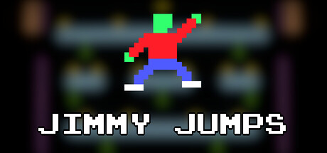
Get your initials on the leaderboards and strive to be the best Jimmy in the world! Jimmy Jumps is a retro arcade platformer built for competitors. With 90 levels and leaderboards for each one, Jimmy Jumps delivers the simplicity of classic platformers and the obsessive replayability of speedrunning
$4.99Positive(12)
2D PlatformerRetroCasual
Gray Goat GamingMar 17, 2026