Scoring genre clarity...

CGA Trek capsule

CGA Trek

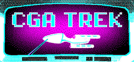
Cyan Alert! Set your eyeballs on stunned because it's time for CGA Trek! Your continuing mission is to seek out and destroy an invading fleet of warships in this modern homage to the classic turn-based strategy "Trek" game that originated on mainframe computers in the 1970s.

$3.999 user reviews
StrategyTurn-Based TacticsColorful
Classyk GamesNov 6, 2025

CGA Trek scores 80/100 — better than 92% of Strategy capsules (n=5,103).

9 user reviews · $3.99 · Released Nov 6, 2025 · By Classyk Games

Quick text summary

CGA Trek scored 80/100 on Steam Analyzer — Good for a Strategy capsule. Top priority fix: [title_readability] Remove or enlarge the small tagline text at bottom to prevent visual clutter and improve focus at small sizes

Capsule scores by dimension

  • Genre Clarity: 7/10 — Retro strategy game evident. The spaceship silhouette and cyan-on-magenta color scheme immediately signal a retro sci-fi strategy aesthetic, consistent with the mainframe Trek heritage. At TINY size, the ship icon remains recognizable and the neon aesthetic conveys arcade/strategy gameplay. However, the exact subgenre (turn-based space strategy) is not immediately obvious without prior knowledge; a player might guess action-arcade first.
  • Title Readability: 8/10 — Bold title, excellent contrast. The title 'CGA TREK' uses a thick, blocky sans-serif font in bright cyan with magenta backing that creates strong value separation against the dark Steam background. At SMALL and TINY sizes the letterforms remain legible and the cyan neon glow effect aids recognition. The title placement in the upper half is strategic and avoids noisy texture interference.
  • Contrast & Color: 9/10 — Striking neon pop, excellent silhouette. Bright cyan and magenta create vivid value contrast against the #1b2838 Steam background, with the glowing neon effect amplifying separation. The spaceship silhouette reads clearly even at TINY size due to sharp cyan outline against magenta fill. The grayscale test confirms strong light-dark separation; no muddy midtones or subject blending.
  • Uniqueness & Polish: 8/10 — Nostalgic retro polish, distinctive. The CGA-era color palette and deliberate pixelated/scanline aesthetic create a cohesive visual identity that stands apart from generic sci-fi strategy capsules. The neon glow effects and retro typography feel intentional and premium rather than cheap, communicating the game's core design philosophy clearly. This is a strong thematic hook that signals indie craft rather than generic asset assembly.
  • Brand Consistency: 8/10 — Strong retro identity, memorable. The cyan-magenta-black palette and CGA aesthetic create an iconic, immediately recognizable identity that would carry across marketing materials and store screenshots. The spaceship icon and neon typography style are distinctive enough to be recalled later. The retro mainframe strategy theme is coherent throughout; no mixed messaging or inconsistent art direction.
  • Composition: 8/10 — Clean hierarchy, balanced focal point. The title dominates the upper two-thirds with the spaceship icon positioned as a secondary focal point in the center-right, creating clear visual hierarchy. At SMALL size the composition remains readable with no clutter; the scanline effects add texture without overwhelming. Safe margins are respected and no critical elements sit on crop-vulnerable edges.

What works

  • Vibrant neon contrast. Cyan and magenta colors pop dramatically against the Steam dark background, ensuring high visibility in quick scroll.
  • Cohesive retro aesthetic. The CGA-era palette, scanline texture, and neon glow create a memorable, distinctive brand identity tied directly to the game's core theme.
  • Clear legible typography. The title font is bold and readable at all sizes, with strong outline contrast ensuring no letter collapse at TINY.
  • Strong focal hierarchy. Title and ship icon work together with clear primary-secondary balance; no competing elements fight for attention.

What hurts the capsule

  • Genre ambiguity at glance. Without the spaceship icon and context, the neon aesthetic alone could suggest action arcade rather than turn-based strategy.
  • Tagline unreadable at small size. The small text at the bottom (likely 'STILL BUILDING' or similar) is illegible at TINY size and adds visual noise without benefit.

Priority fixes

  1. [title_readability] Remove or enlarge the small tagline text at bottom to prevent visual clutter and improve focus at small sizes
  2. [composition] Verify the spaceship icon remains within safe crop margins on all edges to prevent loss of key focal element

Store copy priority fixes

  1. [feature_communication] Move or expand the 'Your very own starship' section to describe core turn-based mechanics: explain how combat works, what resources/energy systems matter, and what the player decides each turn (e.g., 'Manage shield strength, target enemy ships, navigate the grid, and plan away missions').
  2. [hook_strength] Rewrite the opening to lead with the core strategic hook: 'Command a starship in real-time sectors filled with alien fleets and lost planets. Manage energy, engage in turn-based combat, and explore an 8x8 grid universe—a faithful, modern reimagining of the legendary 1970s Trek game.'
  3. [audience_targeting] Add a 1–2 sentence pitch that explicitly names the intended player: 'Perfect for fans of turn-based tactics and retro computing aesthetics who want a bite-sized strategy game' or similar.
  4. [feature_communication] Trim the History section to 1–2 paragraphs maximum and move it to the end or to a separate 'About' section; prioritize explaining gameplay in the Introduction and Features.

Related guides

  • Steam page optimisationCapsule, copy, screenshots, tags — the full Steam page conversion stack.
  • Steam tags guideTag selection, ordering, and how it shapes Steam's recommendation rails.

Steam app ID: 4118300 · Tags: Strategy, Turn-Based Tactics, Colorful, Minimalist, Retro