Uktena 64 - Ultimate scores 68/100 — better than 20% of Hunting capsules (n=132).

Quick text summary

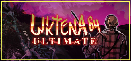
Uktena 64 - Ultimate scored 68/100 on Steam Analyzer — Solid for a Hunting capsule. Top priority fix: [uniqueness_polish] Introduce a distinctive character or iconographic element that reads recognizably at small size and signals Uktena 64's specific horror-comedy tone beyond generic dark imagery.

Capsule scores by dimension

  • Genre Clarity: 7/10 — Horror comedy with retro vibes clear. The dark purple gradient, skull imagery on the right, and grotesque character silhouettes signal horror-comedy tone effectively. The N64-style pixelated aesthetic is visible in the character rendering and contributes to genre recognition, though at tiny size the retro angle becomes harder to parse and reads more as generic dark action rather than specifically nostalgic horror-comedy.
  • Title Readability: 8/10 — Bold gold title highly legible. UKTENA 64 in large yellow-gold lettering with dark outline reads clearly at all sizes, including tiny thumbnails where the stroke weight maintains definition. ULTIMATE in smaller text below remains readable at small size but starts to blur at tiny scale, creating minor hierarchy clarity issues at the smallest viewing condition.
  • Contrast & Color: 7/10 — Strong purple-gold pop against dark. The vibrant magenta-purple gradient background provides excellent value separation against the Steam dark background, and the golden title pops distinctly through both full and small viewing. At tiny size, the gold-on-purple maintains silhouette clarity, though character details on the right side begin to muddy together in grayscale and lose edge definition.
  • Uniqueness & Polish: 6/10 — Competent horror aesthetic generic execution. The capsule uses familiar dark comedy horror visual language—skulls, purple tones, menacing silhouettes—but executes it in a straightforward, template-adjacent manner without a distinctive visual hook or memorable art direction. The N64 retro angle is thematic but not leveraged strongly enough in the capsule design itself to feel premium or standout compared to top indie peers like Buckshot Roulette or DREDGE.
  • Brand Consistency: 6/10 — Adequate but underdeveloped visual identity. Internal cohesion is present through consistent purple palette and horror theme, but there are no iconic character motifs, signature symbols, or distinctive rendering style that would make this capsule recognizable as distinctly Uktena 64 in isolation. Without access to screenshot brand language confirmation, the capsule reads as a generic dark-comedy-horror entry rather than a branded experience.
  • Composition: 7/10 — Balanced layout with clear focal hierarchy. The title anchors center-left with strong visual weight, while character silhouettes on the right create depth and secondary focal interest. Layout respects safe margins and avoids edge clipping, though at tiny size the right-side figures compress and lose definition, reducing the compositional impact that relies on mid-ground detail separation.

What works

  • Gold title contrast and legibility. The yellow-gold UKTENA 64 text with dark outline maintains readability across full, small, and tiny sizes with excellent pop against the purple background.
  • Purple gradient color choice. The vibrant magenta-purple background creates strong separation against Steam's dark interface and supports the horror-comedy tone effectively.
  • Balanced composition with depth. Title left-center and character elements right-side create natural eye flow and layered focal hierarchy without clutter.

What hurts the capsule

  • Generic horror-comedy visual language. The skull, purple tones, and menacing silhouettes feel like familiar indie horror tropes rather than a distinctive brand identity or unique selling visual.
  • Character detail loss at tiny size. Right-side character silhouettes collapse into muddy shapes at thumbnail scale, reducing compositional depth impact and genre clarity.
  • ULTIMATE tagline readability weakness. The smaller ULTIMATE text becomes difficult to parse at tiny size, creating secondary hierarchy clarity problems.

Priority fixes

  1. [uniqueness_polish] Introduce a distinctive character or iconographic element that reads recognizably at small size and signals Uktena 64's specific horror-comedy tone beyond generic dark imagery.
  2. [composition] Increase character silhouette contrast or simplify shapes on the right side to maintain readable depth at tiny thumbnail scale without muddy mid-tone collapse.
  3. [brand_consistency] Develop a signature color accent or motif (beyond purple-gold) that appears consistently across store pages and creates immediate recognition of the Uktena 64 brand.

Store copy priority fixes

  1. [hook_strength] Replace the opening line with 'Hunt diseased creatures and photograph their mutations—or use their meat for your failing BBQ restaurant—in this absurd dark comedy hunting game.' This leads with the unique premise and gameplay verb rather than generic descriptor.
  2. [feature_communication] Expand the photography mechanic: add a sentence like 'Document strange bodily corruptions as evidence, or destroy the bodies to hide your crimes' to clarify the mechanic's purpose and divergence between campaigns.
  3. [audience_targeting] Add explicit audience signal such as 'Perfect for players who loved Dread X Collection 4, fans of dark comedy over jump scares, and those craving retro low-poly nostalgia with a twisted edge.'

Related guides

Steam app ID: 4121400 · Tags: Hunting, Dark Comedy, Simulation, Atmospheric, First-Person