Scoring genre clarity...

Silent Road capsule

Silent Road

Drive through Japan’s most haunted forests in your night-shift taxi. Pick up strange passengers, fulfill their unsettling requests and follow the silent road as their stories make each ride darker than the last.

AdventurePsychological HorrorHorror
EndflameComing soon

Silent Road scores 72/100 — better than 47% of Adventure capsules (n=8,253).

Released Coming soon · By Endflame

Quick text summary

Silent Road scored 72/100 on Steam Analyzer — Good for a Adventure capsule. Top priority fix: [title_readability] Remove or enlarge the Japanese subtitle to maintain legibility at small and tiny sizes, or relocate it outside the primary focal area to reduce visual clutter.

Capsule scores by dimension

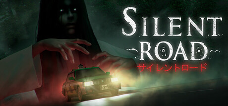
  • Genre Clarity: 7/10 — Horror-adjacent mystery clear. The spectral figure silhouette and car headlights strongly signal supernatural taxi horror, positioning this as a unique narrative adventure with dread elements. At tiny size, the ghostly face and vehicle are still readable, though the specific 'haunted taxi' hook becomes more ambiguous without the text—the genre reads as horror-mystery rather than pure adventure.
  • Title Readability: 8/10 — Strong English, Japanese secondary. SILENT ROAD in large white serif caps is highly legible across all sizes, with excellent contrast against the dark teal background and clear separation from the spectral imagery. The Japanese subtitle below is smaller but readable at full size; at tiny size it becomes illegible but the main title remains crisp and scannable, supporting quick recognition.
  • Contrast & Color: 8/10 — Strong dark-light silhouette. The white title and warm yellow-orange car headlights pop decisively against the dark teal-green mist background, creating clear value separation and immediate visual focus. The ghostly figure's pale face and red-hands against the dark establish silhouette hierarchy; at tiny size the contrast holds well, though fine details like the spirit's features soften slightly.
  • Uniqueness & Polish: 7/10 — Distinctive horror taxi premise. The concept of a haunted taxi with passenger narrative fuses supernatural horror and driving mechanics in a visually cohesive way that stands apart from generic ghost stories. The spectral imagery and headlight composition feel intentional rather than templated; however, the execution relies on familiar horror tropes (ghostly figure, atmospheric mist) rather than a signature visual style that screams premium craft.
  • Brand Consistency: 6/10 — Cohesive but not iconic. The dark teal palette, soft-focus spirit aesthetic, and taxi-road framing create internal visual consistency that aligns with the story premise. Without access to the store screenshots, this capsule reads as thematically unified but lacks a distinctive brand motif or recurring visual signature that would make Silent Road immediately recognizable at a glance across marketing materials.
  • Composition: 7/10 — Clear focal hierarchy, safe layout. The ghostly face commands the upper-left quadrant as primary focal point, the car and headlights anchor the lower-right in supporting depth, and the title sits cleanly in the right third with safe margins from edges. The layering (spirit–mist–car–road) creates readable depth; at small size all elements retain their purpose, though the spirit's fine facial detail becomes slightly muddied.

What works

  • High-contrast title placement. White SILENT ROAD text in serif caps commands attention against dark background and remains crisp and legible at tiny thumbnail size.
  • Thematic visual cohesion. The spectral figure, taxi headlights, and misty atmosphere work together to clearly communicate a supernatural driving-horror experience without confusion.
  • Effective depth layering. Spirit–mist–vehicle–road composition guides the eye naturally and maintains clear focal hierarchy across all viewing sizes.

What hurts the capsule

  • Japanese subtitle illegibility at small size. The small red Japanese text below the main title becomes unreadable at small and tiny sizes, adding visual noise without payoff.
  • Generic spectral imagery. The ghostly pale face and misty lighting rely on familiar horror conventions rather than a distinctive visual signature that would make the brand memorable.
  • Soft focus details in spirit face. Fine facial features of the spectral figure soften and blur at tiny size, reducing the impact of the primary subject and making the silhouette less striking.

Priority fixes

  1. [title_readability] Remove or enlarge the Japanese subtitle to maintain legibility at small and tiny sizes, or relocate it outside the primary focal area to reduce visual clutter.
  2. [genre_clarity] Add a more distinctive visual hook or color accent (e.g., a glowing rune, unique spirit design, or signature taxi detail) to help Silent Road stand out from generic supernatural horror in a crowded indie market.
  3. [contrast_color] Increase the saturation and definition of the spirit figure's silhouette or add a subtle outline to ensure the primary subject remains crisp and striking at thumbnail size.

Store copy priority fixes

  1. [feature_communication] Expand the detailed description to include a sentence on player agency: do choices matter? Are there multiple endings or passenger outcomes based on player decisions?
  2. [feature_communication] Add concrete examples of 'Unsettling Requests' (e.g., 'help repair a broken-down shrine,' 'search for a lost heirloom') to clarify the scope of interactions beyond driving.
  3. [audience_targeting] Add a line clarifying that this is a single-sitting or short-form narrative experience (if applicable) to set correct playtime expectations.
  4. [uniqueness] Add one sentence emphasizing what separates this from other taxi-based games or Japanese horror titles, e.g., 'Every passenger alters the fabric of your routes and reality.'

Related guides

Steam app ID: 4124320 · Tags: Adventure, Psychological Horror, Horror, Dark, Driving