Scoring genre clarity...

Paradise Falls capsule

Paradise Falls

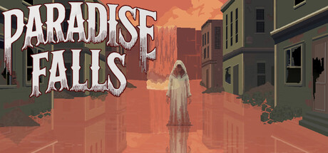
Manage escalating anxiety and play as multiple characters in Paradise Falls, a classic verb-coin adventure. Listen to the voices, commit acts of violence, and wash the blood from your knife to return to normal in a shifting reality. Can you uncover the town's dark secrets?

$6.99Positive(11)
Point & Click2DPsychological Horror
L GoatFeb 18, 2026

Paradise Falls scores 73/100 — better than 54% of Point & Click capsules (n=1,681).

Positive (11 reviews) · $6.99 · Released Feb 18, 2026 · By L Goat

Quick text summary

Paradise Falls scored 73/100 on Steam Analyzer — Good for a Point & Click capsule. Top priority fix: [uniqueness_polish] Introduce a distinctive visual hook or unique character design element that differentiates Paradise Falls from other atmospheric indie adventures in visual memory.

Capsule scores by dimension

  • Genre Clarity: 7/10 — Atmospheric indie adventure with mystery. The capsule communicates a psychological/horror-tinged adventure through the ghostly white figure in a decaying town center, warm apocalyptic lighting, and surreal architecture. At TINY size, the central figure silhouette and desolate setting remain readable, though the specific genre (psychological horror adventure) requires inference rather than immediate clarity. The visual mood is distinctive but genre signals are atmospheric rather than mechanical.
  • Title Readability: 8/10 — Large bold title, excellent contrast. PARADISE FALLS uses chunky white serif lettering with clean black outlines positioned in the upper portion against warm orange sky, ensuring strong legibility at all sizes including TINY. The letterforms are bold and well-spaced without decorative collapse. At small size the title remains crisp and immediately recognizable without any tagline clutter.
  • Contrast & Color: 8/10 — Strong warm-cool atmospheric separation. Warm orange-red gradient sky contrasts effectively against cool gray-green building silhouettes and the pale white central figure, creating clear value separation at all viewing sizes. The silhouette of the ghostly character and architectural forms read cleanly in grayscale due to distinct tonal layering. Even at TINY size, the figure stands apart from the background through luminosity and position.
  • Uniqueness & Polish: 7/10 — Cohesive surreal aesthetic, light on distinctiveness. The capsule presents polished pixel art with consistent rendering, layered depth, and intentional color grading that conveys mood and narrative unease. However, the visual approach—desolate town, isolated figure, warm apocalyptic lighting—aligns closely with other indie psychological adventures (comparable to DREDGE or Slay the Princess), limiting standalone distinctiveness. The craft is solid but the core visual hook is familiar within the genre.
  • Brand Consistency: 6/10 — Consistent pixel art style, generic symbolic. The capsule maintains unified pixel art rendering and warm color palette that likely matches game screenshots, establishing internal coherence. However, there are no distinctive character designs, iconic symbols, or signature visual motifs that create a memorable brand identity specific to Paradise Falls. The ghostly figure and town are archetypal rather than uniquely recognizable as this game's signature look.
  • Composition: 8/10 — Clear hierarchy with centered focal point. The white ghostly figure is positioned as a strong central focus, with symmetrical architecture creating balanced framing and clear depth layers (foreground figure, midground buildings, background sky gradient). Title placement at top left does not interfere with the primary subject. At SMALL and TINY sizes, the composition remains unambiguous with the figure as the undeniable anchor, though the extreme center placement risks slight monotony.

What works

  • Title legibility across all sizes. Bold outlined white text reads clearly at FULL, SMALL, and TINY sizes with no letterform collapse or contrast loss against warm background.
  • Atmospheric value separation. Warm-to-cool tonal contrast between sky, buildings, and figure creates immediate visual hierarchy and silhouette clarity even at thumbnail scale.
  • Polished pixel art rendering. Consistent art style and layered depth (foreground, midground, background) feel intentional and craft-forward rather than asset-based or template-like.

What hurts the capsule

  • Generic visual archetype. The desolate town, lone ghostly figure, and apocalyptic atmosphere are familiar tropes in indie horror-adventure that don't immediately distinguish this game from competitors like DREDGE or Slay the Princess.
  • Lack of iconic brand signals. No distinctive character, symbol, logo, or signature visual motif that would make Paradise Falls instantly recognizable in a lineup of similar indie games.
  • Center-focused composition risk. The centered figure and symmetrical layout, while balanced, offer minimal compositional surprise or tension that might elevate it above competent baseline.

Priority fixes

  1. [uniqueness_polish] Introduce a distinctive visual hook or unique character design element that differentiates Paradise Falls from other atmospheric indie adventures in visual memory.
  2. [brand_consistency] Develop or emphasize a signature visual motif (distinctive symbol, color accent, or character quirk) that becomes recognizable across all promotional materials.
  3. [composition] Consider asymmetrical or off-center framing that adds compositional tension while maintaining clarity at TINY size to increase visual memorability.

Store copy priority fixes

  1. [feature_communication] Restructure the detailed description to lead with gameplay (verb-coin, anxiety mechanic, multi-character play) before diving into Dennis's backstory—move the 'Key Features' section earlier or add a one-sentence gameplay summary in the opening paragraph.
  2. [uniqueness] Add a comparative phrase to the short description such as 'where your conscience is the puzzle' or 'combines Lovecraftian mystery with intimate psychological horror' to strengthen differentiation from other point-and-click horror games.
  3. [genre_clarity] Fix the 'Paradise Fall' → 'Paradise Falls' inconsistency in the detailed description's opening line to reinforce brand clarity.

Related guides

Steam app ID: 4125050 · Tags: Point & Click, 2D, Psychological Horror, Story Rich, Pixel Graphics