Scoring genre clarity...

Pixel Game Maker Series Stray Witch and the Ghost Train capsule

Pixel Game Maker Series Stray Witch and the Ghost Train

A witch who has lost her memory boards a train in an unfamiliar world and travels to recover her memories.

$8.991 user reviews
ActionAdventureCasual
KIMAMASEISAKUSYONov 26, 2025

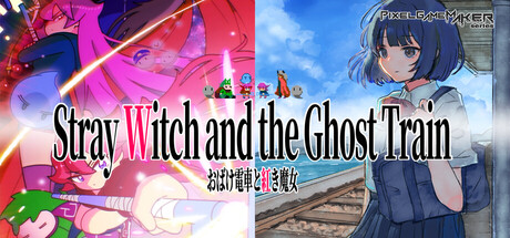
Pixel Game Maker Series Stray Witch and the Ghost Train scores 60/100 — better than 0% of Action capsules (n=8,535).

1 user reviews · $8.99 · Released Nov 26, 2025 · By KIMAMASEISAKUSYO

Quick text summary

Pixel Game Maker Series Stray Witch and the Ghost Train scored 60/100 on Steam Analyzer — Solid for a Action capsule. Top priority fix: [title_readability] Enlarge and reposition title to a cleaner background region (solid bar or character shadow area) and reduce to single line or use bold weight to maintain legibility at TINY size.

Capsule scores by dimension

  • Genre Clarity: 7/10 — Anime adventure with magical elements clear. The capsule communicates a magical girl or witch-themed action-adventure through the anime character on the right, colorful magical effects on the left, and the ghost train setting. At TINY size, the character silhouette and vibrant magical aura remain readable, though the specific 'witch' identity requires the title. The magical energy and anime art style successfully signal action-adventure-casual gameplay without ambiguity.
  • Title Readability: 6/10 — Title readable at full but compromised small. At full size, 'Stray Witch and the Ghost Train' is clearly legible with good contrast against the mixed background, though the white text competes with bright magical effects. At SMALL size (231×87), the title remains mostly readable but begins to feel cramped. At TINY size (120×45), the text degrades significantly and becomes difficult to parse quickly, with the two-line layout collapsing into blur. The Japanese subtitle below is unreadable at all reduced sizes.
  • Contrast & Color: 7/10 — Strong local contrast but uneven overall. The right side featuring the character against the blue-white sky and the left side with magenta-pink-orange magical effects both have good value separation. Against the dark Steam background #1b2838, these colors pop well. However, the central title area suffers from white text over medium-bright mixed tones, reducing clarity. The grayscale test shows adequate silhouette separation for the character but the magical effects read as muddy mid-tone texture rather than crisp contrast.
  • Uniqueness & Polish: 5/10 — Competent anime art, generic composition. The character illustration on the right is well-drawn and shows solid anime craft with good detail and shading. However, the overall composition feels like a standard anime game capsule template—split between character and magical effects with no distinctive storytelling hook or unique visual idea. The capsule communicates 'anime game' but not specifically why this witch's story or train mechanic matters. It lacks a memorable visual hook that would distinguish it from other anime-action titles.
  • Brand Consistency: 5/10 — Clean anime style but no iconic identity. The internal rendering style is consistent—anime character, magical particle effects, and a cohesive color palette of purples, blues, and warm oranges. However, there are no distinctive brand identity cues like a signature character pose, iconic motif, or recognizable symbol that would make this capsule identifiable as specifically this game later. The witch character is generically rendered without standout personality markers that would create brand memory.
  • Composition: 6/10 — Balanced layout but weak focal hierarchy. The composition splits the frame roughly in half: magical effects on left, character on right, with the title overlaid centrally. At full size this is balanced, but at SMALL and TINY sizes, neither element dominates clearly enough to create a strong focal point—the eye is pulled in two directions equally. The title placement over bright effects creates reading interference. The background gradient and train elements in the character area are secondary but not clearly layered; depth hierarchy is weak.

What works

  • Character illustration quality. The anime character on the right is well-rendered with good detail, shading, and appeal that attracts attention and reads at small sizes.
  • Color saturation and vibrancy. The magenta, orange, and blue color palette is rich and saturated, creating visual appeal and popping against the dark Steam background at all sizes.
  • Magical effects communicate genre. The particle effects and glowing aura on the left immediately signal action and fantasy without requiring text.

What hurts the capsule

  • Title readability collapses at tiny size. The two-line title becomes blurred and illegible at TINY (120×45), severely hurting discoverability in store browsing.
  • Weak focal hierarchy at reduced sizes. The character and effects carry equal visual weight, creating no clear primary focal point when the capsule shrinks.
  • Generic anime game composition. The split character-and-effects layout is a common template across anime titles, lacking distinctive visual storytelling or a unique hook.
  • Title placement over busy background. White text overlaying the bright magical effects creates contrast interference, reducing legibility especially at smaller sizes.

Priority fixes

  1. [title_readability] Enlarge and reposition title to a cleaner background region (solid bar or character shadow area) and reduce to single line or use bold weight to maintain legibility at TINY size.
  2. [composition] Establish clearer focal hierarchy by darkening or simplifying the left magical effect area and drawing more attention to the character as the primary subject at all sizes.
  3. [uniqueness_polish] Add a distinctive visual element (e.g., unique train design, signature witch motif, or memory-recovery visual metaphor) to communicate the specific story hook and differentiate from generic anime titles.
  4. [genre_clarity] Increase the train element's prominence in the composition to reinforce the 'Ghost Train' core mechanic as part of the brand identity.

Store copy priority fixes

  1. [hook_strength] Rewrite the short description to lead with a gameplay hook: e.g., 'Cast magic, defeat monsters, and uncover the truth—a witch's memory-stealing journey aboard a mysterious ghost train' rather than pure plot summary.
  2. [uniqueness] Add a sentence in the overview explaining what the soul economy or ghost interaction system uniquely enables compared to standard action games, or highlight a specific mechanic that differentiates this from other pixel platformers.
  3. [tone_match] Move the technical controls section (F1, Alt+F4) to a separate 'Settings' or 'Support' area, or reframe it conversationally to preserve narrative immersion.
  4. [feature_communication] Include one concrete gameplay example or progression milestone (e.g., 'Collect 50 souls to unlock a new fire spell') to help players envision how systems reward effort.

Related guides

Steam app ID: 4125970 · Tags: Action, Adventure, Casual, Action-Adventure, Arcade