Scoring genre clarity...
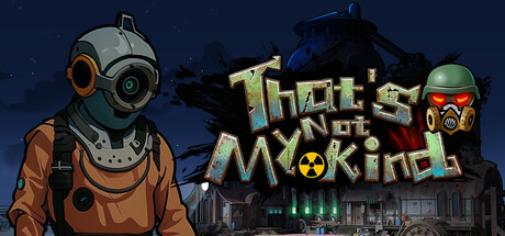
The year is 2155. As an officer of the Mutant Detection Unit, you stand guard at humanity’s last safe zones after a global nuclear catastrophe. Inspect, question, and decide who’s human—because one mistake could doom them all.
$2.991 user reviews
Outbreak SimZombiesPost-apocalyptic
LunarkGamesNov 13, 2025