Scoring genre clarity...

My Otter Friends capsule

My Otter Friends

Explore a flooded island as a small otter. Meet stranded animals, restore nature, and bring warmth back to a world that has grown quiet.

AdventureAction-AdventureInteractive Fiction
PolygoatTo be announced

My Otter Friends scores 78/100 — better than 89% of Adventure capsules (n=8,313).

Released To be announced · By Polygoat

Quick text summary

My Otter Friends scored 78/100 on Steam Analyzer — Good for a Adventure capsule. Top priority fix: [uniqueness_polish] Add subtle visual storytelling cue—such as a wilted plant, a stranded companion animal, or a restoration element—to communicate the core 'restore nature' mechanic at a glance.

Capsule scores by dimension

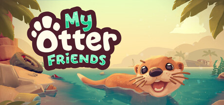
  • Genre Clarity: 8/10 — Clear cozy exploration adventure. The cheerful otter character, tropical beach setting with water, and warm pastel palette immediately signal a family-friendly adventure game with exploration and nature themes. At tiny size, the distinctive otter silhouette and bright colors still read as a relaxing, approachable indie title rather than action or combat-focused gameplay.
  • Title Readability: 9/10 — Excellent legibility at all sizes. The title uses a bold, rounded sans-serif with strong cyan and magenta contrast against the pale background, maintaining excellent readability from full size down to tiny thumbnail. The paw icon and word spacing create clear visual rhythm that doesn't collapse under squint or at small scale, and the tagline is completely absent, avoiding clutter.
  • Contrast & Color: 8/10 — Strong warm palette separation. Warm peachy-tan background with bright cyan text and orange otter create excellent value separation against Steam's dark background #1b2838. The otter's orange body has clear silhouette definition, and the cyan 'FRIENDS' text pops distinctly; in grayscale the composition would still read due to distinct midtone and highlight layers.
  • Uniqueness & Polish: 7/10 — Polished but gentle indie style. The capsule demonstrates solid 3D character modeling and environment rendering with a cohesive illustrative aesthetic that matches top indie adventure titles like Venba and Harold Halibut. The happy otter expression and vacation-resort framing communicate warmth and adventure, though the 'stranded animals restoration' core mechanic isn't visually implied—it relies on script rather than visual storytelling.
  • Brand Consistency: 7/10 — Coherent cute adventure identity. The paw logo, rounded typography, pastel-warm color scheme, and cheerful otter character create a recognizable brand voice consistent with cozy indie games. The style feels intentional and coordinated, though without access to the 8 screenshots it is difficult to assess whether iconic motifs or signature visual elements appear across all marketing materials to create true brand recall.
  • Composition: 8/10 — Balanced focal point with breathing room. The otter character anchors the center-right as the primary focal point with clear foreground-midground-background depth, while the title sits safely in the upper left with adequate margin. The composition maintains visual balance without edge hugging or dead zones, and the design remains readable and appealing when cropped to small and tiny sizes without losing the otter or title legibility.

What works

  • Bold, readable title design. Cyan and magenta text with strong contrast and rounded letterforms hold legibility even at tiny thumbnail size without decorative loss.
  • Warm, cohesive color palette. Peachy-tan backgrounds, orange character, and cyan accents create a distinct warm mood that separates cleanly from Steam's dark interface.
  • Clear primary focal point. The happy otter character is positioned as an obvious anchor with balanced negative space, avoiding visual clutter or competing elements.
  • Genre-appropriate art style. Soft 3D rendering and whimsical character design signal indie adventure and cozy exploration clearly at all viewing scales.

What hurts the capsule

  • Mechanic ambiguity in visuals. The capsule shows a happy vacation scene but doesn't visually communicate the 'restore nature' or 'stranded animals' core mechanics, relying on text rather than visual storytelling.
  • Generic tropical setting. While appealing, the beach and water environment are common in cozy games and don't establish a distinctive or memorable sense of place without additional visual hooks.
  • Limited identity markers. The paw logo is the only potential recurring brand symbol, and without iconic motifs or signature visual patterns, the capsule may lack immediate recognition on subsequent views.

Priority fixes

  1. [uniqueness_polish] Add subtle visual storytelling cue—such as a wilted plant, a stranded companion animal, or a restoration element—to communicate the core 'restore nature' mechanic at a glance.
  2. [brand_consistency] Establish and prominently feature a distinctive icon or motif (e.g., a unique paw variant, glowing restore effect, or character symbol) that can carry across all marketing materials for brand recall.

Store copy priority fixes

  1. [feature_communication] Add a sentence describing the primary gameplay loop: is it mission-based, free-form exploration, or a mix? Example: 'Complete tasks to restore the island, or explore freely at your own pace.'
  2. [uniqueness] Insert a specific differentiator in the short description or first section of detailed copy, such as a sentence about the otter movement system or the instant environmental feedback mechanic that sets it apart from other platformers.
  3. [feature_communication] Briefly mention puzzle types or examples (e.g., 'solve environmental puzzles to access new areas') to clarify what the 'Puzzle Platformer' tag delivers.

Related guides

Steam app ID: 4126510 · Tags: Adventure, Action-Adventure, Interactive Fiction, Platformer, Sandbox