Scoring genre clarity...

TROID BLASTER 2 capsule

TROID BLASTER 2

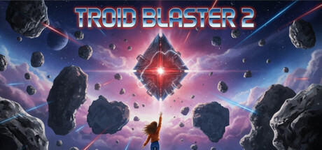
TROID BLASTER 2 is a physics based asteroids tribute game, featuring: * Random Levels * Gachapon random generated pilots and ships * 30 weapon types to unlock * Physics based! * Hundreds of bite sized levels to play * A graveyard to bury and remember your fallen pilots

$4.211 user reviews
ActionArcadeShooter
KINGSGUARD GAMESFeb 12, 2026

TROID BLASTER 2 scores 73/100 — better than 58% of Action capsules (n=8,535).

1 user reviews · $4.21 · Released Feb 12, 2026 · By KINGSGUARD GAMES

Quick text summary

TROID BLASTER 2 scored 73/100 on Steam Analyzer — Good for a Action capsule. Top priority fix: [title_readability] Use a solid bold sans-serif font or reduce outline thickness variation to maintain letterform clarity at tiny sizes, replacing the decorative gradient outline style.

Capsule scores by dimension

  • Genre Clarity: 8/10 — Clear action shooter with space combat. The asteroids, glowing red energy core, and spaceship silhouette immediately signal a space action game. At tiny size, the geometric asteroids and central energy burst still communicate an arcade-style shooter without ambiguity. The physics-based asteroid field and sci-fi aesthetic firmly establish the action genre, though the specific 'asteroids tribute' mechanic may not be immediately obvious.
  • Title Readability: 7/10 — Readable title with minor small-size concerns. The title 'TROID BLASTER 2' uses a bold red and blue gradient outline font that reads clearly at full and small sizes. However, at tiny size the outline thickness becomes proportionally thinner and some letter definition softens, particularly in the 'O' and 'A' letterforms. The strategic placement on the upper portion against darker space background helps, but the decorative outline style sacrifices a bit of crispness at the smallest viewing sizes.
  • Contrast & Color: 8/10 — Strong value separation with vibrant accents. The deep blue-purple gradient background contrasts well against the bright red central energy core and the warm pink-magenta nebula, creating clear silhouette separation. The dark asteroid shapes have defined edges against the lighter background gradients, and the glowing red centerpiece pops strongly against the cool space environment. In grayscale, the mid to dark tones of asteroids read clearly against lighter nebula regions, maintaining silhouette integrity at all sizes.
  • Uniqueness & Polish: 7/10 — Polished sci-fi aesthetic with familiar homage. The capsule demonstrates solid craft with clean gradients, particle-like asteroid distribution, and a cohesive glowing energy effect at the center that feels intentional. The visual clearly communicates a premium indie space action experience rather than a budget asset-flip. However, the core concept—a glowing geometric shape surrounded by asteroids—is a somewhat familiar trope in space game marketing, and the execution, while clean, does not introduce a visually distinctive hook that separates it from the competitive indie action space.
  • Brand Consistency: 6/10 — Competent but generic space game identity. The capsule uses consistent sci-fi rendering with a cohesive cool-to-warm color palette of blues, purples, and reds that suggests a unified visual style. However, there are no immediately recognizable character motifs, pilot iconography, or signature symbols that would create a memorable brand identity specific to TROID BLASTER 2's unique mechanics (Gachapon pilots, physics-based gameplay). The visual language is archetypal space action rather than distinctly branded.
  • Composition: 8/10 — Strong focal hierarchy with clear centerpiece. The glowing red diamond core sits at the visual center and immediately draws attention, with asteroids arranged radially around it creating depth layering: dark foreground rocks, bright nebula midground, and starfield background. The title placement in the upper left avoids competing with the central focal point. At small and tiny sizes, the hierarchical structure remains intact with the bright center unmistakably primary, and no cropping risk to key elements or safe margins.

What works

  • Bold contrast and focal clarity. The bright red energy core pops distinctly against the dark space background, maintaining visual dominance at all viewing sizes including tiny thumbnails.
  • Coherent depth layering. Background starfield, midground nebula gradient, and foreground asteroid silhouettes create natural visual recession that reads at every scale.
  • Title placement strategy. The upper-left title positioning avoids interference with the central focal point, allowing the logo space to breathe without competing elements.

What hurts the capsule

  • Outline font crispness at tiny size. The decorative outlined letterforms lose definition at thumbnail scale, with thin strokes becoming harder to distinguish in the 'BLASTER 2' portion.
  • Generic space game visual language. The glowing geometric shape and asteroid field aesthetic closely mirrors common sci-fi shooter marketing without obvious mechanical or thematic differentiation.
  • Lack of character or pilot visibility. Despite Gachapon pilots being a core unique mechanic, no pilot silhouette or character representation is visible, missing an opportunity for brand-specific identity.

Priority fixes

  1. [title_readability] Use a solid bold sans-serif font or reduce outline thickness variation to maintain letterform clarity at tiny sizes, replacing the decorative gradient outline style.
  2. [uniqueness_polish] Add a recognizable pilot silhouette or ship silhouette to the center that hints at the Gachapon character system and visual identity to differentiate from generic space shooters.
  3. [brand_consistency] Introduce a signature color accent or symbol (e.g., a recurring UI element, badge, or visual motif) that ties to the core physics or pilot mechanics to build recognizable brand language.

Store copy priority fixes

  1. [hook_strength] Rewrite the opening line to lead with an action verb and emotional payoff: 'Blast asteroids and pilot quirky ships through hundreds of arcade challenges—then immortalize your fallen heroes in a permanent graveyard.' This immediately hooks both the gameplay loop and the unique mechanic.
  2. [audience_targeting] Add one sentence after the feature list explicitly addressing the indie arcade/roguelike audience: 'Perfect for arcade enthusiasts and roguelike fans who love permadeath systems with a heart.' This clarifies who this game is built for.
  3. [feature_communication] Expand the graveyard mechanic description to clarify its role: 'A graveyard to bury and remember your fallen pilots, adding meaningful stakes to each run.' This explains why the feature matters beyond flavor.
  4. [uniqueness] Replace 'Physics based!' with specific mechanical impact: 'Realistic physics create unpredictable asteroid and enemy collisions—no two runs play the same way.' This differentiates from generic asteroids clones.

Related guides

Steam app ID: 4126820 · Tags: Action, Arcade, Shooter, Shoot 'Em Up, Top-Down Shooter