Scoring genre clarity...

Frozen Stillness capsule

Frozen Stillness

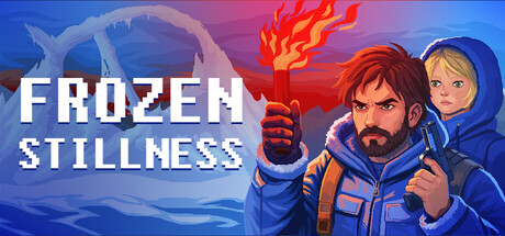
Frozen Silence is an intense yet exhausting pixel-art story about the survival of a father and daughter on a planet that was once their home, but has now become a deadly trap. Monitor your condition and use an energy shield and weapons to survive.

$1.993 user reviews
Pixel Graphics2DWalking Simulator
S.P.GMar 23, 2026

Frozen Stillness scores 70/100 — better than 27% of Pixel Graphics capsules (n=4,749).

3 user reviews · $1.99 · Released Mar 23, 2026 · By S.P.G

Quick text summary

Frozen Stillness scored 70/100 on Steam Analyzer — Good for a Pixel Graphics capsule. Top priority fix: [uniqueness_polish] Introduce a distinctive visual hook such as a glowing energy shield effect, unique weapon silhouette, or environmental hazard (frozen trap/ice crystal) that immediately signals survival gameplay and differentiates from generic action templates.

Capsule scores by dimension

  • Genre Clarity: 7/10 — Survival action with clear setup. The capsule communicates action and survival through the father-daughter characters in winter gear, the aggressive fire effect, and the shield/weapon iconography visible in their poses. At TINY size, the character silhouettes and blue/orange color contrast read as action-adventure, though pixel-art style and specific survival mechanics are less immediately obvious. The winter setting and dual characters hint at a story-driven survival experience rather than pure combat.
  • Title Readability: 8/10 — Bold, clear, well-positioned text. FROZEN STILLNESS is rendered in a clean, thick white sans-serif font with strong letter spacing, positioned in the upper-left quadrant over a controlled blue gradient region. At SMALL size (231×87) the title remains fully legible with good contrast against the background. At TINY size (120×45) the text compresses but individual letterforms hold clarity due to font weight and spacing, though some compression is visible.
  • Contrast & Color: 8/10 — Strong value separation, vibrant palette. The capsule uses a bold blue-to-pink gradient background with bright orange fire accents and character clothing, creating sharp value separation against the Steam dark background (#1b2838). The white title, blue-suited characters, and warm flame effects all read clearly in grayscale and maintain silhouette integrity. The color scheme pops at quick-scroll speed with high saturation and clear luminosity differences between elements.
  • Uniqueness & Polish: 6/10 — Competent pixel-art style, generic framing. The capsule features clean pixel-art character rendering and a cohesive color treatment, but the overall composition—two characters posed against an action backdrop with fire—follows a familiar survival-game template seen in games like Pacific Drive and The Invincible. While the execution is solid, the visual hook (father-daughter survival angle, shield mechanic, energy monitoring) is not strongly communicated through the capsule's specific iconography or layout. The generic pose and setup reduce distinctiveness compared to top-tier genre capsules.
  • Brand Consistency: 6/10 — Consistent pixel aesthetic, limited identity. The capsule maintains a coherent pixel-art style and cool blue-orange palette that should carry across store assets, but lacks memorable brand identity signals such as an iconic character marker, signature symbol, or unique visual motif. The father-daughter dynamic and survival theme are present but not reinforced through distinctive visual cues that would make this capsule instantly recognizable without the title.
  • Composition: 7/10 — Clear focal point, balanced layout. The father-daughter characters occupy the center-right, creating a strong primary focal point, while the fire effect in the upper-center draws secondary attention and creates depth layering. The title anchors the upper-left in negative space, avoiding clutter and maintaining safe margins. At SMALL and TINY sizes the character silhouettes remain the dominant read, though some fine detail in the background gradient is lost; the composition is resilient to edge cropping and maintains hierarchy across all viewing sizes.

What works

  • Strong color contrast and readability. Bold white title and vibrant blue-orange palette create excellent separation against Steam's dark background with clean silhouettes that hold at TINY size.
  • Clear focal point and depth layering. Center-placed characters, secondary fire element, and background gradient create effective visual hierarchy that guides the eye without scattered attention.
  • Pixel-art execution quality. Character rendering and color treatment are clean and professional, demonstrating craft and visual coherence across the capsule.

What hurts the capsule

  • Generic survival-game template. The composition and character pose mirror common action-survival game layouts, reducing distinctiveness compared to top-tier competitors in the genre.
  • Weak brand identity signals. The capsule lacks iconic visual markers, signature symbols, or unique motifs that would make the game recognizable without its title text.
  • Core mechanic obscurity. The energy shield, weapon variety, and survival-monitoring systems mentioned in the description are not clearly communicated through visual iconography in the capsule.

Priority fixes

  1. [uniqueness_polish] Introduce a distinctive visual hook such as a glowing energy shield effect, unique weapon silhouette, or environmental hazard (frozen trap/ice crystal) that immediately signals survival gameplay and differentiates from generic action templates.
  2. [brand_consistency] Add a memorable icon or motif (e.g., father's weapon design, daughter's tech marker, or a signature freeze/flame visual) that reinforces brand identity and creates recognition anchor across store assets.
  3. [genre_clarity] Enhance the pixel-art to subtly emphasize survival status monitoring or resource scarcity (e.g., visible energy meter, worn equipment detail, environmental threat cue) to clarify the specific survival-game subgenre.

Store copy priority fixes

  1. [hook_strength] Fix the title inconsistency immediately: change all instances of 'Frozen Silence' to 'Frozen Stillness' in the store copy to match the game's actual title.
  2. [feature_communication] Add 1-2 sentences describing the core gameplay loop: e.g., 'Navigate frozen terrain, manage dual resources, encounter escalating threats, and adapt your equipment loadout in real time.'
  3. [uniqueness] Insert a specific differentiator about the dual-character mechanic: e.g., 'Split your limited resources between yourself and your daughter—neglect either and both suffer' to clarify what makes this survival game distinct.
  4. [audience_targeting] Clarify the difficulty and accessibility tier early: specify whether this is a hardcore permadeath experience or a narrative-first story with adjustable difficulty to help players self-select.

Related guides

Steam app ID: 4127000 · Tags: Pixel Graphics, 2D, Walking Simulator, Survival, Snow