Scoring genre clarity...

Thousand N' Thousand: Mimico capsule

Thousand N' Thousand: Mimico

Short story driven RPG-esque top-down adventure with simple puzzles. Escape the Igneferia mini-mall before it's too late. May fortune be on your side!

Free to PlayPositive(10)
AdventureAction-AdventurePuzzle
Inconclusive NameNov 12, 2025

Thousand N' Thousand: Mimico scores 67/100 — better than 17% of Adventure capsules (n=7,922).

Positive (10 reviews) · Free to Play · Released Nov 12, 2025 · By Inconclusive Name

Quick text summary

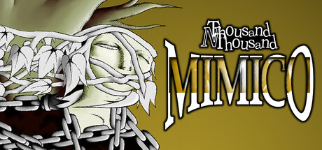
Thousand N' Thousand: Mimico scored 67/100 on Steam Analyzer — Solid for a Adventure capsule. Top priority fix: [contrast_color] Increase value contrast by darkening the background to a deeper brown or rust tone, or adding a dark shadow/stroke behind the character to strengthen silhouette separation against Steam's dark UI.

Capsule scores by dimension

  • Genre Clarity: 7/10 — Adventure indie vibe readable. The hand-drawn wrapped mummy character and whimsical art style clearly signal a story-driven indie adventure rather than action or combat-focused game. At tiny size, the bandaged figure remains identifiable as the protagonist, and the warm gold-brown palette with sketch aesthetics communicate a quirky, lighthearted tone. Genre is apparent but not genre-iconic—could be adventure, puzzle, or quirky narrative game.
  • Title Readability: 8/10 — Clear bold title with hierarchy. The title 'MIMICO' is rendered in large white outline letters with strong contrast against the gold-brown background, and the smaller 'A Thousand A Thousand' subtitle sits above in readable white outline text. At small and tiny sizes, 'MIMICO' remains legible as the dominant element, though the tagline becomes soft. The outline stroke prevents the text from drowning into the background, and strategic placement on the right side avoids the busy character on the left.
  • Contrast & Color: 6/10 — Warm palette lacks dark punch. The capsule relies on a warm ochre-gold background with cream-white title text and pale bandaged character, creating soft value separation. Against Steam's dark background #1b2838, the overall image reads but lacks the high-contrast silhouette pop seen in top performers like DREDGE or COCOON. In grayscale, the mid-toned bandaged mummy and warm tan background compress together, reducing the clarity at tiny size where strong value separation matters most.
  • Uniqueness & Polish: 6/10 — Charming but generic indie aesthetic. The hand-drawn bandaged character and sketch-line art style convey craft and personality, but the visual approach feels familiar within indie adventure circles without a distinctive hook or selling point. The design is competent and warm, but doesn't communicate a unique mechanic, narrative hook, or memorable visual signature that would stand out among top-tier indie titles like Harold Halibut or Slay the Princess. The mummy wrapping is a simple, clear character concept rather than a bold or surprising choice.
  • Brand Consistency: 6/10 — Consistent art style, limited identity. The sketch line aesthetic, warm palette, and whimsical proportions appear internally cohesive and likely match the in-game art direction based on the indie adventure context. However, there are no strong iconic motifs, symbols, or signature brand markers—the wrapped mummy is a character but not a branded symbol, and the palette is generic warm-indie rather than uniquely memorable. The design would benefit from a more distinctive visual identity that persists across marketing materials.
  • Composition: 7/10 — Clear focal split, well-balanced. The mummy character occupies the left side as the visual anchor while the title text dominates the right, creating a natural left-to-right reading flow without clutter. At small and tiny sizes, both elements remain distinct and readable without competing for attention. The composition avoids center void and uses the space efficiently, though the very top has some empty gold area that could have been tightened, and the character's extended bandages near the left edge risk minor cropping on narrow displays.

What works

  • Strong title contrast and readability. White outline text on warm background with strategic right-side placement ensures 'MIMICO' reads clearly even at tiny capsule size.
  • Coherent hand-drawn aesthetic. The sketch-line art style and warm palette create a unified, intentional look that signals indie craft and charm without feeling template-based.
  • Balanced two-element composition. Character and title elements are well-separated spatially, creating clear hierarchy and avoiding visual clutter at all viewing sizes.

What hurts the capsule

  • Warm palette lacks pop against Steam dark theme. The gold-brown background and pale character compress in value against #1b2838, reducing silhouette separation and visual impact on quick scroll.
  • No distinctive brand identity cues. The design lacks iconic symbols, unique motifs, or memorable visual signatures that would make it instantly recognizable in a crowded genre.
  • Generic indie adventure visual formula. While competent, the hand-drawn style and whimsical tone don't communicate a unique selling point or core mechanic that differentiates it from established indie titles.

Priority fixes

  1. [contrast_color] Increase value contrast by darkening the background to a deeper brown or rust tone, or adding a dark shadow/stroke behind the character to strengthen silhouette separation against Steam's dark UI.
  2. [genre_clarity] Add a subtle visual cue—such as a mini-mall storefront, puzzle icon, or clock symbol—to the composition to more clearly communicate the 'escape room mall adventure' core concept.
  3. [uniqueness_polish] Introduce a distinctive brand marker or color accent (e.g., a signature purple glow, unique UI element, or symbolic object) that creates immediate visual recognition and differentiates from generic indie adventure peers.
  4. [title_readability] Ensure the 'A Thousand A Thousand' subtitle remains readable at tiny size by increasing its line weight or letter spacing, or repositioning it for better visibility.

Store copy priority fixes

  1. [hook_strength] Rewrite the opening to lead with emotional stakes—replace 'May fortune be on your side!' with a concrete consequence, such as 'Escape the Igneferia before midnight—or disappear like the 30 others.' This creates urgency the whimsy currently lacks.
  2. [feature_communication] Add 1–2 sentences clarifying core gameplay loops: describe what puzzle-solving looks like (environmental? inventory-based?), what NPC interaction provides (story progression? resources?), and how 'chasing' works mechanically (avoidance? combat?).
  3. [audience_targeting] Explicitly mention the free-to-play model in the detailed description and note what it includes (full story access, optional cosmetics, etc.) to set expectations and signal cost to budget-conscious players.
  4. [tone_match] Deepen the dark fantasy and horror tone in the copy by emphasizing dread and mystery over lightness—replace 'speak to yourself' asides with description of the mall's uncanny atmosphere or the tangible sense of being hunted.

Related guides

Steam app ID: 4127310 · Tags: Adventure, Action-Adventure, Puzzle, JRPG, Fantasy