Scoring genre clarity...

Seconda capsule

Seconda

Survive in the ruins of a post-apocalyptic Italy. Manage resources, defend your home, and try to reactivate a radio to contact the outside world.

Free to PlayPositive(16)
AdventureActionAction-Adventure
Videogame CollectiveNov 10, 2025

Seconda scores 67/100 — better than 17% of Adventure capsules (n=7,922).

Positive (16 reviews) · Free to Play · Released Nov 10, 2025 · By Videogame Collective

Quick text summary

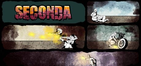
Seconda scored 67/100 on Steam Analyzer — Solid for a Adventure capsule. Top priority fix: [composition] Consolidate the four-panel grid into a single dominant scene or character at center with a clear focal point that reads at TINY size, moving away from the scattered collage approach.

Capsule scores by dimension

  • Genre Clarity: 7/10 — Post-apocalyptic survival implied. The collage of sketched vehicles, scattered mechanical elements, and weathered brown/tan color palette signal post-apocalyptic action-adventure with resource survival mechanics. At TINY size, the scattered vehicle silhouettes and rusted aesthetic read as survival-themed, though the exact gameplay loop (defend, manage, radio) is not immediately obvious from visuals alone.
  • Title Readability: 8/10 — Bold title with strong contrast. The title 'SECONDA' in large orange-red gradient letterforms sits in the top-left against a dark teal background, providing clear separation and legibility at all sizes. The bold sans-serif holds up well at TINY size due to weight and color contrast, though no supporting tagline or descriptor is readable at small scale.
  • Contrast & Color: 7/10 — Warm tones stand out clearly. The orange-red title and yellow-orange accent streaks create strong value separation against the dark teal, brown, and charcoal background palette. At TINY size, the warm highlights and title remain visible, though the mid-tone sketched vehicle details lose some definition in the muddy brown regions.
  • Uniqueness & Polish: 6/10 — Competent but generic post-apocalyptic. The sketched vehicle silhouettes and weathered texture approach feels serviceable but does not distinguish itself from common post-apocalyptic indie game aesthetics seen in survival titles. The rough pencil-sketch art style is consistent but lacks a signature visual hook or memorable unique selling point that sets it apart from similarly-themed games.
  • Brand Consistency: 6/10 — Coherent but not iconic. The hand-drawn vehicle motif, weathered texture overlay, and warm-on-dark color scheme are internally consistent across the visible panels. However, there are no distinctive character, symbol, or palette elements that create a memorable brand identity likely to be recognized across multiple marketing materials without external reference.
  • Composition: 6/10 — Balanced grid layout, scattered focus. The four-panel grid layout balances the composition and avoids a cluttered center, with the title anchoring the top-left quadrant. At TINY size, the multi-panel design fragments into visual noise, and the lack of a single dominant focal point makes the capsule feel segmented rather than cohesive; the eye does not settle on a clear primary subject.

What works

  • Title legibility and contrast. The orange-red 'SECONDA' letterforms maintain strong readability at all sizes due to bold weight, warm hue, and placement on a controlled dark background.
  • Thematic color consistency. The warm orange-yellow accents against cool dark tones reinforce a post-apocalyptic aesthetic and create visual cohesion across the sketched vehicle panels.
  • Organized layout structure. The four-panel grid avoids chaotic clutter and provides balanced spacing that does not crowd the title or create dead zones.

What hurts the capsule

  • Fragmented focal point at small sizes. The multi-panel grid design breaks apart into competing visual elements at SMALL and TINY sizes, losing the ability to communicate a single clear subject or hook.
  • Generic artistic style. Sketched vehicles and weathered textures are common post-apocalyptic game tropes that do not establish a distinctive or memorable brand identity.
  • Detail loss in muddy mid-tones. The brown and tan vehicle sketches blend into the weathered background texture, reducing silhouette clarity and legibility at reduced scales.

Priority fixes

  1. [composition] Consolidate the four-panel grid into a single dominant scene or character at center with a clear focal point that reads at TINY size, moving away from the scattered collage approach.
  2. [uniqueness_polish] Introduce a signature visual element (iconic character, distinctive prop, or unique art style signature) that immediately signals this game's unique identity separate from generic post-apocalyptic survival titles.
  3. [contrast_color] Increase silhouette separation of vehicle sketches by adding a light rim or glow effect, or shift vehicle placement to higher-contrast background regions to prevent detail loss at small scales.

Store copy priority fixes

  1. [feature_communication] Restructure the detailed description to include a bulleted or short-paragraph feature summary after the narrative opening, explicitly listing: Radio Repair Quest, Food Management & Trading, Home Fortification, Combat vs. Stealth, and Contaminated Zone Exploration.
  2. [uniqueness] Add 1-2 sentences articulating what is mechanically or narratively different about Seconda's survival experience (e.g., 'the only Italian post-apocalyptic survival game' or 'focus on repair and salvage over scavenging' if true).
  3. [hook_strength] Strengthen the short description by leading with Aurora's agency or a specific challenge ('Help Aurora rebuild a military radio to escape post-apocalyptic Italy—but survival comes first') rather than a list of tasks.

Related guides

Steam app ID: 4127470 · Tags: Adventure, Action, Action-Adventure, Shooter, Exploration