Scoring genre clarity...

Deliverance capsule

Deliverance

Explore an abandoned town as a postman delivering letters to dead residents. Make choices, find clues, and uncover the truth about yourself. Every house tells a new story, and every letter changes the world around you.

$7.991 user reviews
AdventureActionAction-Adventure
KUWANov 13, 2025

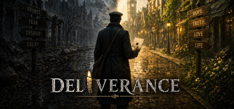
Deliverance scores 73/100 — better than 61% of Adventure capsules (n=7,922).

1 user reviews · $7.99 · Released Nov 13, 2025 · By KUWA

Quick text summary

Deliverance scored 73/100 on Steam Analyzer — Good for a Adventure capsule. Top priority fix: [genre_clarity] Integrate a subtle visual element that hints at the postman or letter mechanic—such as a visible letter, mailbag, or envelope detail—to differentiate from generic mystery-adventure capsules and communicate the unique premise.

Capsule scores by dimension

  • Genre Clarity: 7/10 — Atmospheric mystery adventure clear. The solitary figure in a decaying urban environment with moody golden-to-gray lighting immediately signals a narrative-driven adventure game with mystery or melancholic undertones. At tiny size, the silhouette of the lone character walking through an abandoned street is legible and genre-appropriate, though the specific postman/letter-delivery mechanic is not visually apparent from the image alone. The atmosphere suggests story-focused gameplay rather than pure action, which aligns with the indie adventure positioning.
  • Title Readability: 8/10 — Strong serif typography centered. DELIVERANCE is rendered in large, elegant serif capitals with clean white letterforms positioned centrally over a mid-tone background region, avoiding the busiest parts of the street detail. The title remains clearly readable at small and tiny sizes due to consistent weight and the dark semi-transparent backing implied by the text placement. Letter spacing is generous and the word sits in a controlled zone that survives Steam's typical crop margins.
  • Contrast & Color: 8/10 — Warm-cool balance with separation. The composition leverages a strong value contrast between the dark charcoal left side (ruined buildings) and the warm golden-yellow light bleeding from the right, creating clear depth and atmospheric separation. The protagonist's dark silhouette pops cleanly against both the murky foreground and the lit background, maintaining readable separation even in grayscale. The warm light pool on the right edge ensures the title and focal point do not blend into a flat midtone sludge.
  • Uniqueness & Polish: 7/10 — Moody aesthetic, narrative focused. The image conveys a distinctive melancholic, literary tone—enhanced by the elegant serif typography and the concept of delivering letters to the dead—that sets it apart from typical action-adventure capsules which often emphasize combat or spectacle. The lighting and composition feel intentional and painterly rather than generic screenshot grab, suggesting craft. However, the solitary-figure-in-ruins visual is familiar in indie mystery games, preventing a higher score despite solid execution.
  • Brand Consistency: 6/10 — Cohesive mood, limited icon signals. The capsule establishes a consistent melancholic, noir-tinged atmosphere with desaturated ruins and warm focal lighting that should carry across marketing materials. However, without reference to the 9 available screenshots, there are no obvious recurring motifs, character silhouettes, or signature design elements visible that would become a recognizable brand anchor. The visual language is strong internally but does not yet communicate a distinctive brand signature beyond 'moody urban mystery.'
  • Composition: 8/10 — Clear focal point, balanced layers. The lone figure walking left-center creates a strong primary focal point with clear foreground (immediate street ruins), midground (the character), and background (golden-lit distant buildings) layering that maintains hierarchy at all sizes. The title sits comfortably in the upper-middle safe zone without edge hugging or crop risk. At tiny size, the silhouette and lighting contrast preserve the composition's readability despite the loss of fine texture detail.

What works

  • Atmospheric depth layering. Three distinct spatial layers (foreground rubble, midground character, background lit architecture) create visual depth that reads even at tiny sizes and guides the eye naturally through the frame.
  • Title placement and contrast. The large, centered DELIVERANCE text uses clean serif letterforms with ample spacing, positioned over a controlled mid-tone region that keeps it legible and safe from crop margins at all viewing sizes.
  • Mood coherence and lighting design. The warm-to-cool color shift from golden light to charcoal ruin creates both atmospheric storytelling and strong value separation that ensures the focal character does not blend into the background even in grayscale.

What hurts the capsule

  • Generic solitary-figure trope. The 'lone person in ruins' visual is repeated in many indie mystery and narrative adventure games, limiting distinctiveness despite solid execution.
  • No visible brand identity motif. The capsule does not establish a recurring symbol, character trait, or signature design pattern that would become recognizable across multiple marketing touchpoints without relying on the title alone.
  • Limited gameplay hint in image. The postman and letter-delivery mechanic—a core unique selling point—are not visually communicated through props, UI cues, or symbolic elements in the capsule, leaving the game's distinctive premise unclear.

Priority fixes

  1. [genre_clarity] Integrate a subtle visual element that hints at the postman or letter mechanic—such as a visible letter, mailbag, or envelope detail—to differentiate from generic mystery-adventure capsules and communicate the unique premise.
  2. [uniqueness_polish] Add a recognizable recurring motif or character prop that can function as a visual brand anchor across marketing materials, moving beyond mood alone toward iconic identity.
  3. [composition] Consider moving the focal character slightly off-center or introducing a secondary narrative element (e.g., a house detail, glowing window) that reinforces the 'story in every location' concept without cluttering the design.

Store copy priority fixes

  1. [tone_match] Remove emojis from the key features section or replace them with subtle dingbats that match the dark aesthetic—emojis undercut the psychological, melancholic mood.
  2. [feature_communication] Clarify or remove the 'Survival' tag by adding a sentence explaining resource scarcity, time pressure, or danger mechanics, or by removing the tag if it doesn't apply.
  3. [uniqueness] Strengthen the final unique-selling-point statement by explicitly contrasting the letter-choice mechanic: 'Unlike dialogue trees, your choices are silent acts of interpretation—finding the right letter for each resident is the entire game.'
  4. [audience_targeting] Add a brief line signaling game length and intended audience (e.g., '2-3 hour narrative adventure for players who value story and choice over action') to set expectations.

Related guides

Steam app ID: 4127950 · Tags: Adventure, Action, Action-Adventure, Exploration, Survival