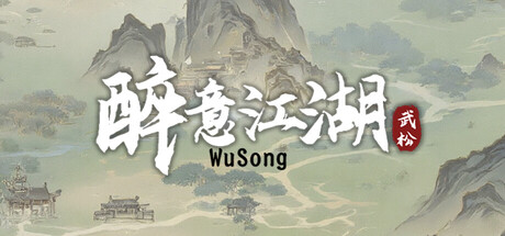
The martial world of drinking:Wu Song scores 65/100 — better than 10% of Strategy capsules (n=5,436).
3 user reviews · $3.99 · Released Apr 30, 2026 · By 北悲呀 BBY Games
The martial world of drinking:Wu Song scored 65/100 on Steam Analyzer — Solid for a Strategy capsule. Top priority fix: [title_readability] Replace fine-stroke Chinese characters with a bolder, more geometric typeface variant that maintains authenticity while surviving the TINY size blur test without losing individual stroke clarity.
Steam app ID: 4128640 · Tags: Strategy, Card Battler, Card Game, 2.5D, Turn-Based Combat