Scoring genre clarity...
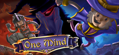
One Mind capsule

One Mind

A 3D puzzle-platformer where you control two characters in different locations, each facing their own challenges. Navigate through obstacles, solve interconnected puzzles, and coordinate their actions carefully — every move to help one could put the other in danger.

Singleplayer3D PlatformerAdventure
Kimera GamesComing soon

One Mind scores 75/100 — better than 67% of Singleplayer capsules (n=16,625).

Released Coming soon · By Kimera Games

Quick text summary

One Mind scored 75/100 on Steam Analyzer — Good for a Singleplayer capsule. Top priority fix: [genre_clarity] Add a subtle environmental or puzzle element (gears, platforms, interconnected paths) to the center composition to reinforce puzzle-platformer identity beyond character duality

Capsule scores by dimension

  • Genre Clarity: 7/10 — Puzzle-platformer with dual character setup clear. The capsule shows two distinct characters in mirrored poses with different visual themes (wizard-like left, steampunk right) on opposing sides of a glowing green central element, immediately suggesting the dual-character mechanic core to the gameplay. At tiny size, the split composition and character silhouettes still read as two separate entities with contrasting designs, though the puzzle-platformer genre is implied rather than explicit through the art style rather than iconography. The visual hierarchy supports the core mechanic over genre clarity.
  • Title Readability: 8/10 — Bold yellow serif title stands strong. The 'One Mind' title uses a distinctive yellow serif typeface with good letter spacing and clear outline separation against the dark background, maintaining excellent readability at full size and small capsule sizes. At tiny size, the letterforms remain distinguishable though slightly compressed, with the decorative serif style still readable due to strong value contrast and adequate font weight. The title placement centered above the character artwork avoids overlap with busy elements.
  • Contrast & Color: 8/10 — Vibrant colors pop against dark backdrop. The capsule employs bright yellow title text, saturated purple and orange magical effects on the left character, warm orange/gold on the right character, and a glowing teal-green central element that all create strong value separation against the #1b2838 dark background. At tiny size, the saturated warm and cool tones still register distinctly with good silhouette separation, and the color palette feels cohesive rather than chaotic. The character outlines hold definition even when squinting due to the lighting rim effects.
  • Uniqueness & Polish: 7/10 — Distinctive dual-character art with clear identity. The capsule features stylized character designs with asymmetrical visual themes (magical wizard versus mechanical steampunk) that communicate the dual-perspective gameplay mechanic in a memorable way, differentiating it from generic puzzle platformers. The hand-drawn character art quality and lighting effects (purple aura, orange glow, green glow) suggest a polished indie production with intentional art direction. However, the composition relies on familiar split-mirror tropes that are seen in other dual-mechanic indie games, keeping it from reaching higher uniqueness.
  • Brand Consistency: 7/10 — Strong character contrast defines visual identity. The two characters with their distinct visual identities (left: purple-tinted magical appearance with pointed hat and staff-like pose; right: brown/copper steampunk aesthetic with mechanical details) establish a recognizable brand motif around duality and contrast. The central glowing green shape and consistent warm/cool color separation would be memorable across marketing materials. Without seeing all 6 store screenshots, the internal cohesion appears strong, though additional iconic symbols or a signature UI element could strengthen recognition.
  • Composition: 8/10 — Balanced mirrored layout with clear focal points. The composition uses a symmetrical mirrored arrangement with two distinct character silhouettes flanking a glowing central element, creating natural visual balance and clearly communicating the two-sided puzzle mechanic at any size. The title positioned above in the upper third establishes hierarchy, and the dark background provides safe margins without text encroachment at edges. At small and tiny sizes, the three-part composition (left character, center glow, right character) maintains readability with no elements competing for attention or collapsing into visual noise.

What works

  • Title contrast and legibility. Bright yellow serif typeface with consistent outline delivers strong readability across all viewing sizes from full to tiny thumbnail.
  • Core mechanic communication. The dual-character mirrored composition immediately conveys the puzzle-platformer's central mechanic of coordinating two separate entities without requiring text explanation.
  • Color separation and saturation. Purple, orange, and teal accent colors create vibrant silhouette separation against the dark Steam background while maintaining visual coherence and avoiding muddy mid-tones.
  • Balanced visual hierarchy. Characters anchor left and right, glowing center element bridges them, title crowns the composition—all elements have clear roles without competing for primary attention.

What hurts the capsule

  • Genre iconography underexplored. While characters are visually distinctive, puzzle-platformer gameplay expectations are communicated through composition rather than environmental context or familiar genre visual cues.
  • Central green element ambiguity. The bright teal-green central glow reads as a focal point but its thematic connection to 'One Mind' or the dual-character mechanic is not immediately clear from visual design alone.
  • Symmetry risks predictability. The perfectly mirrored layout, while effective for communication, borrows from familiar indie game design conventions and does not distinctly stand out against other dual-mechanic titles in the genre.

Priority fixes

  1. [genre_clarity] Add a subtle environmental or puzzle element (gears, platforms, interconnected paths) to the center composition to reinforce puzzle-platformer identity beyond character duality
  2. [uniqueness_polish] Introduce a signature visual motif or icon that represents the 'one mind' concept mechanically to elevate distinction from other dual-mechanic indie games
  3. [composition] Test capsule crop at Steam standard margins to ensure no character details or title outline are cut at extreme widths

Store copy priority fixes

  1. [feature_communication] Add a bullet point or short sentence describing the types of puzzles (e.g., 'environmental logic puzzles,' 'timing-based challenges') and the approximate number of levels or estimated playtime to help players gauge scope.
  2. [audience_targeting] Add one sentence clarifying difficulty level (e.g., 'challenging but forgiving for puzzle fans' or 'accessible to newcomers') and whether the game is best enjoyed as solo or better with a specific player mindset.
  3. [uniqueness] Include a comparison or explicit statement such as 'the only puzzle-platformer where both characters move in perfect sync, forcing you to rethink every jump' to sharpen the competitive differentiation.

Related guides

Steam app ID: 4130900 · Tags: Singleplayer, 3D Platformer, Adventure, Puzzle Platformer, Platformer